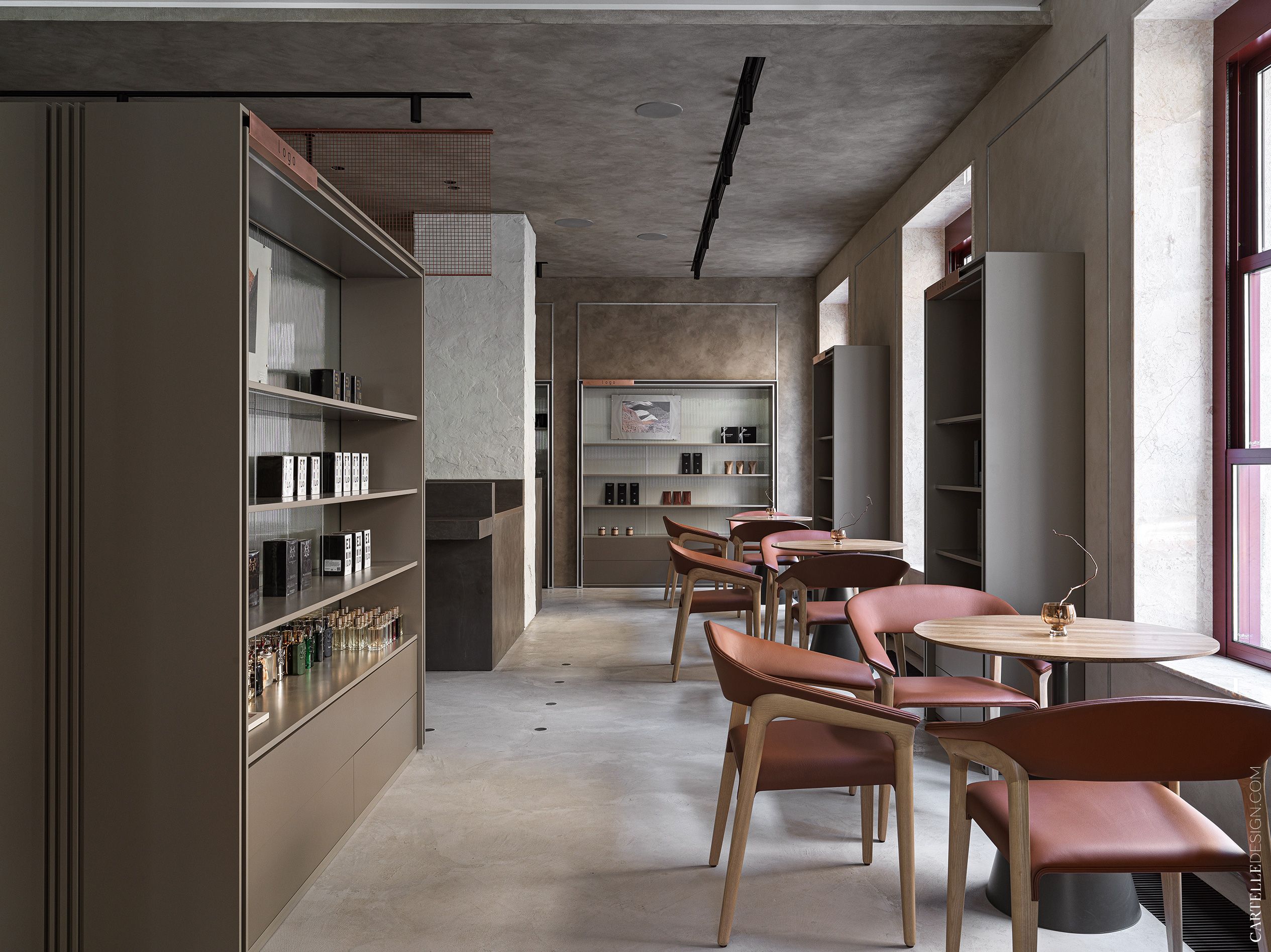
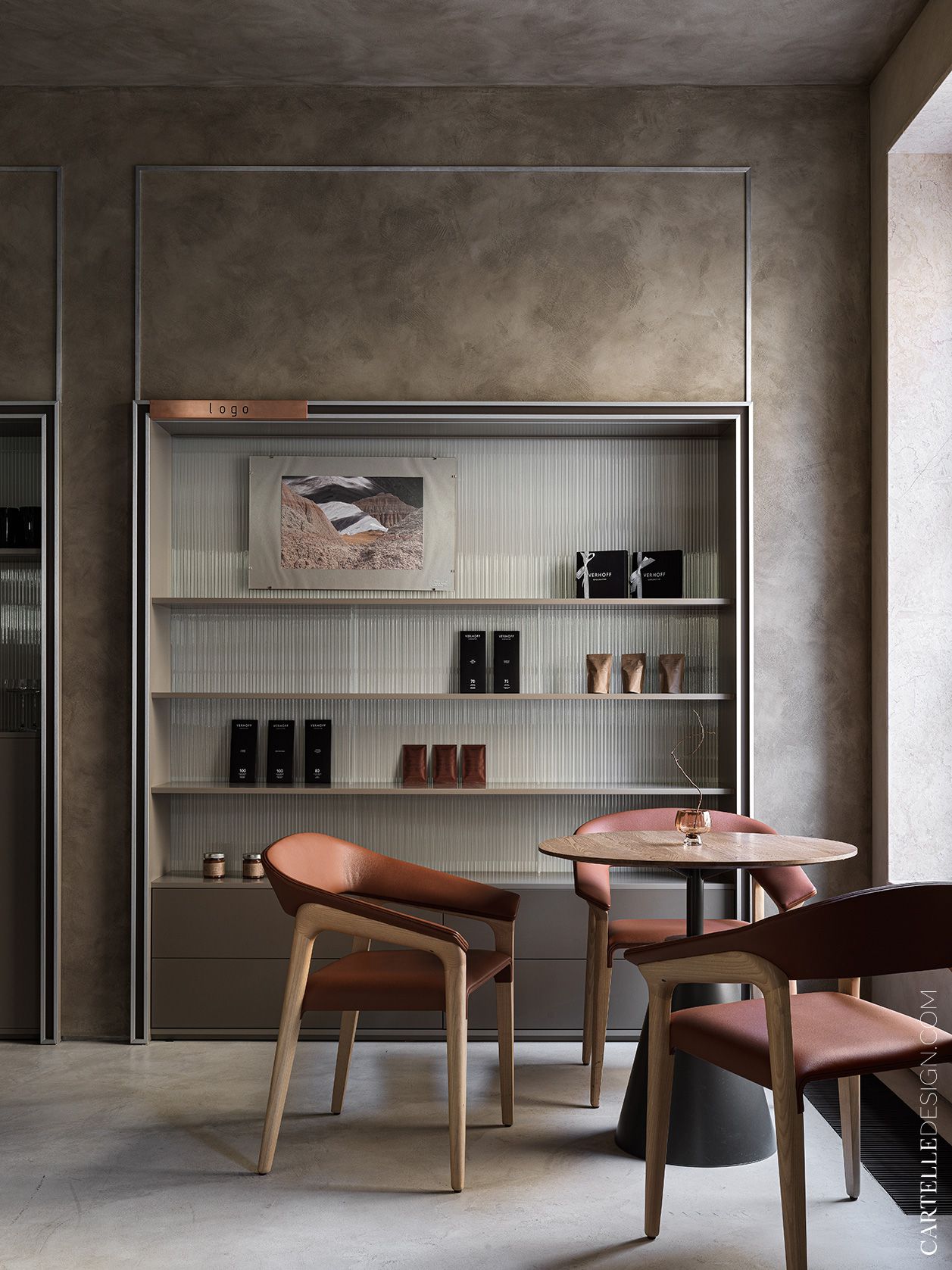
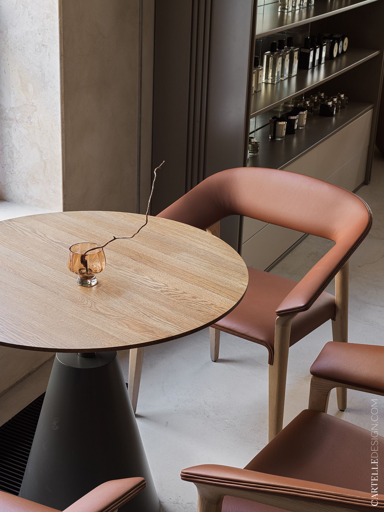
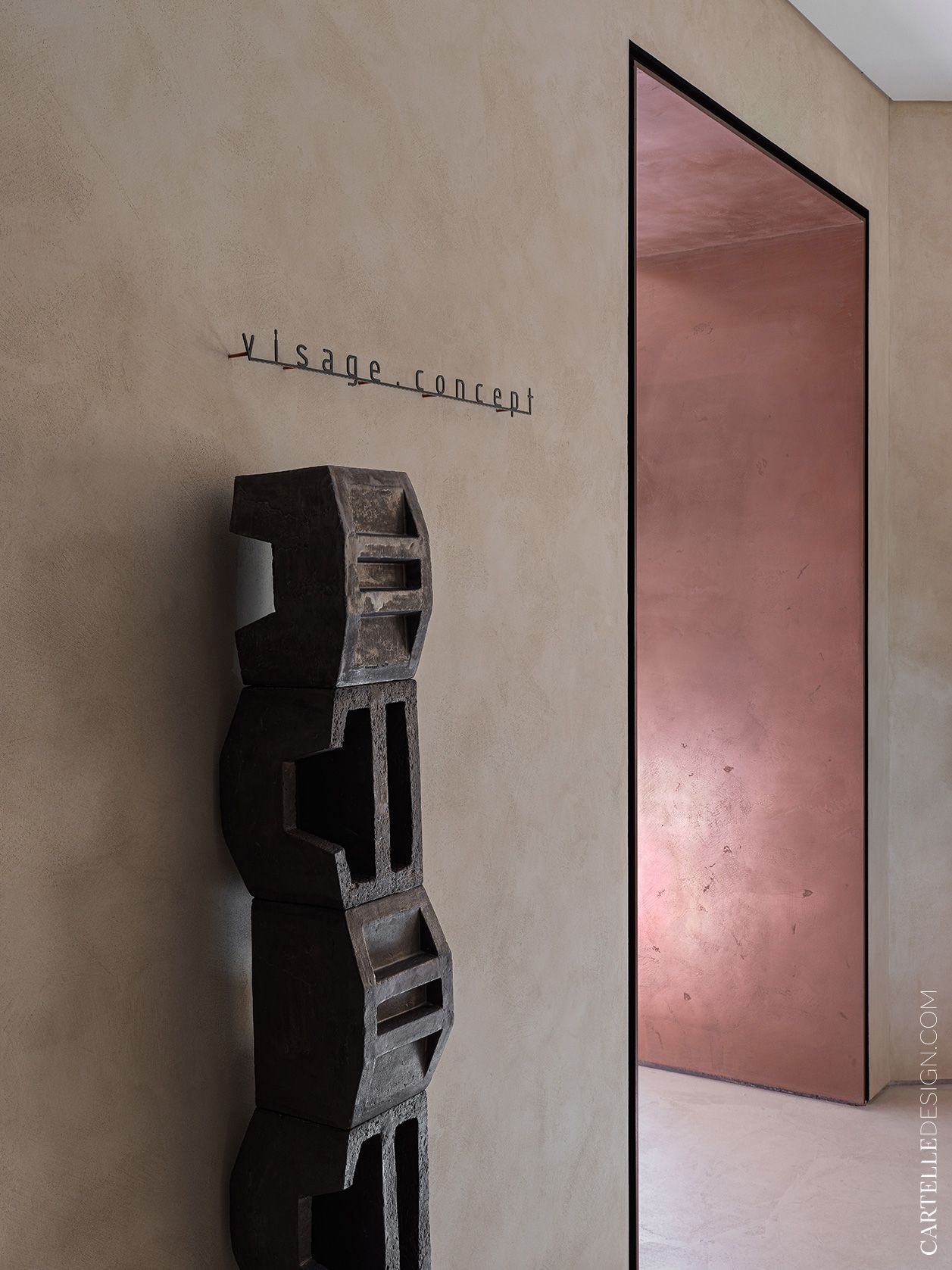
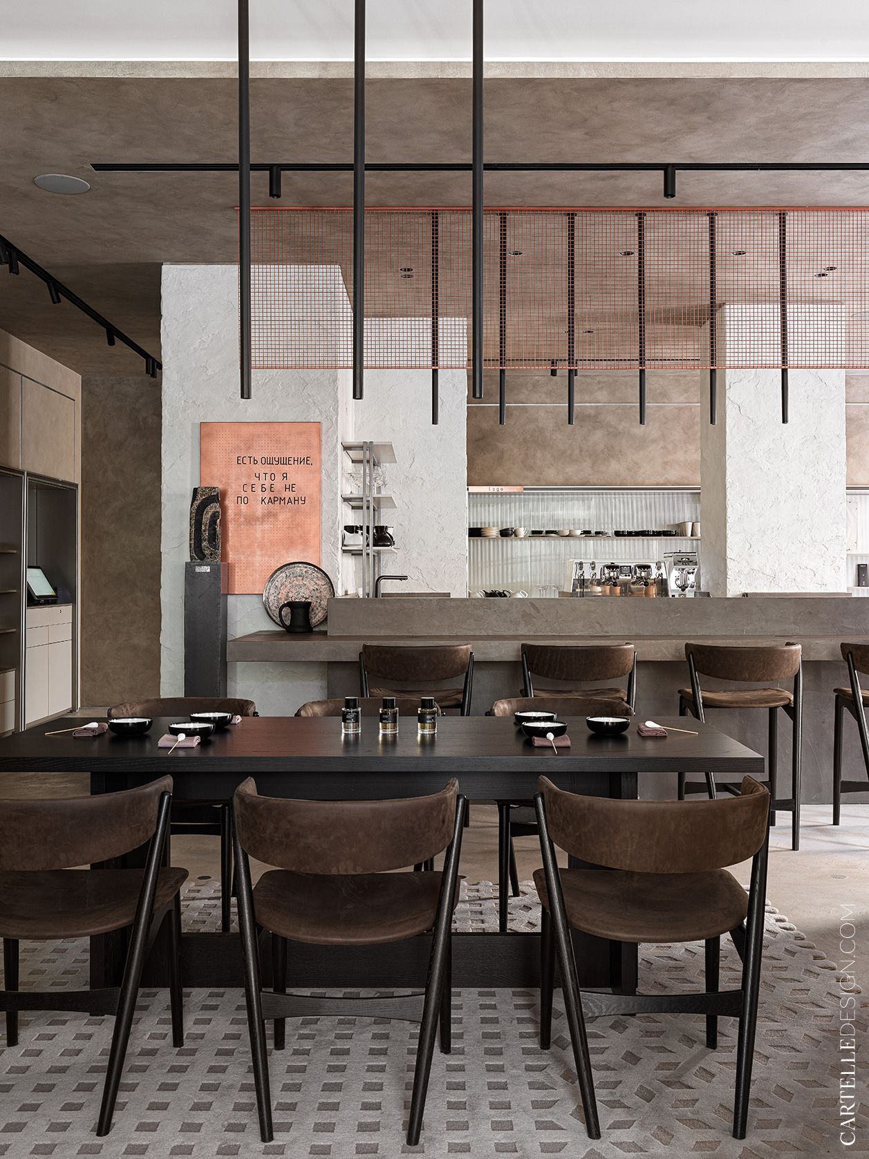
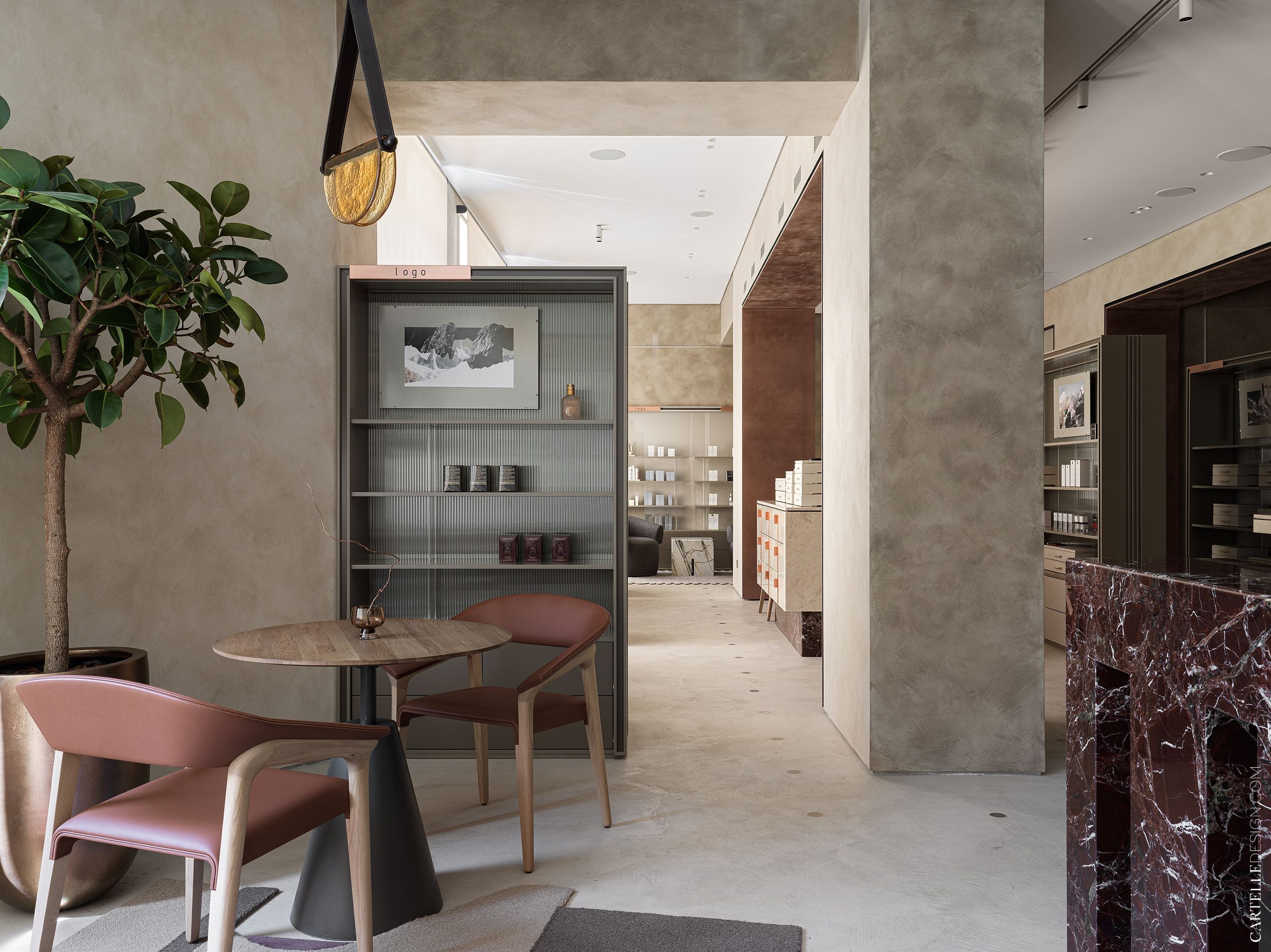
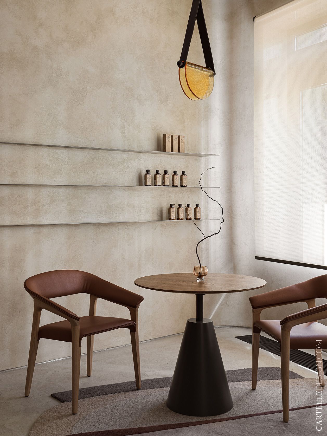
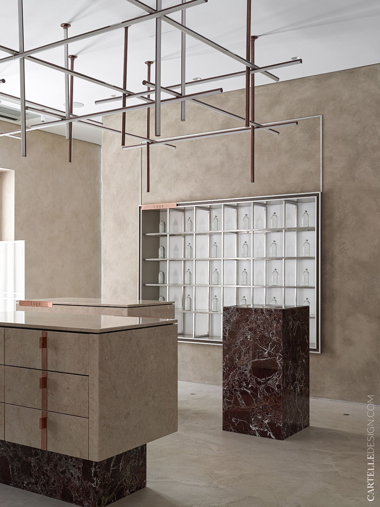
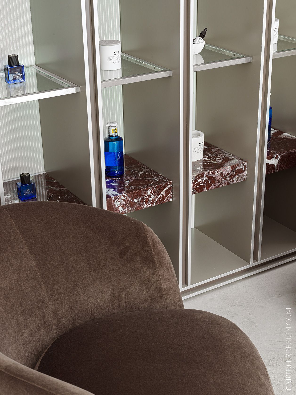
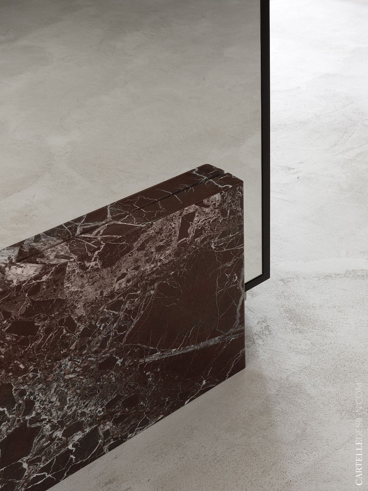
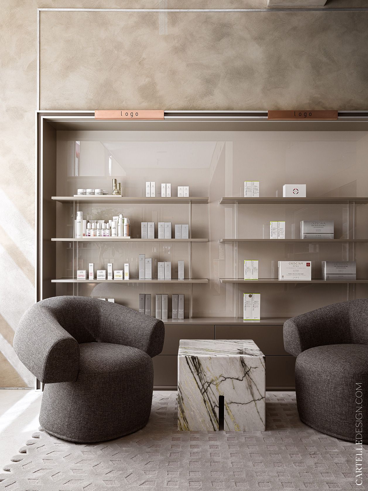
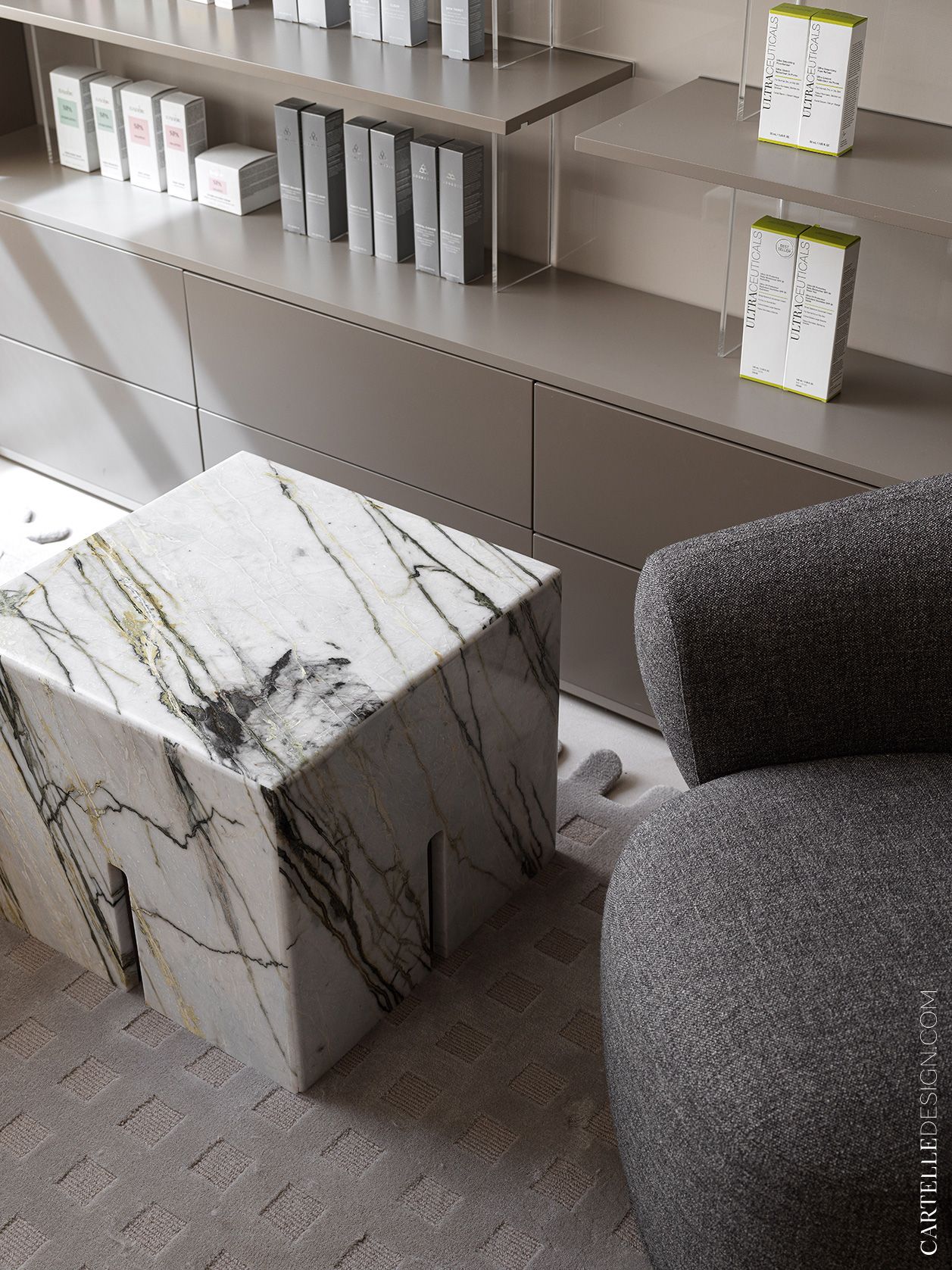
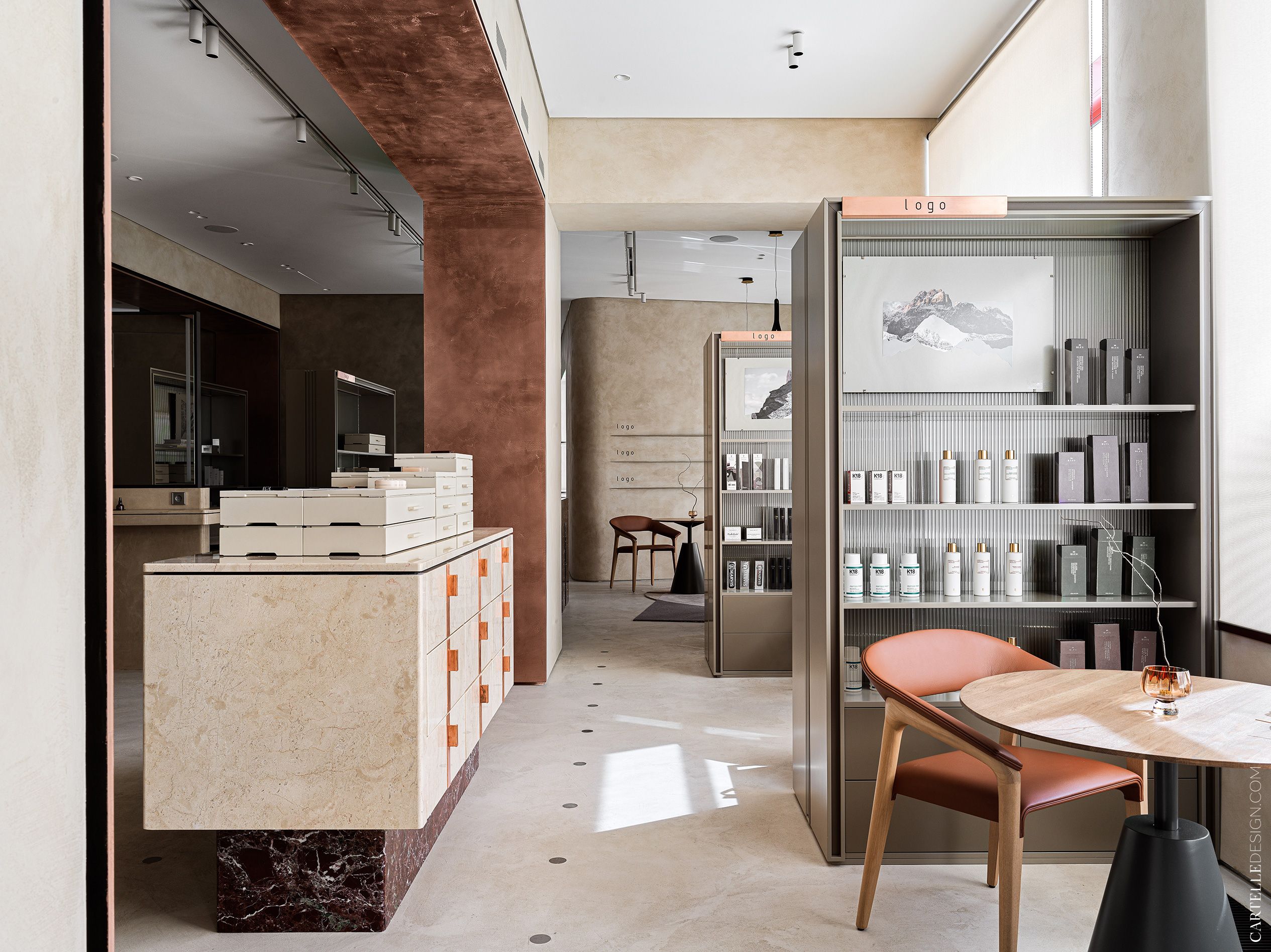
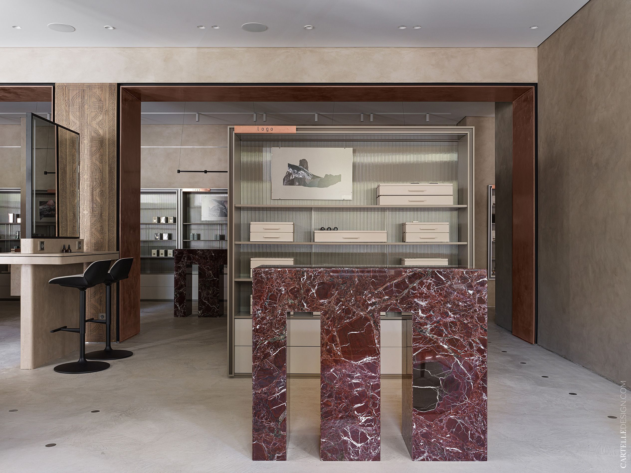
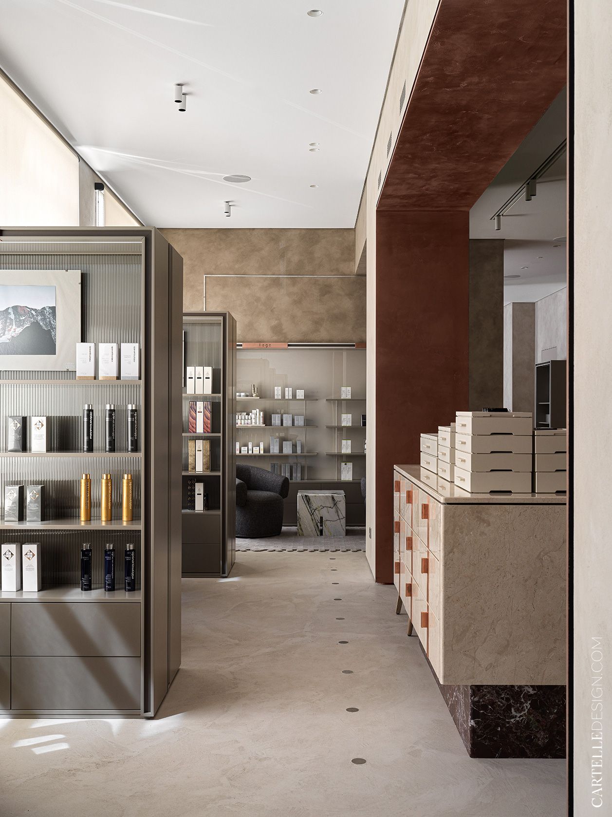
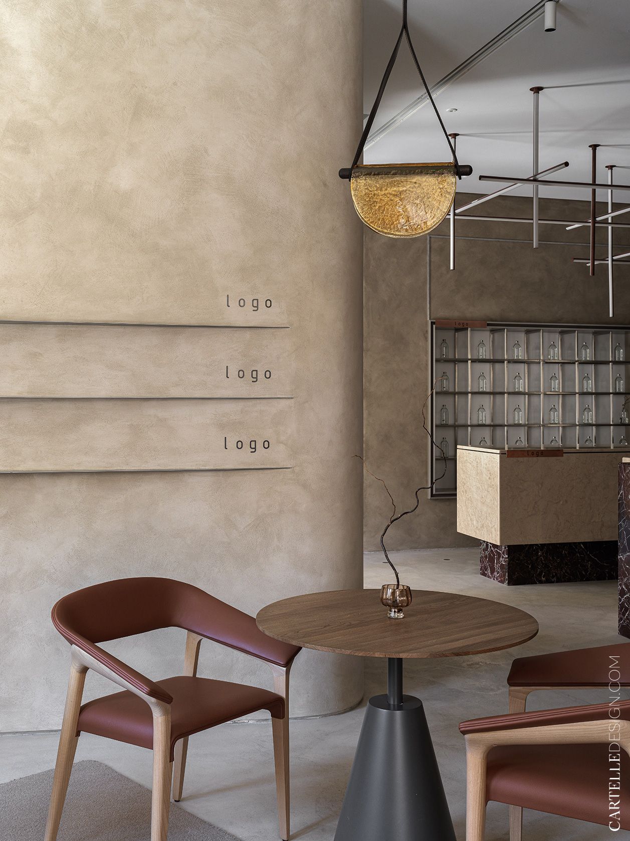
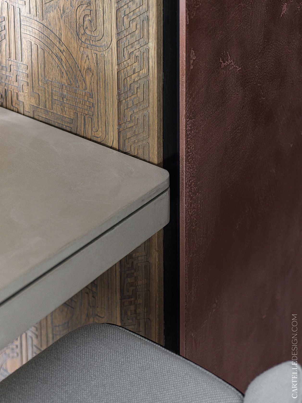
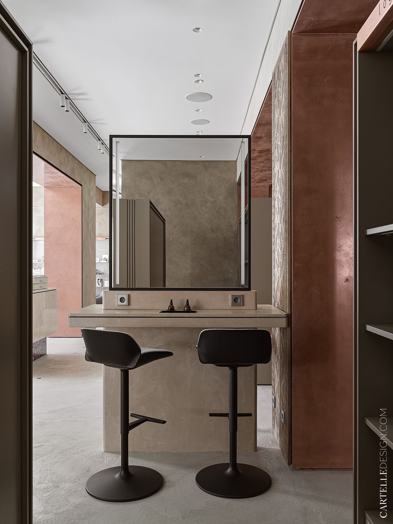
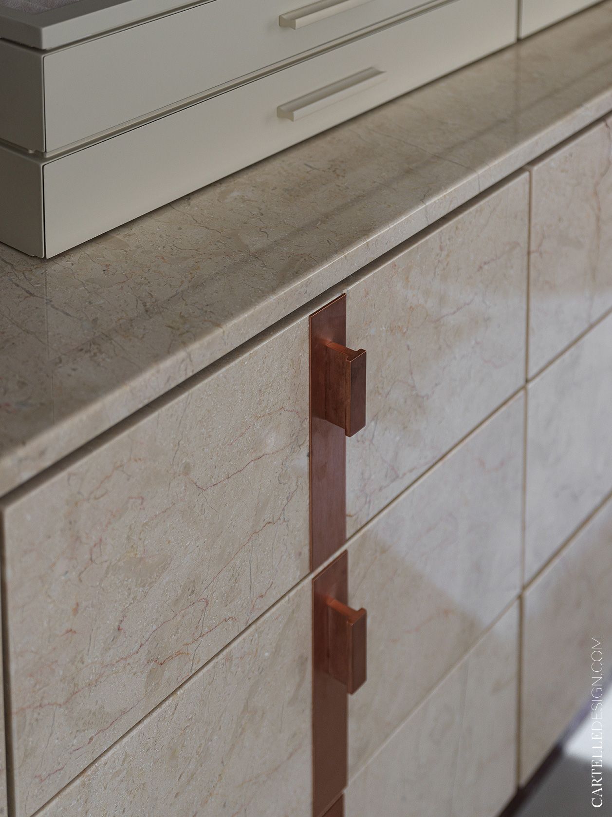
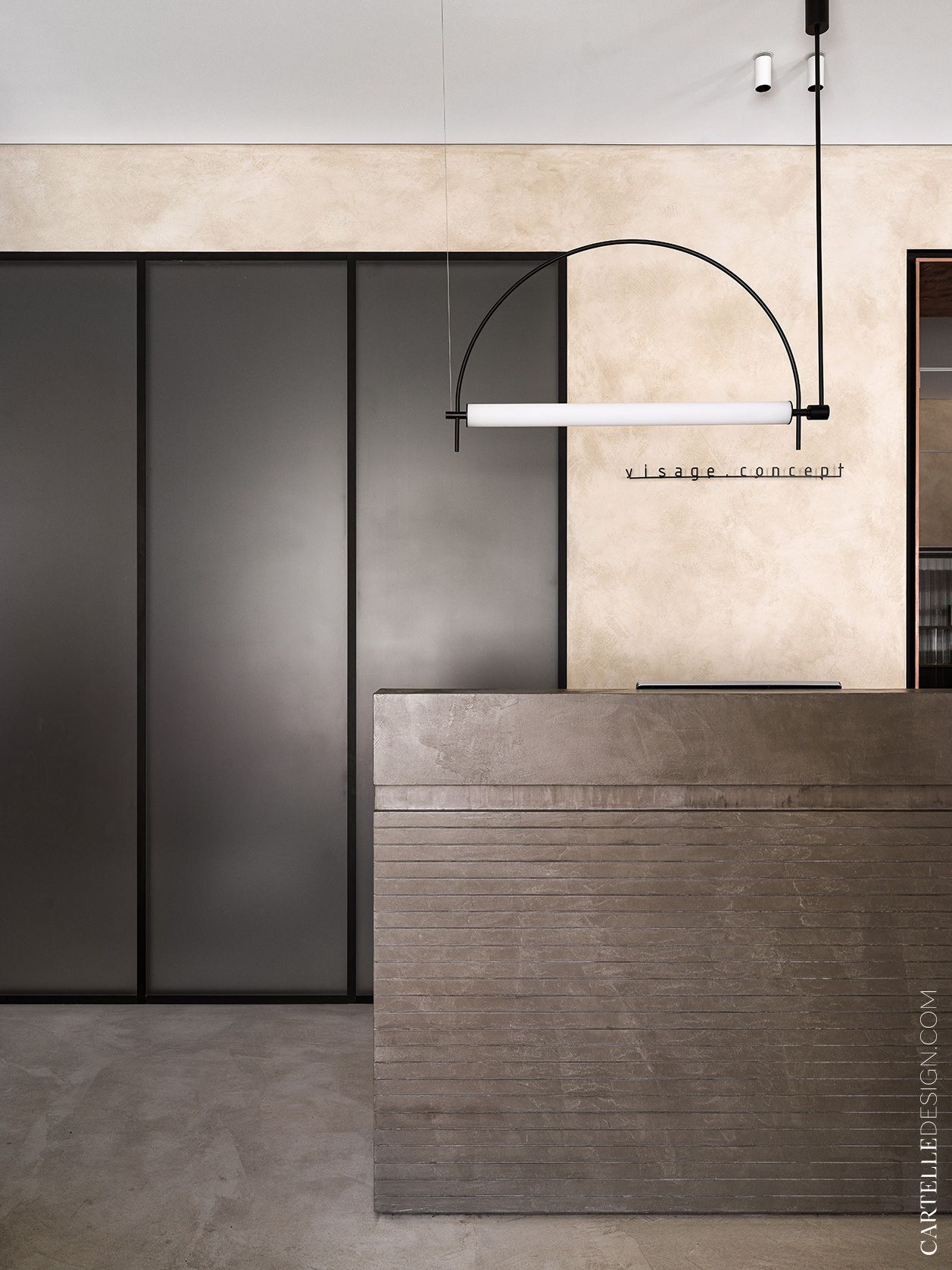
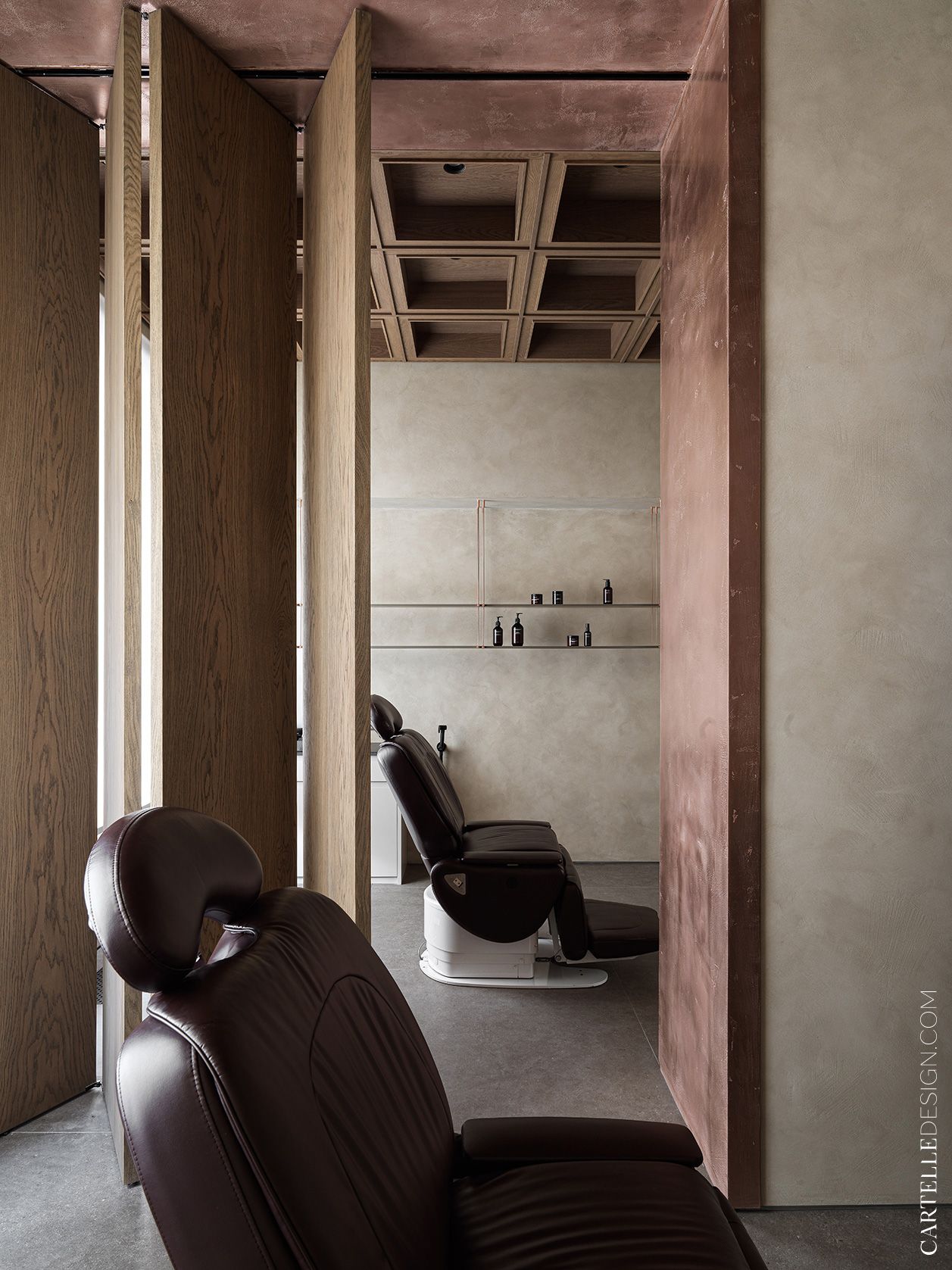
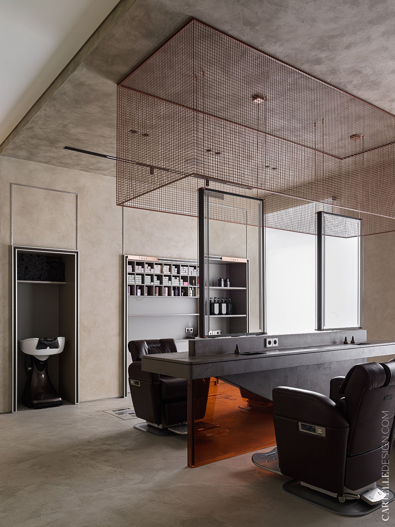
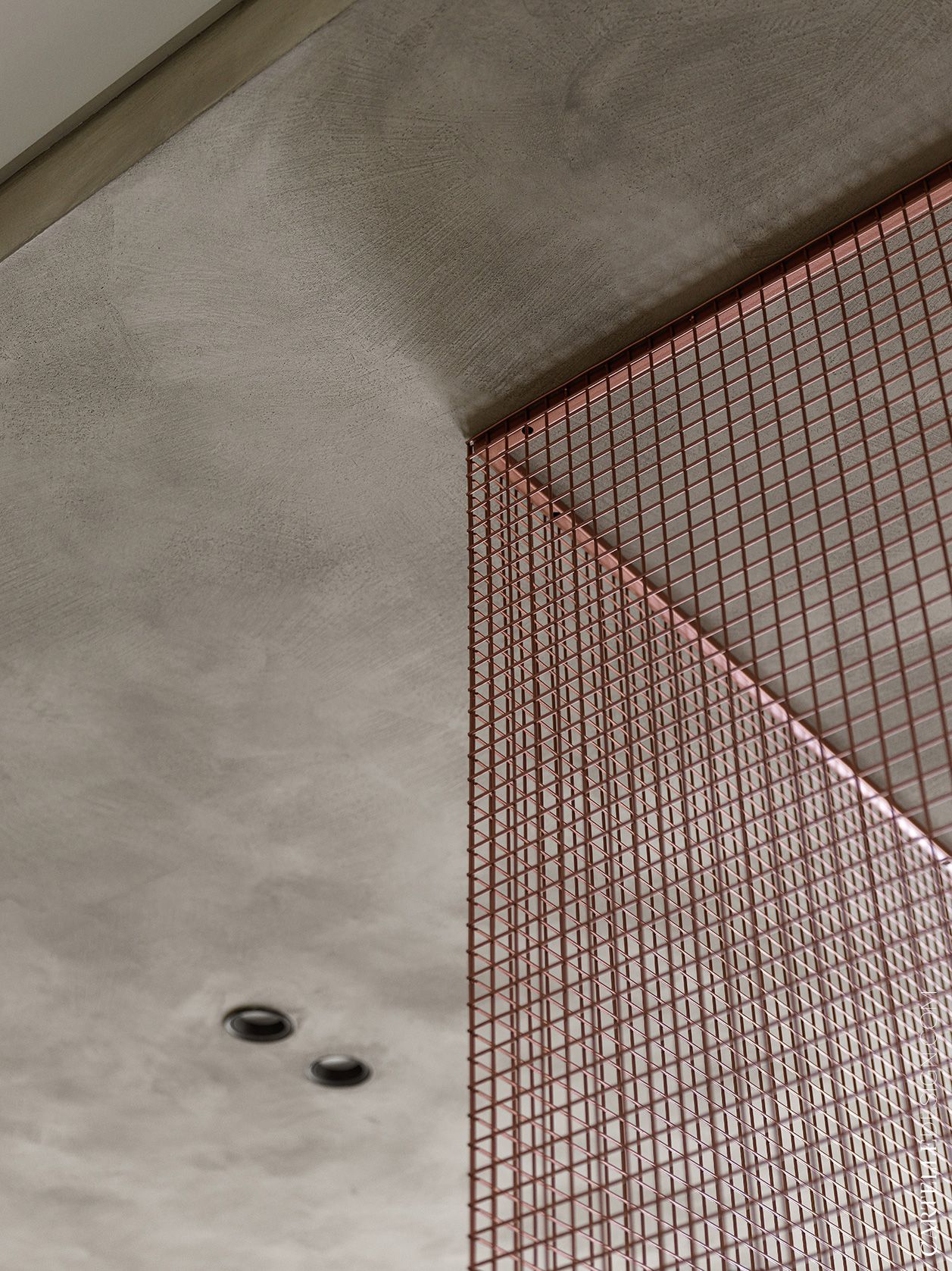
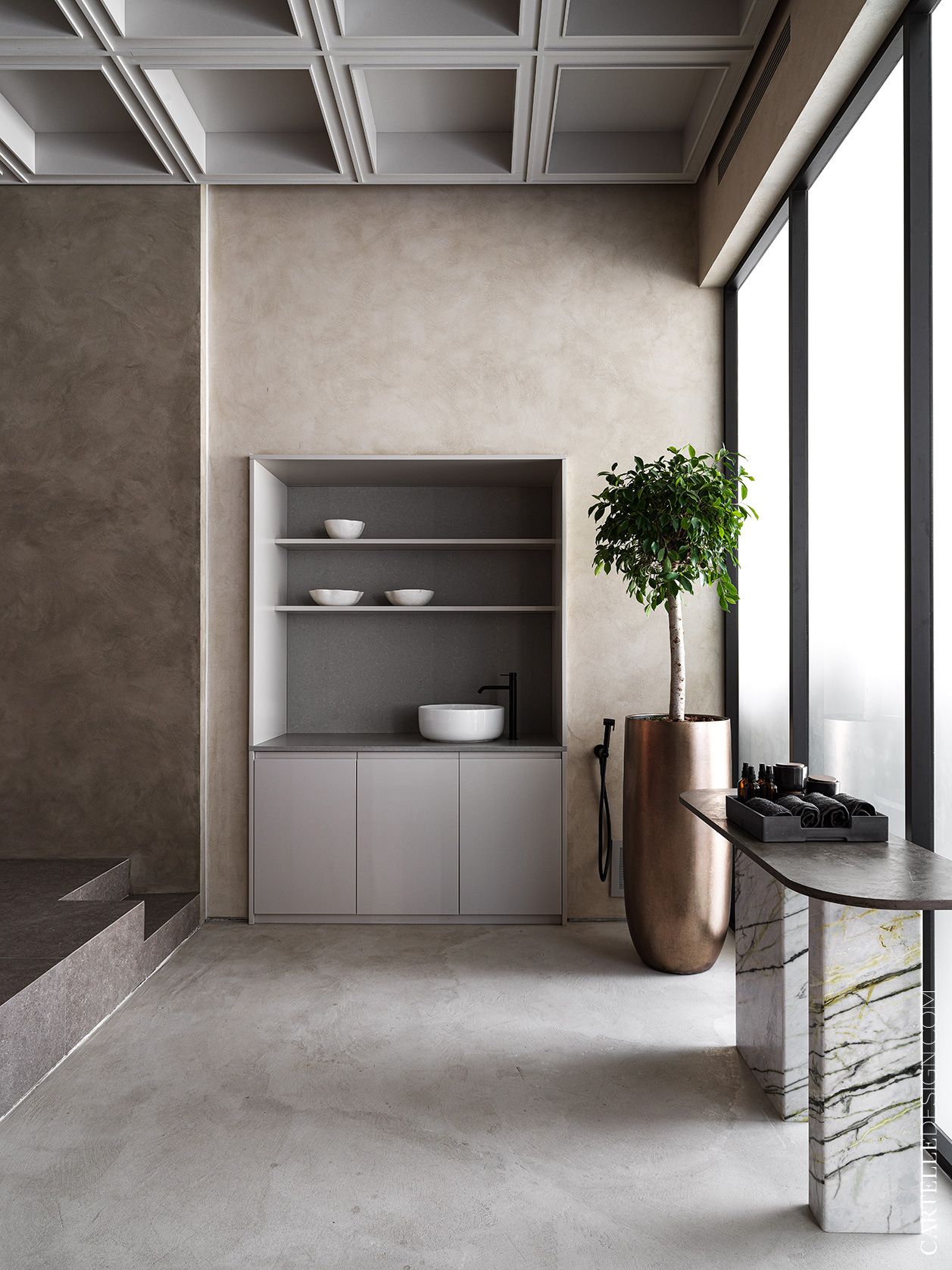
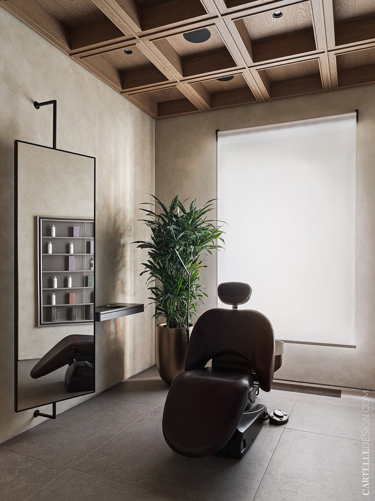
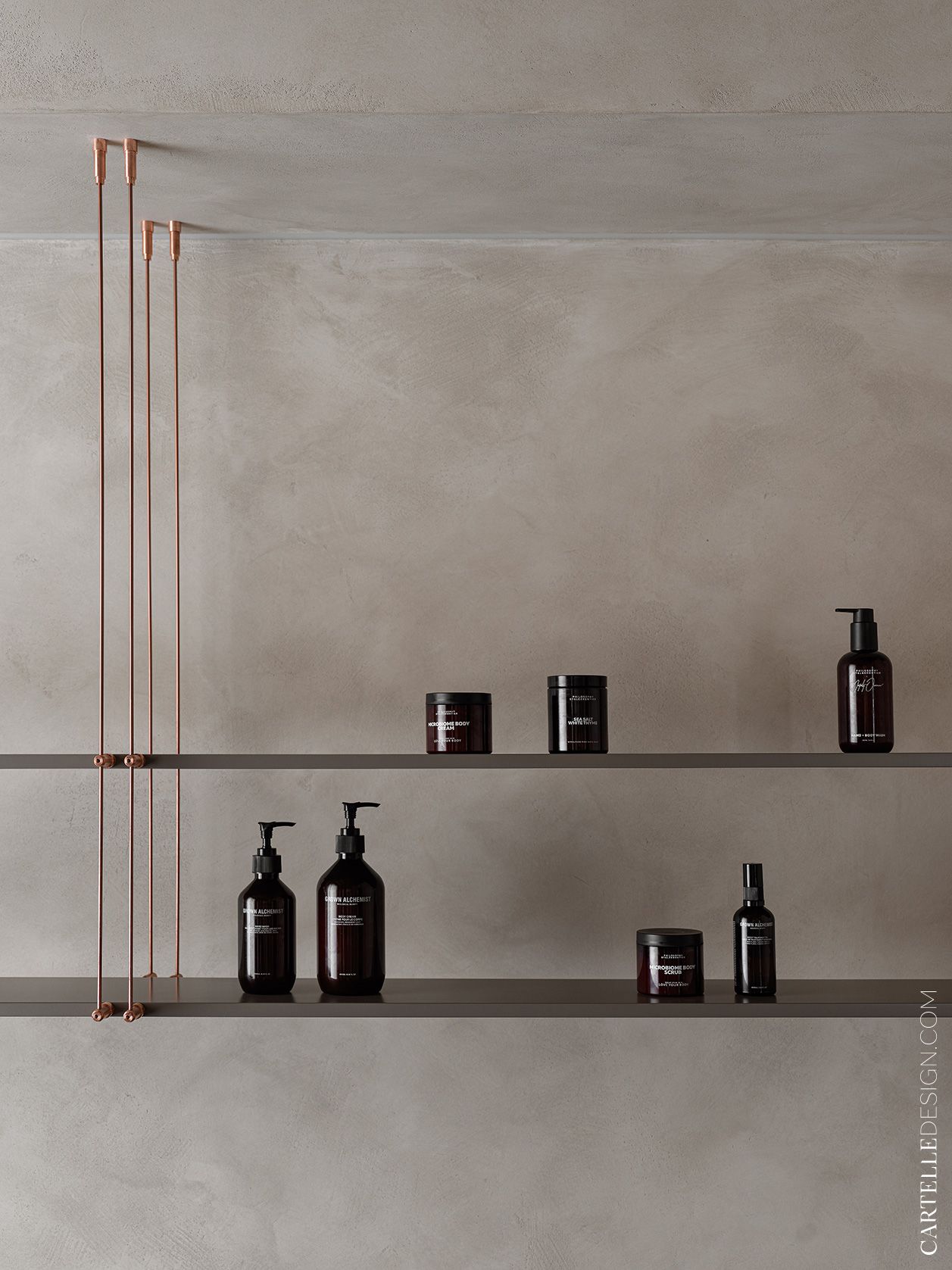
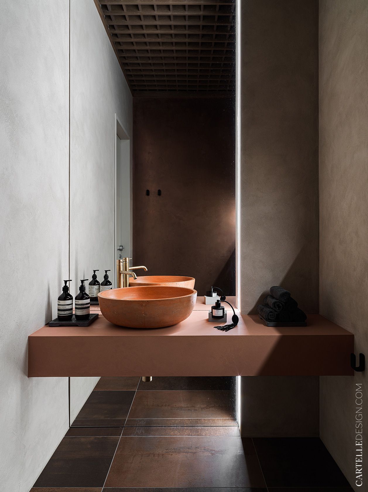
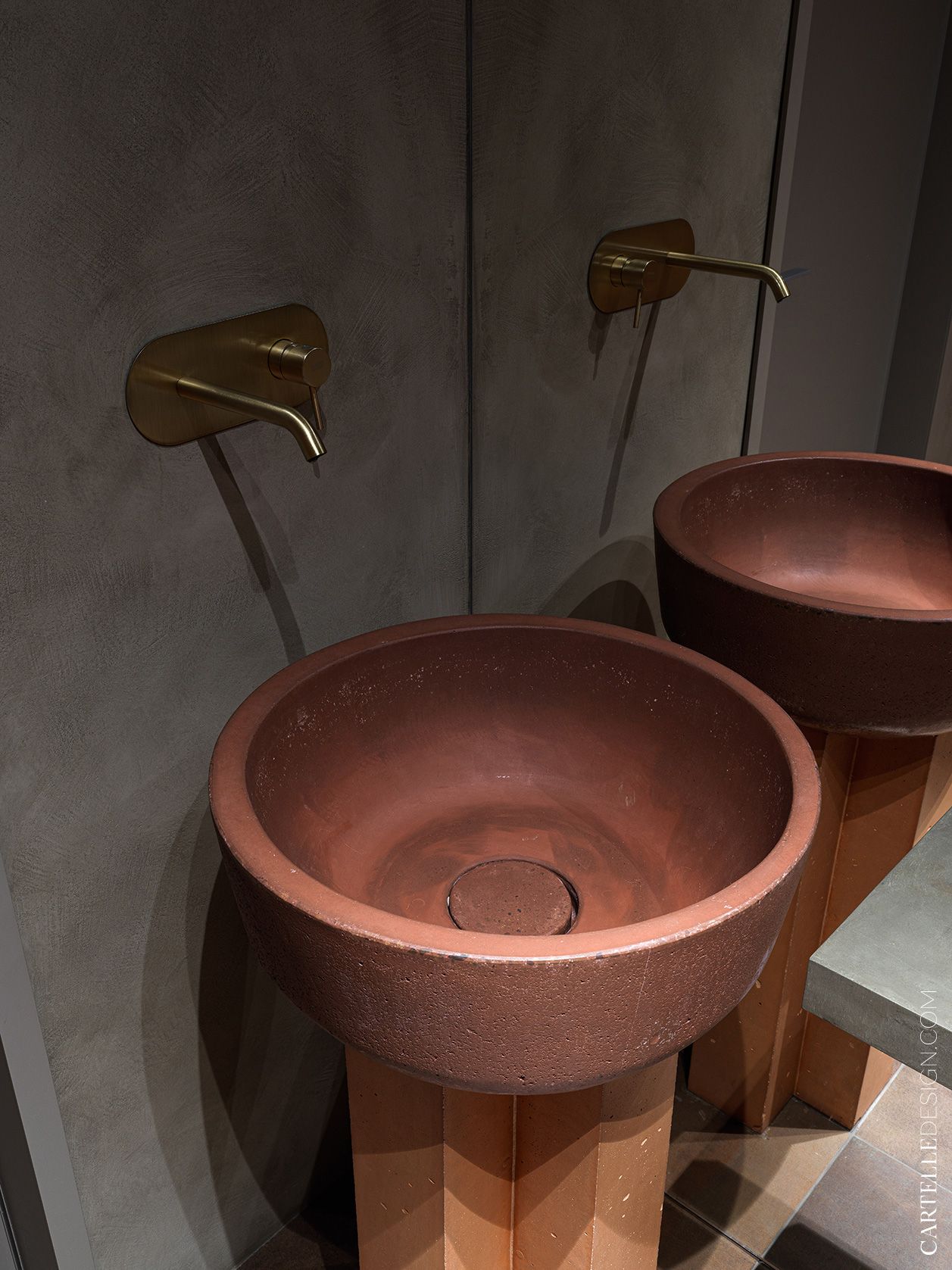
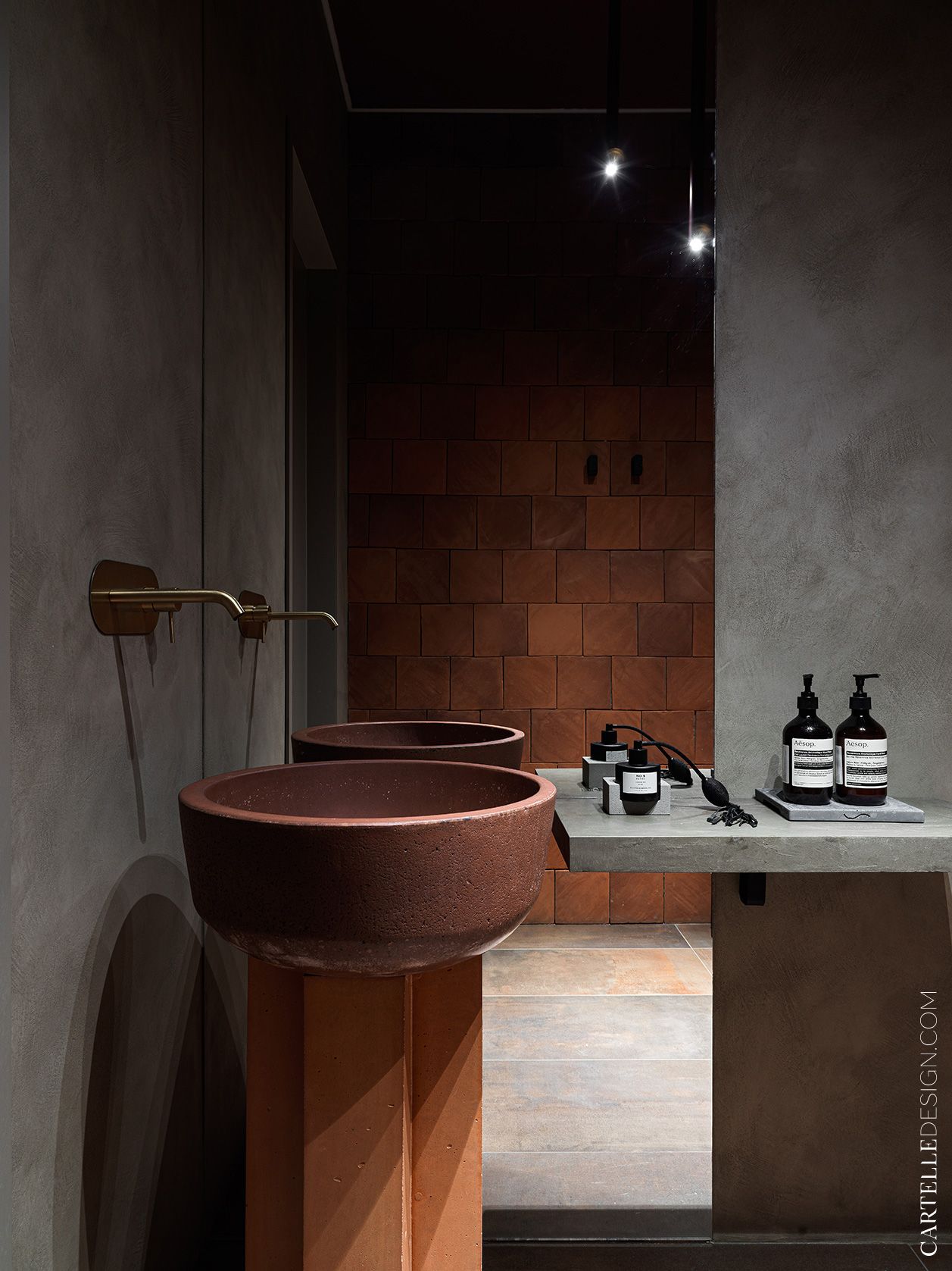
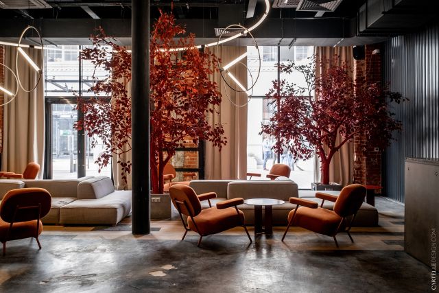
Visage.concept - beauty apartment in the center of Moscow. We wanted to create a completely new type of space. In which beauty shopping takes place mainly while sitting at a table with a cup of coffee. Fill the interior with stories, references to images of the creation of the brand and the region where the idea of a beauty apartment originated. From the very beginning, the red marble was a reference to the poppy fields in Dagestan. Carved wood panels, handmade carpets, copper, clay sinks and tiles, sculptures - we used ethnic elements with a modern twist. This allowed us to create a minimalist interior with soul.
The space consists of three zones. Cosmetics store, beauty salon and chocolate shop. The interior of each zone is individual, but the entire space is united by a single concept. The interior is in a laconic style, with a calm color scheme and expensive finishing materials. When working on the project, we tried to think through every detail so that even the most demanding clients would be satisfied with the unique atmosphere and impeccable service.
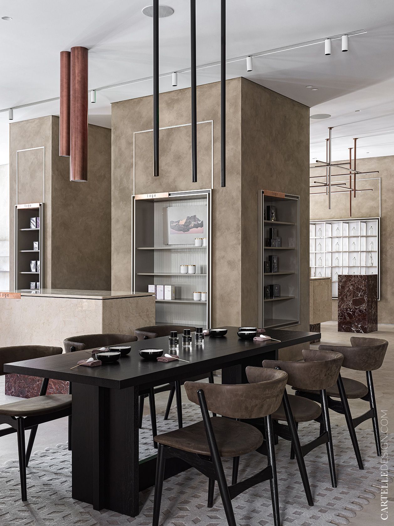
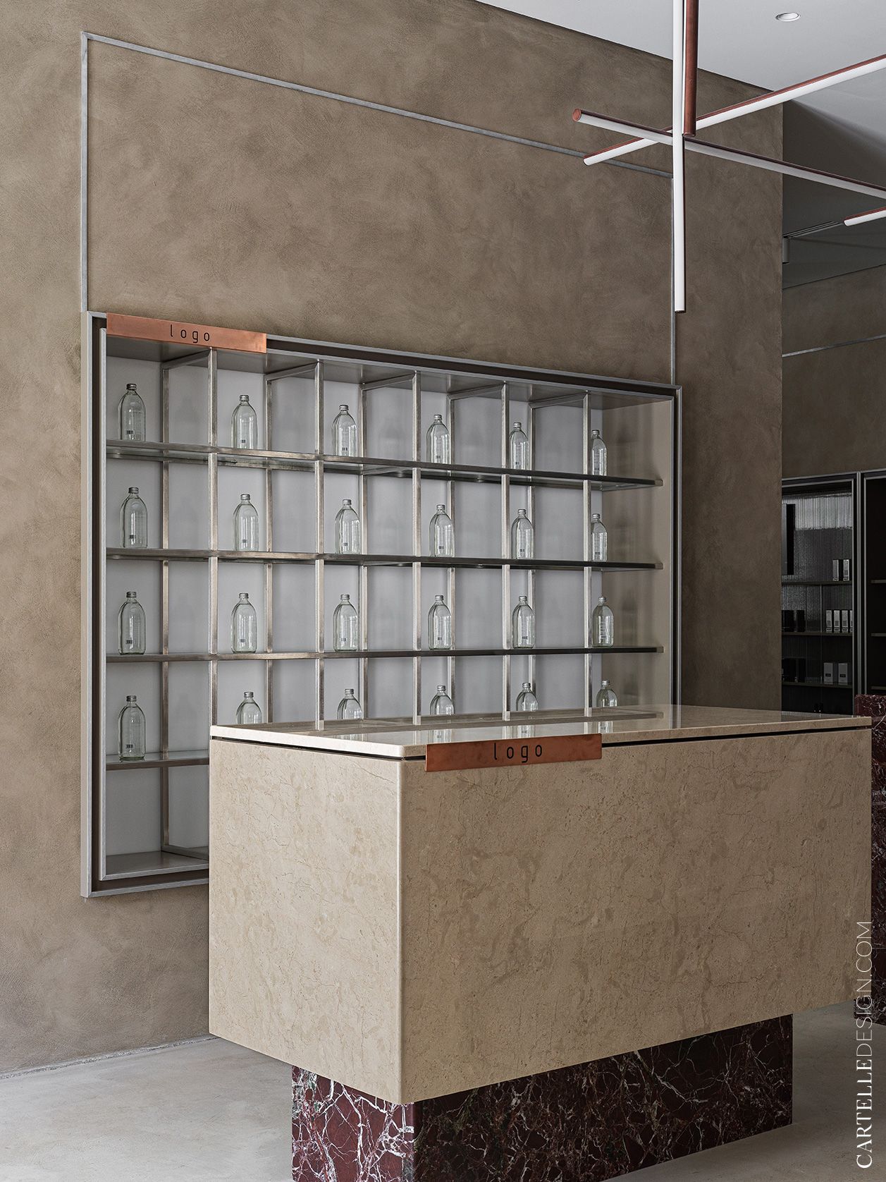
The general background is very laconic, sometimes even ascetic. The emphasis is on certain elements of furniture and decor. Using materials, I wanted to make this space luxurious, expensive, but at the same time discreet. Some elements (for example, island cabinets, bar counter) look heavy and brutal. This contrast is a manifestation of the masculine and feminine, good and evil, light and darkness - a combination of opposites.
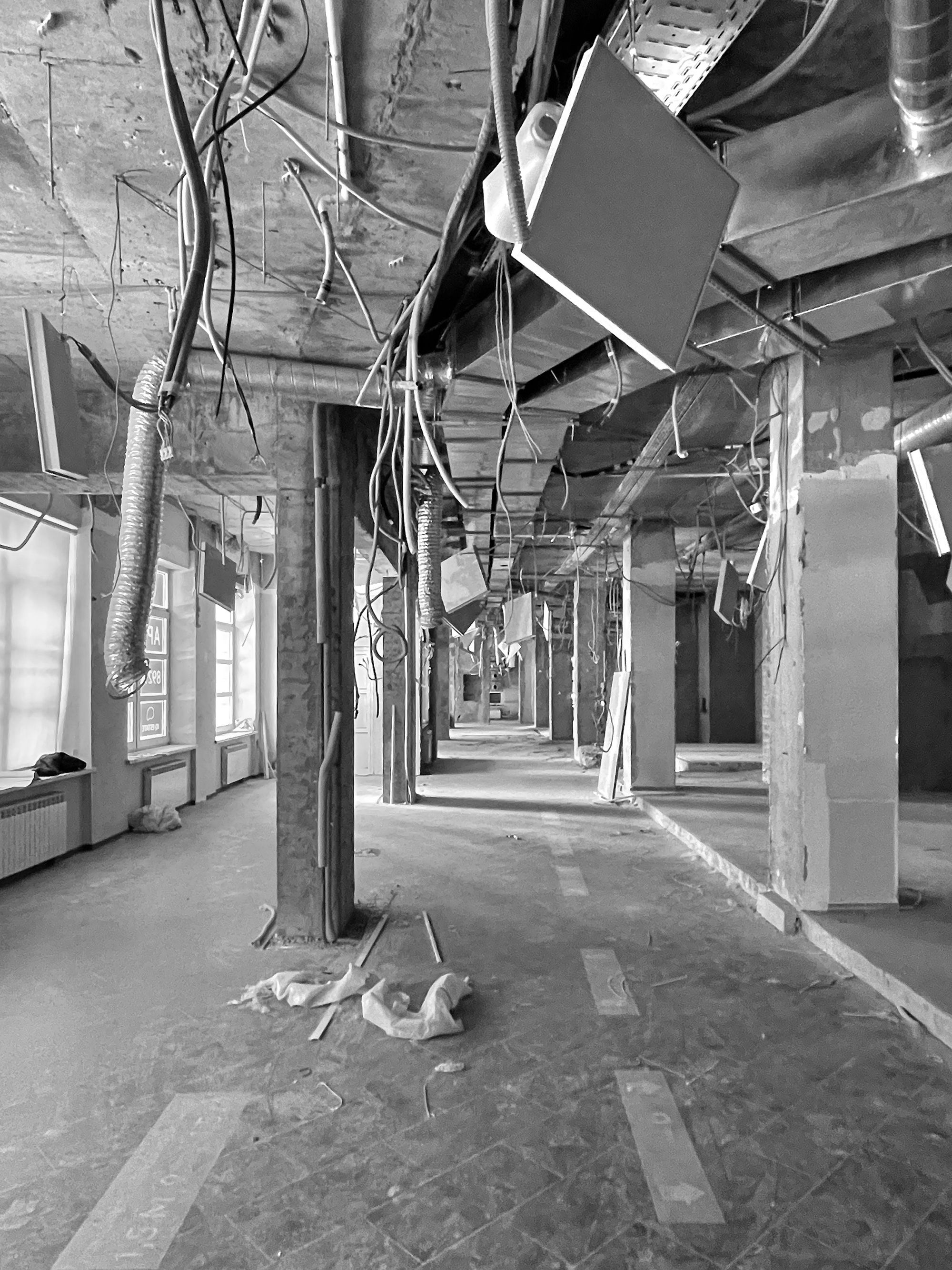
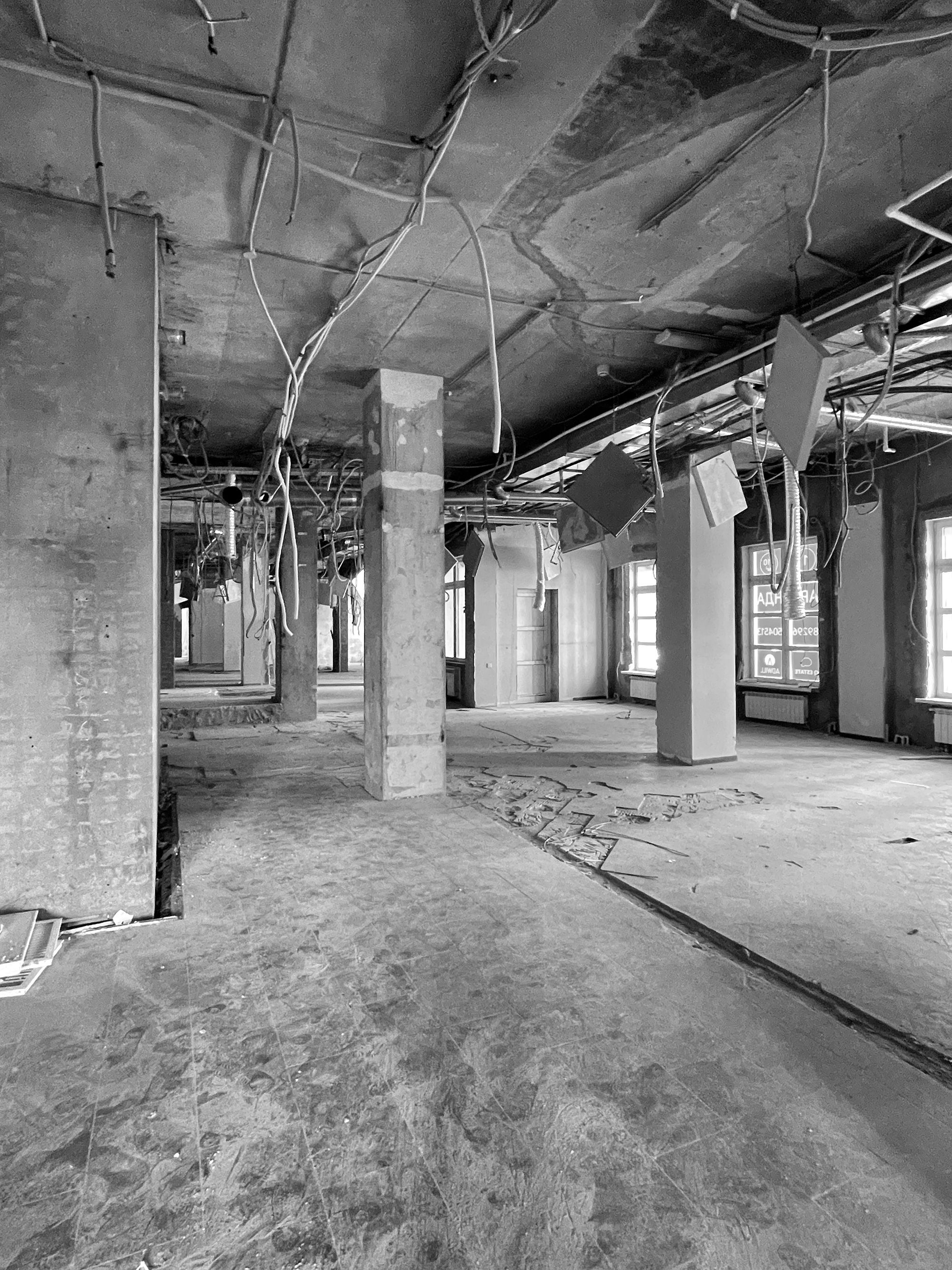
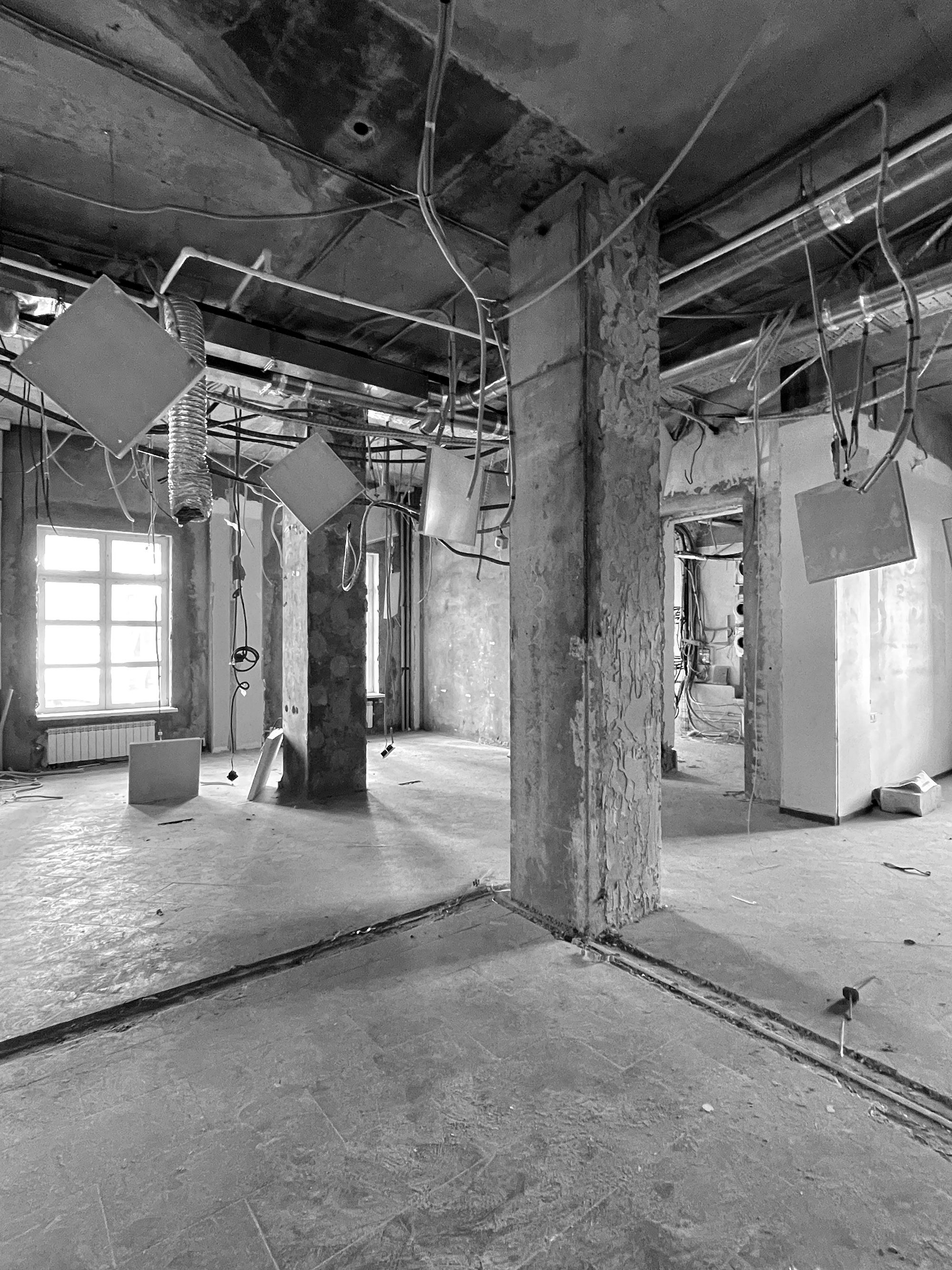
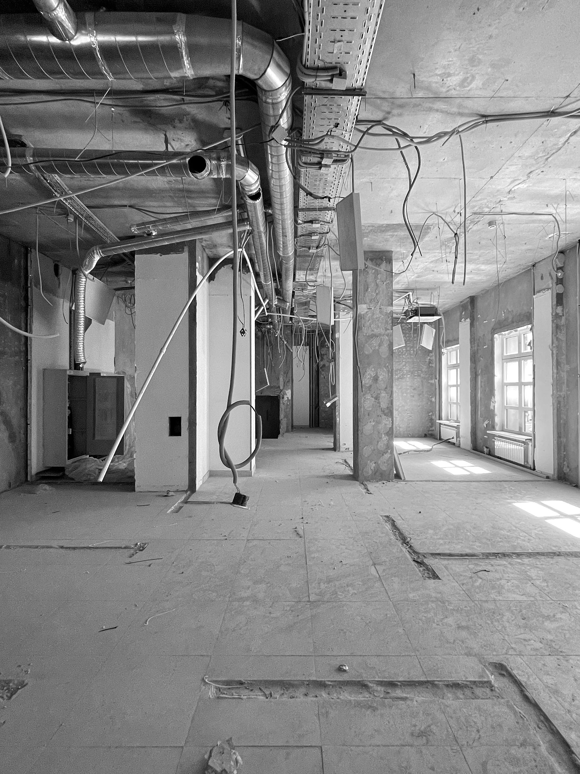
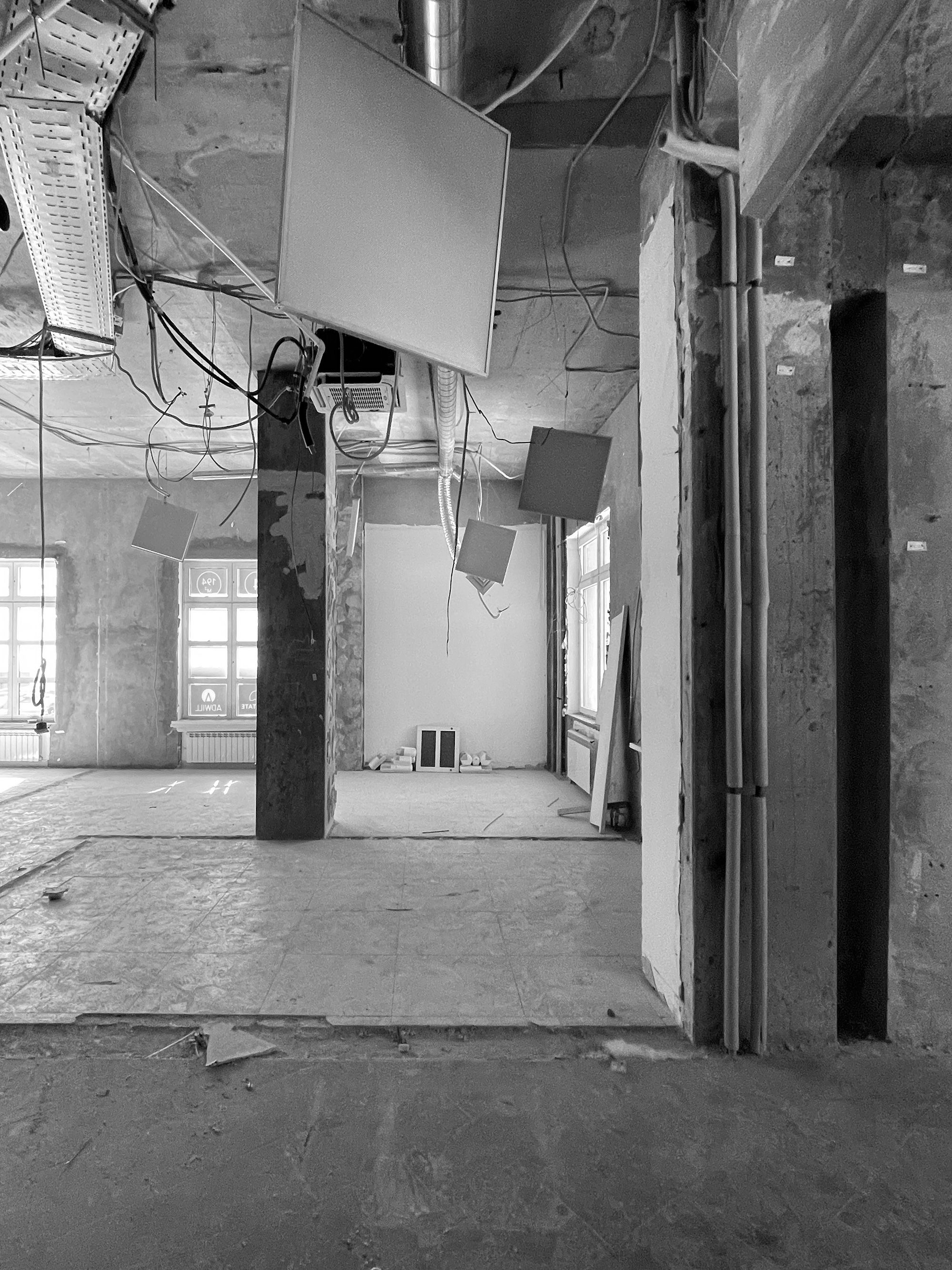
The room is complex in its architecture, asymmetrical, with different angles. It was important to place the accents correctly in order to direct the eye to the right places and level out the shortcomings of the architecture. Red marble pedestals and copper portals set up such “points”. In the chocolate area, the accent was a dark bar counter and ebony furniture. These are the darkest pieces we used and they functionally break up the space. The treatment rooms are more ascetic; they tried not to distract attention to decorative elements, because... the center of these premises will be a person.
We sought to combine modern design with ethnic motifs, with art objects, and also create a pleasant, comfortable atmosphere that does not at all resemble a store. It was important for us to show that this is a team from Dagestan that knows how to make a quality product. We used various elements that create a certain character of the interior and have a clear reference to certain cultural characteristics.


