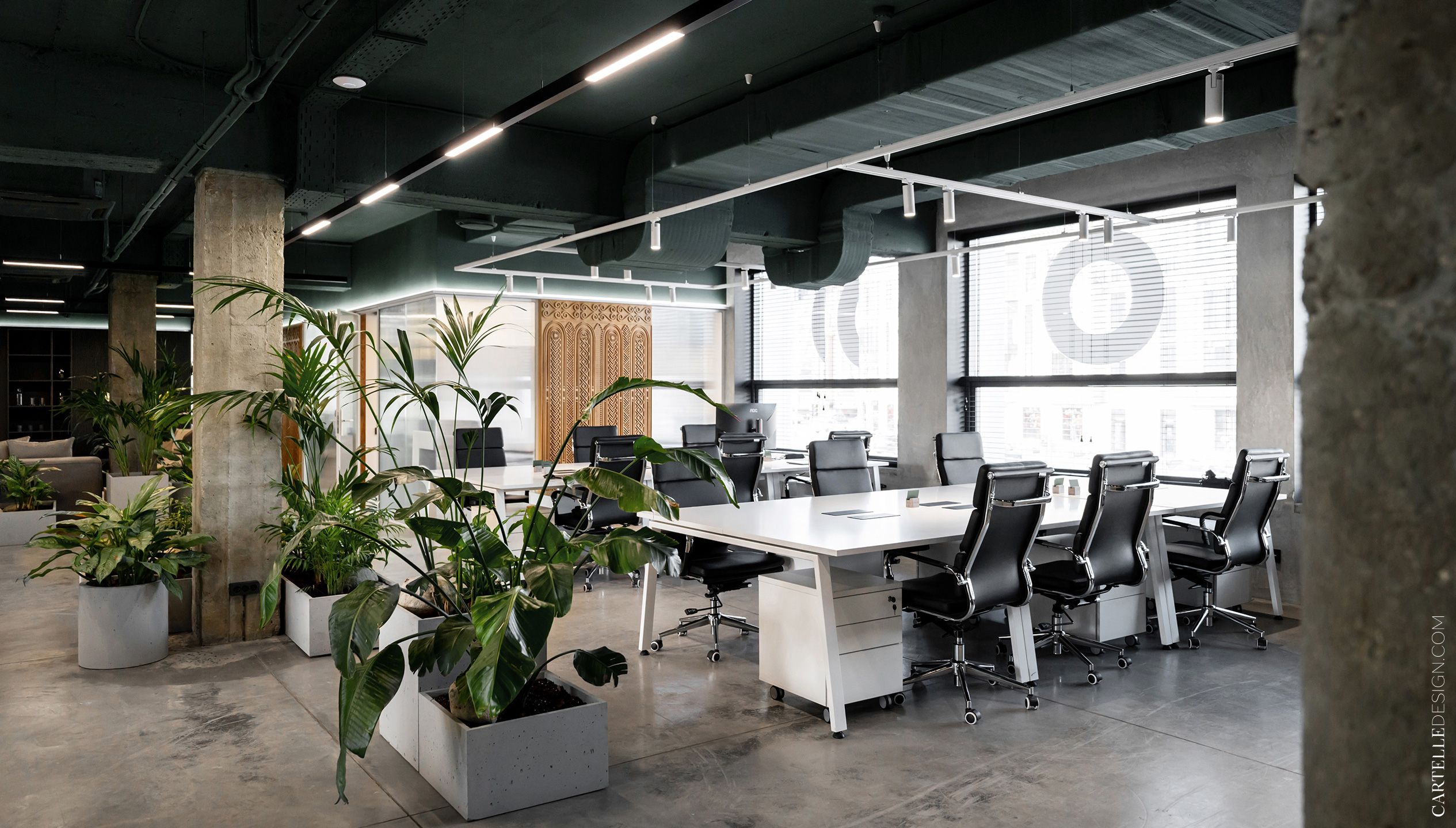
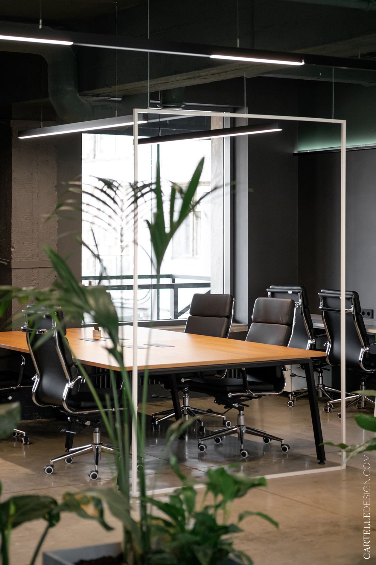
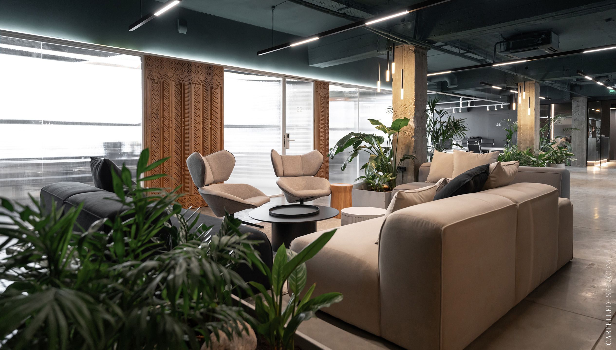
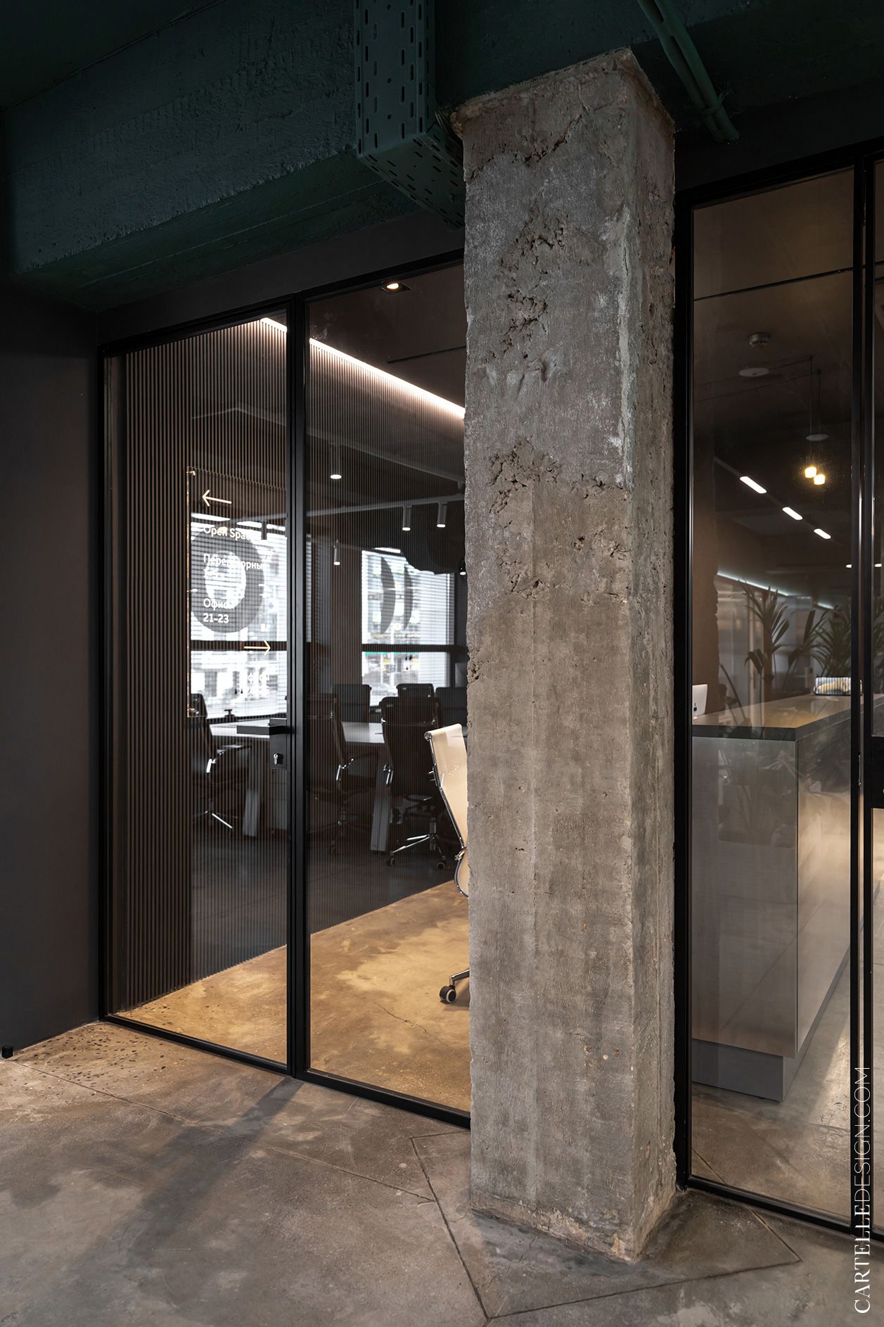
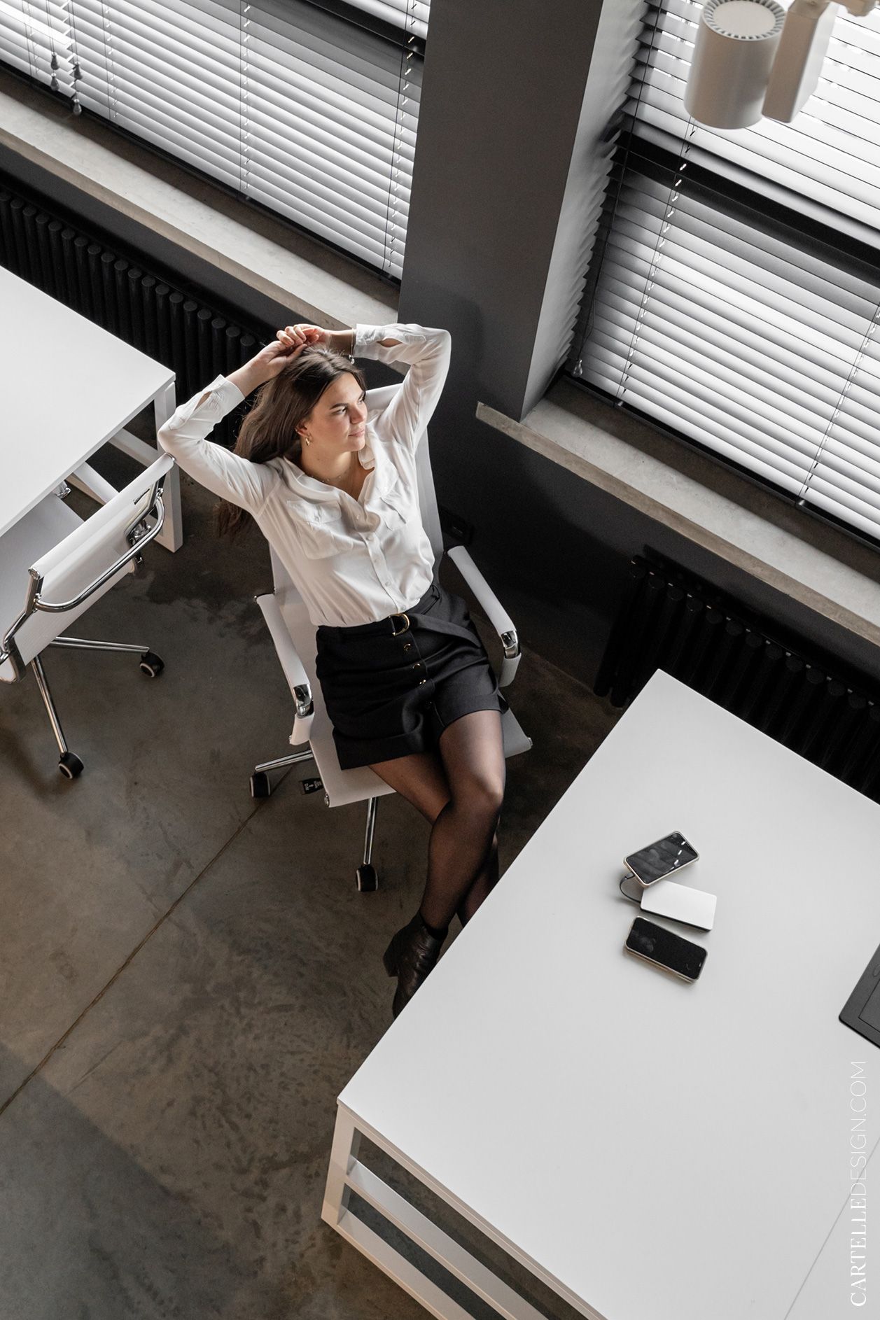
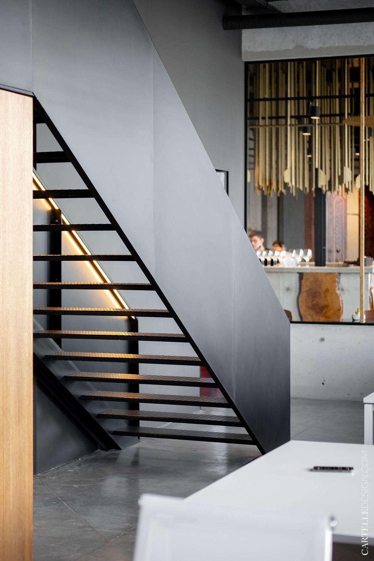
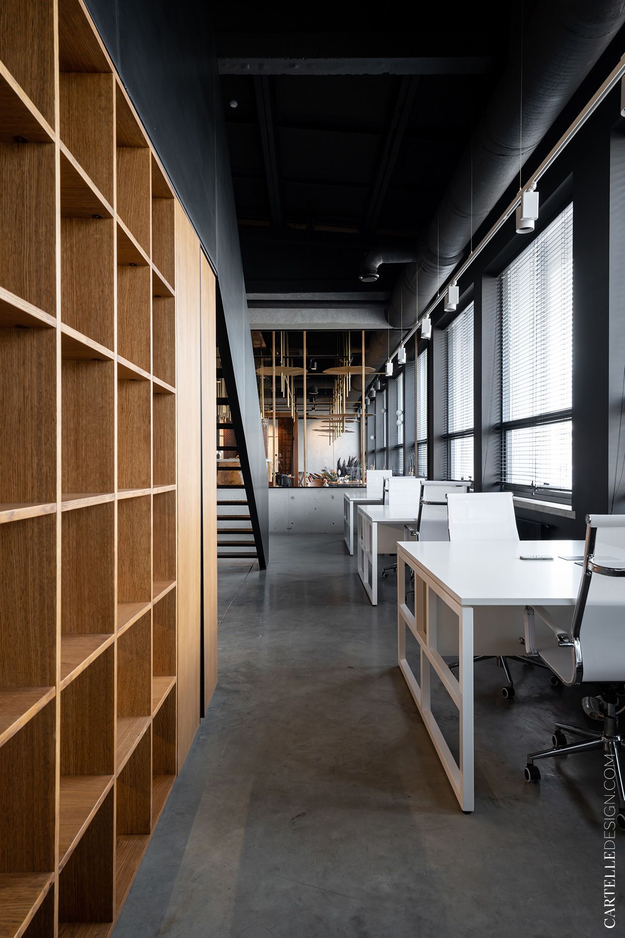
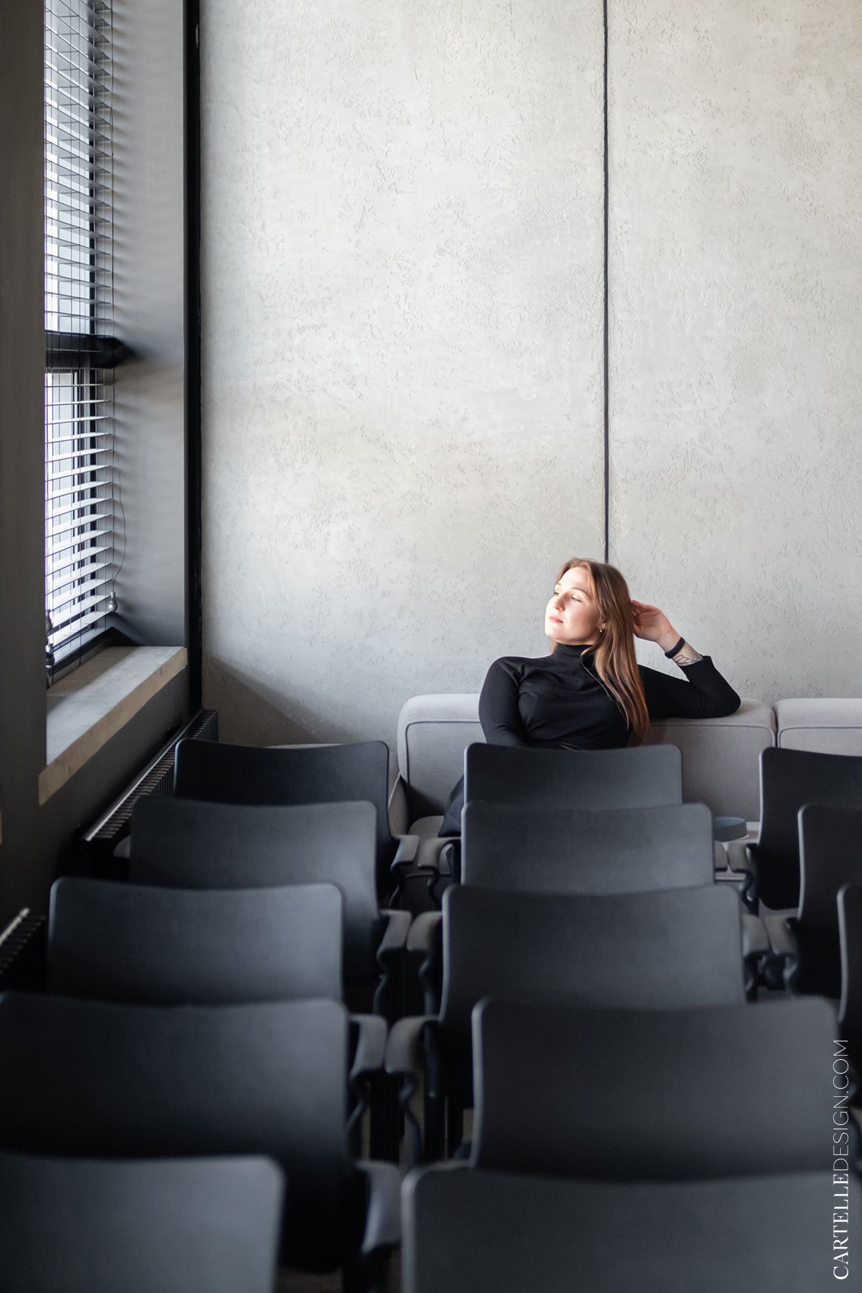
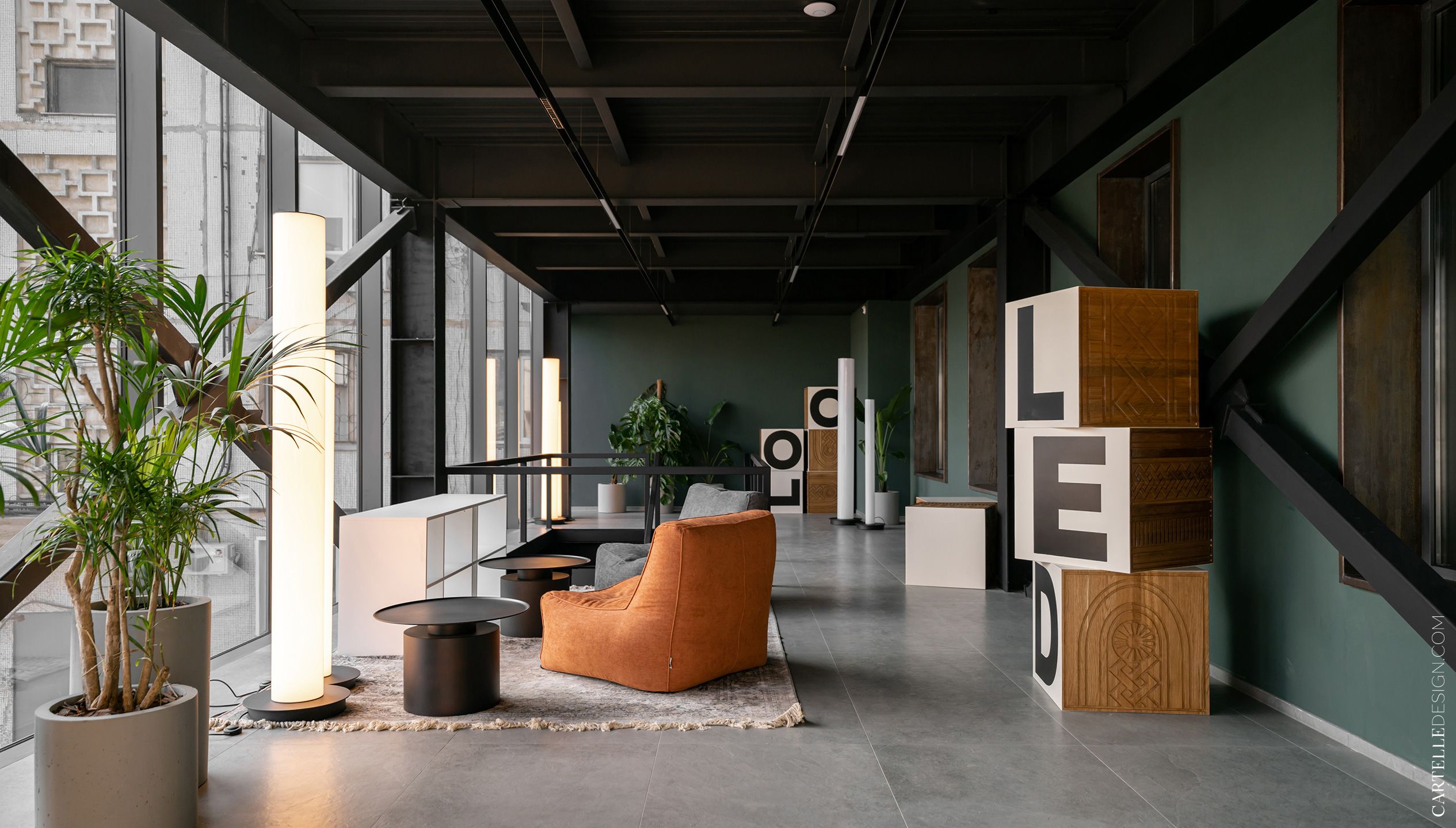
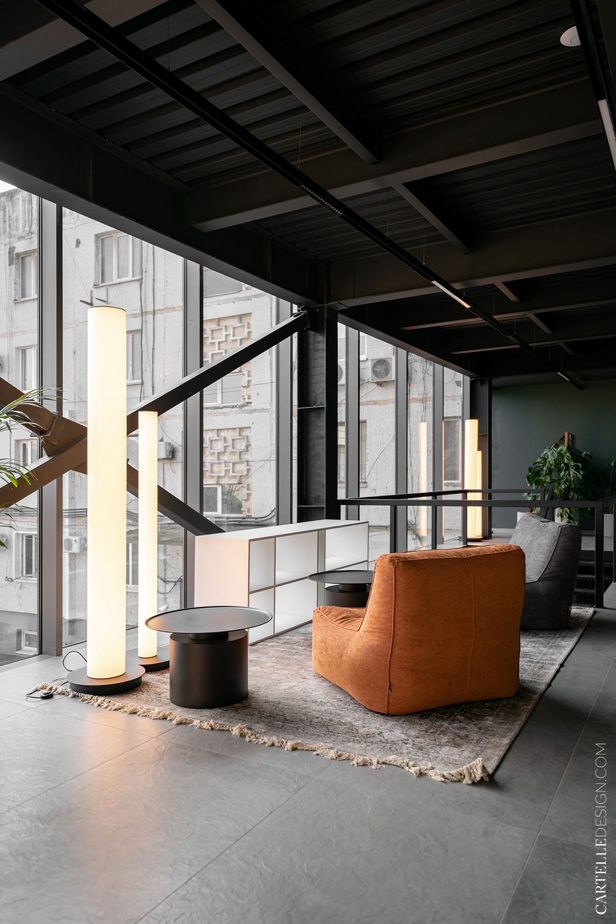
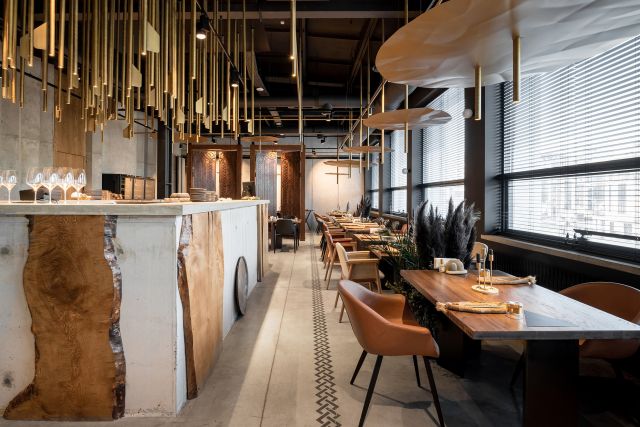
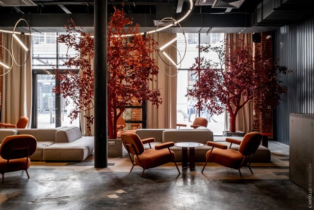
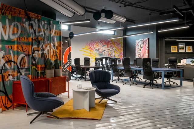
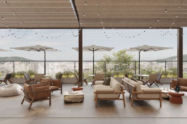
Delo is the city's first co-working space of this scale, which will give impetus to the development of the entire region. A space for bringing together young promising professionals under one roof. Modern laconic technological interior with the identity of the place.
At the height of the pandemic, a team from Makhachkala turned to us with a request to make a bar and coworking project for them. We are all used to good design in cities with a population of over a million. But in most regions, things are going much worse. Dilapidated facades, broken roads and fields of dull panel houses. The more valuable are the people who develop new projects in their cities. Sit back, this is a story about how to turn a dilapidated Soviet building into a point of attraction for young professionals.
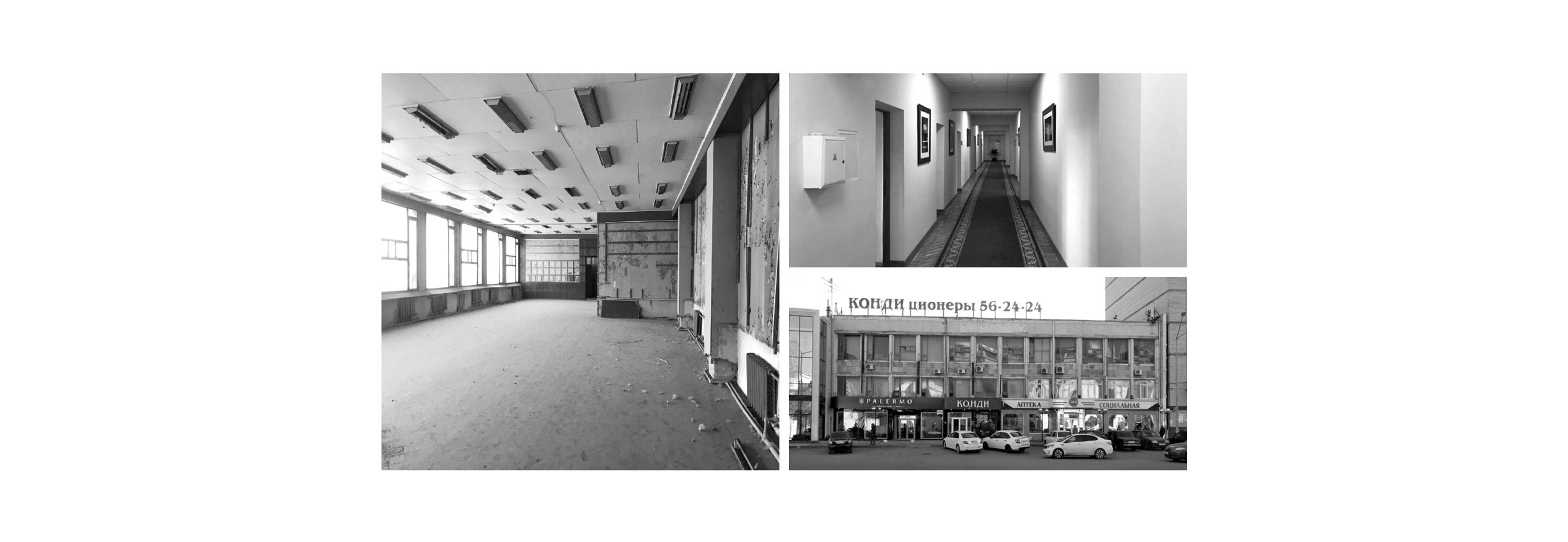
The future co-working is located in a three-story Soviet-built building on the main street of the city. The location is excellent, but the room is in a dilapidated state and with a morally outdated design. Complete dismantling was inevitable. Another difficulty that we immediately encountered was the entrance group. The entire first floor is occupied by shops and the entrance to the coworking is possible only from the courtyard. The courtyard façade was also not pleasing to the eye. Therefore, it was decided to make an extension there, which we will talk about a little later.


After measuring and discussing the future project, we started developing the concept. In a nutshell, the customer wanted to get a cool modern interior - a lot of light, natural materials, timeless solutions. For us, the location was important. We did not want to end up with a “Moscow” office project, uprooted and transported to Makhachkala. We tried to create a project with a modern interpretation of the Dagestan identity. To create a fusion of contemporary design, technological solutions and local culture. The local culture, by the way, almost immediately manifested itself in the form of an extension, but more on that later.
Having decided on the concept, we started planning. The project was conceived not just as an office, but as a point of attraction for young talented professionals from various fields (entrepreneurs, freelancers, designers, IT, marketers, photographers). The main goal was to create a creative atmosphere for development.
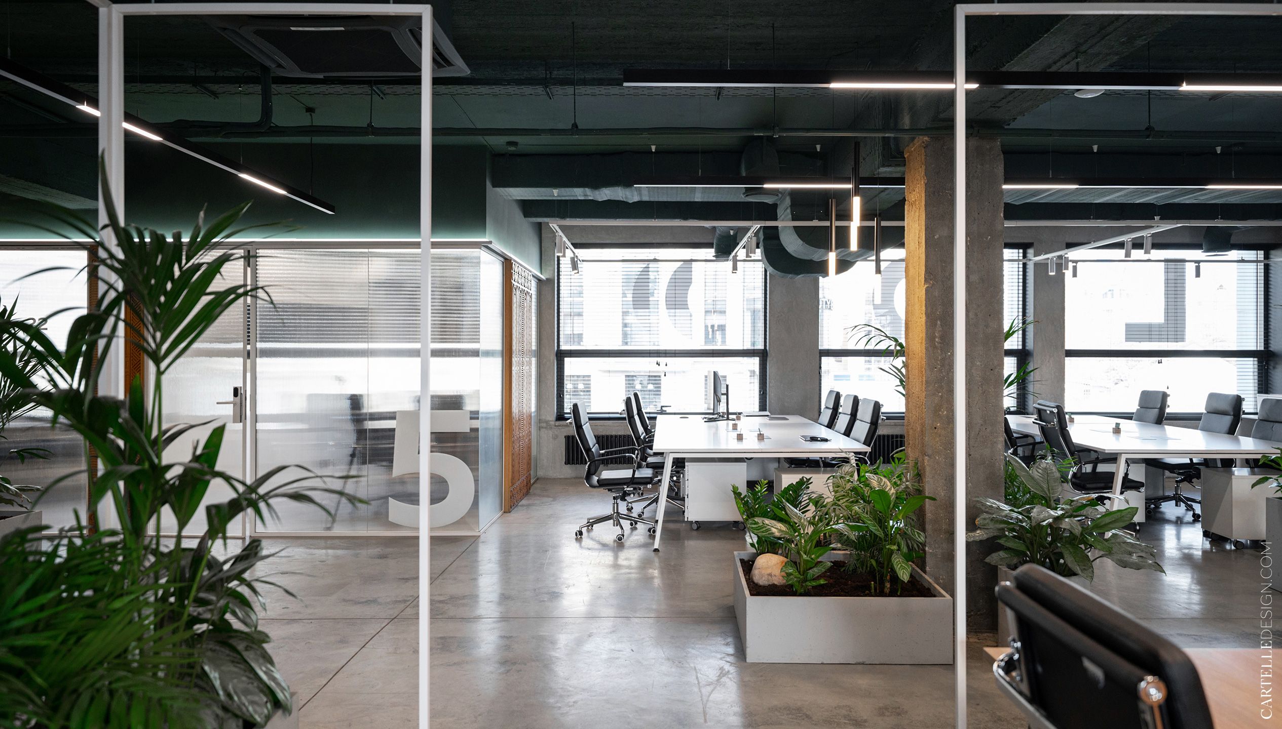
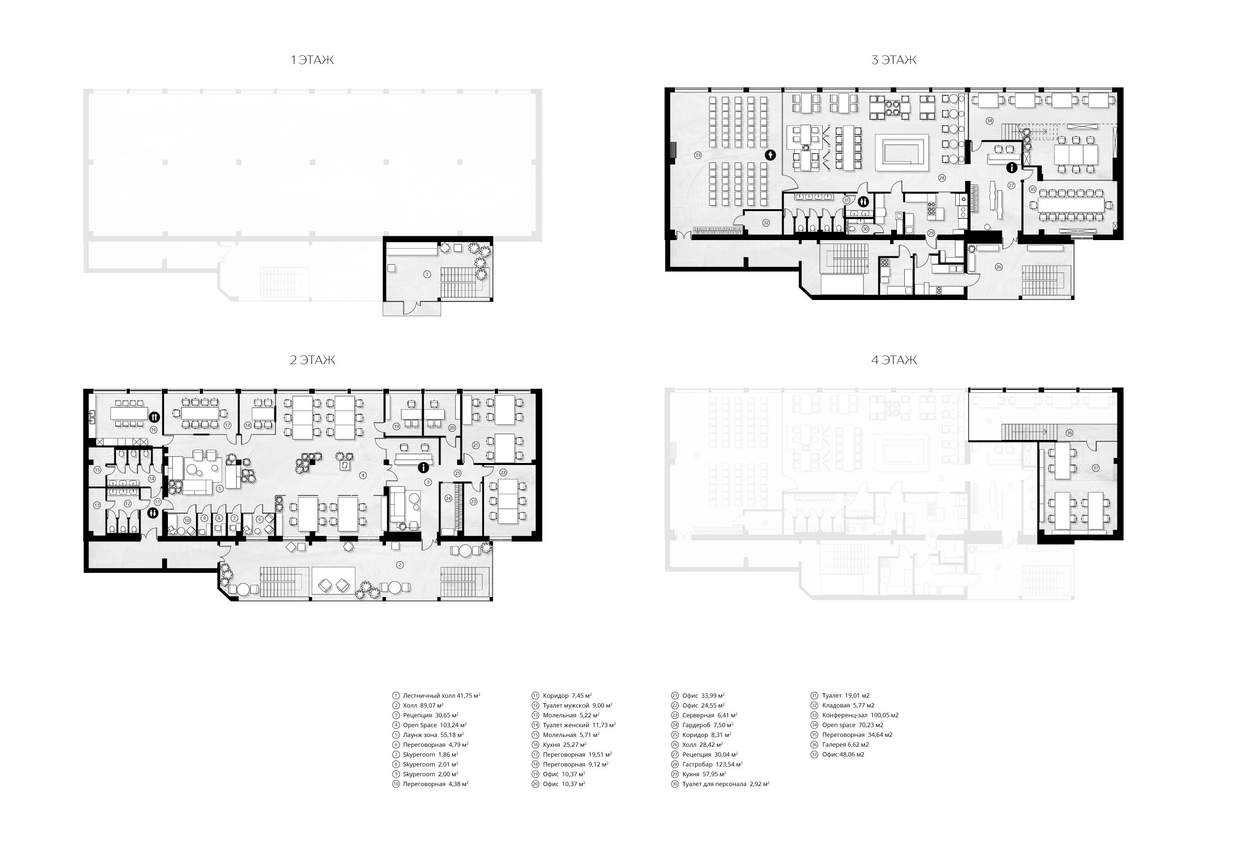
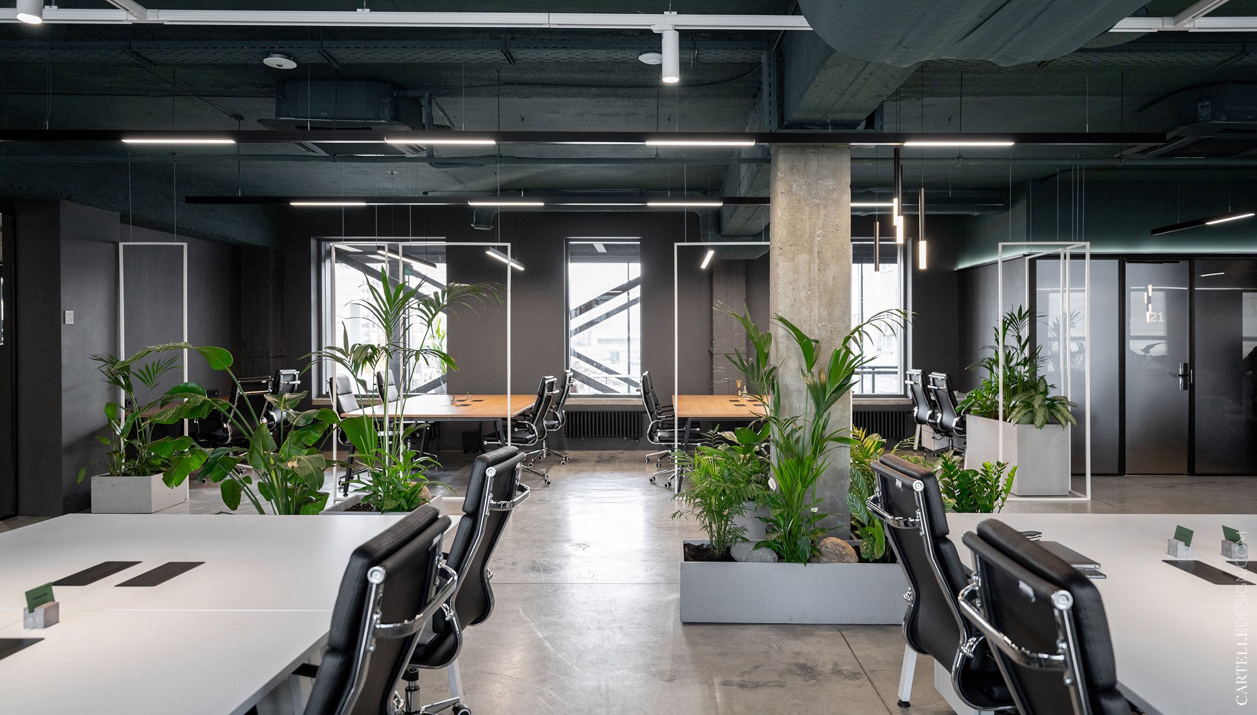
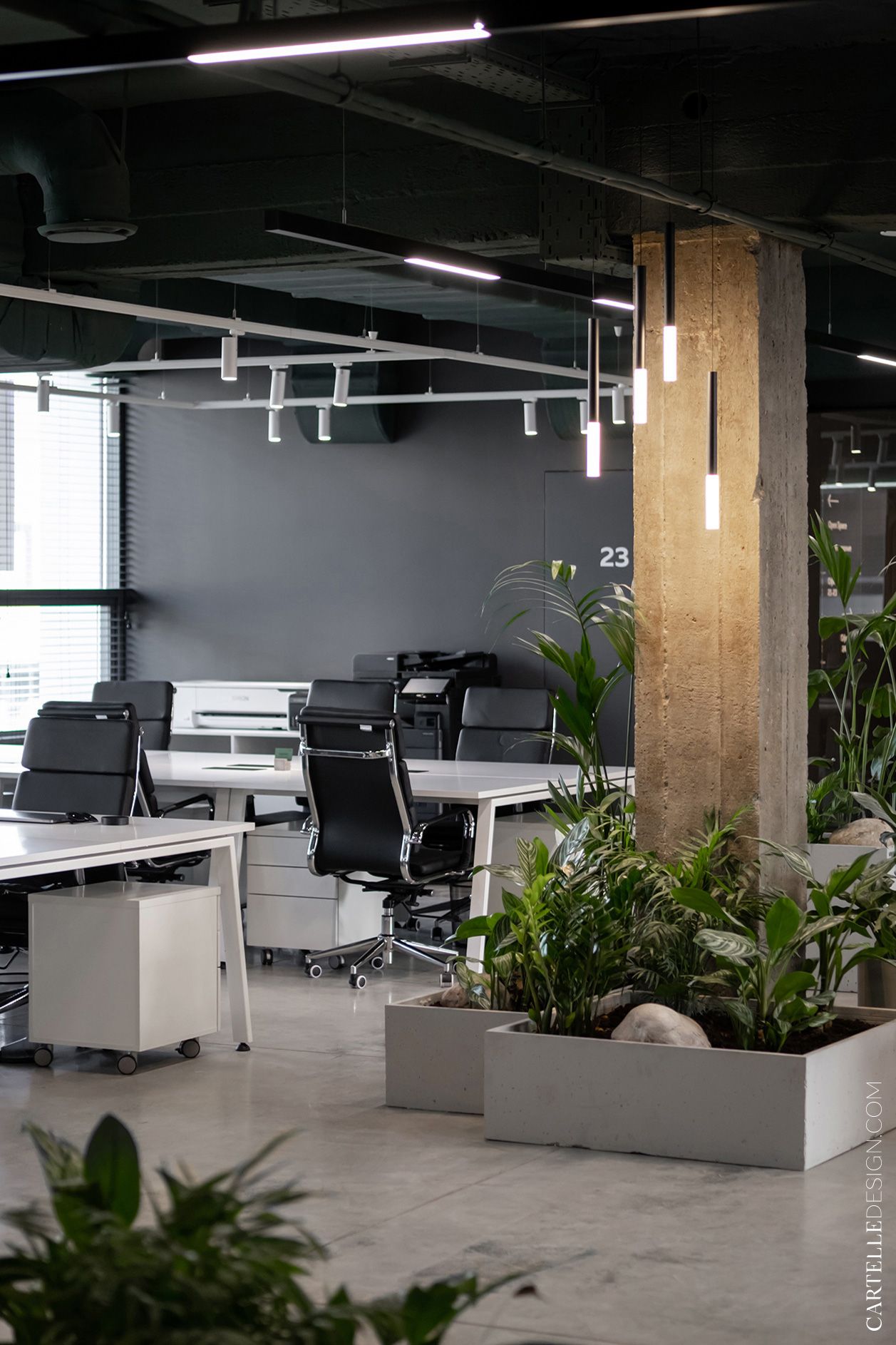
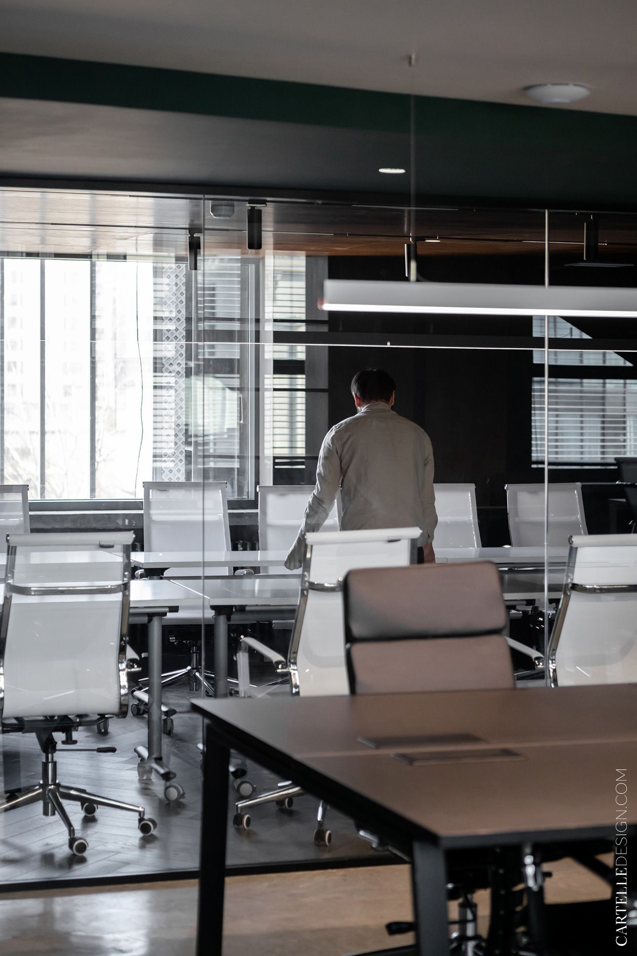
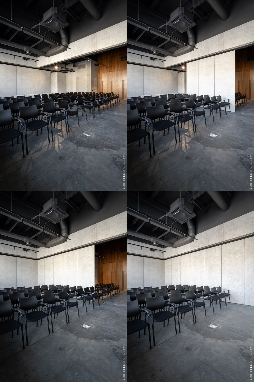
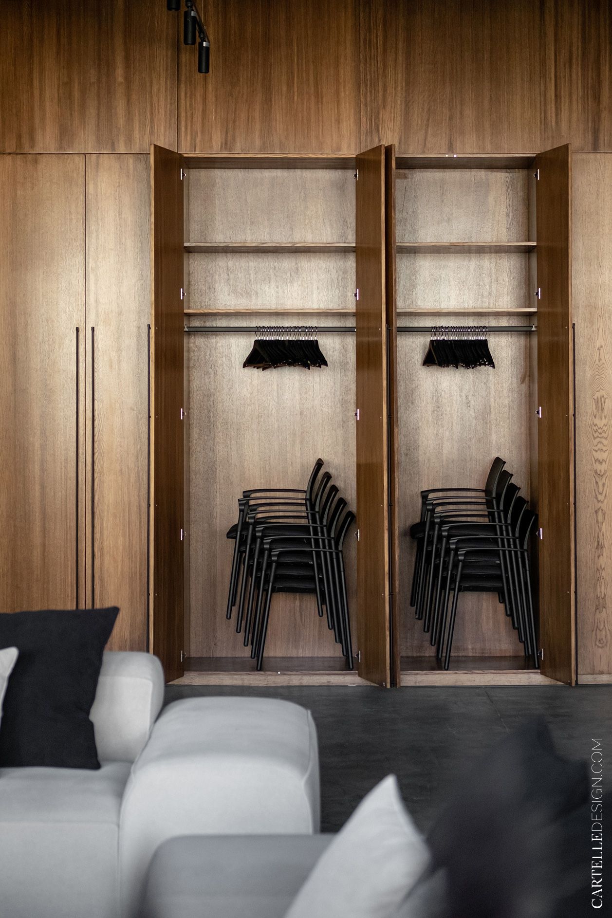
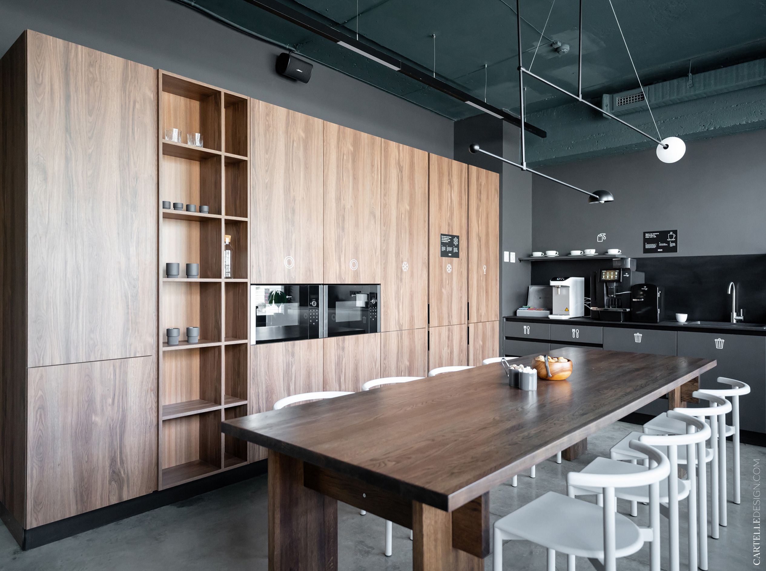
The main area of the coworking space is occupied by open space with comfortable workplaces. There are several separate offices, meeting rooms of different sizes and soundproof skyperooms. For relaxation and informal negotiations - several lounge areas and a kitchen. And for trainings, master classes and lectures - a conference hall for 120 people. There is also a restaurant on the territory of the coworking. The design of the NOMAD restobar was also developed by our studio and its project will soon be available on the website.
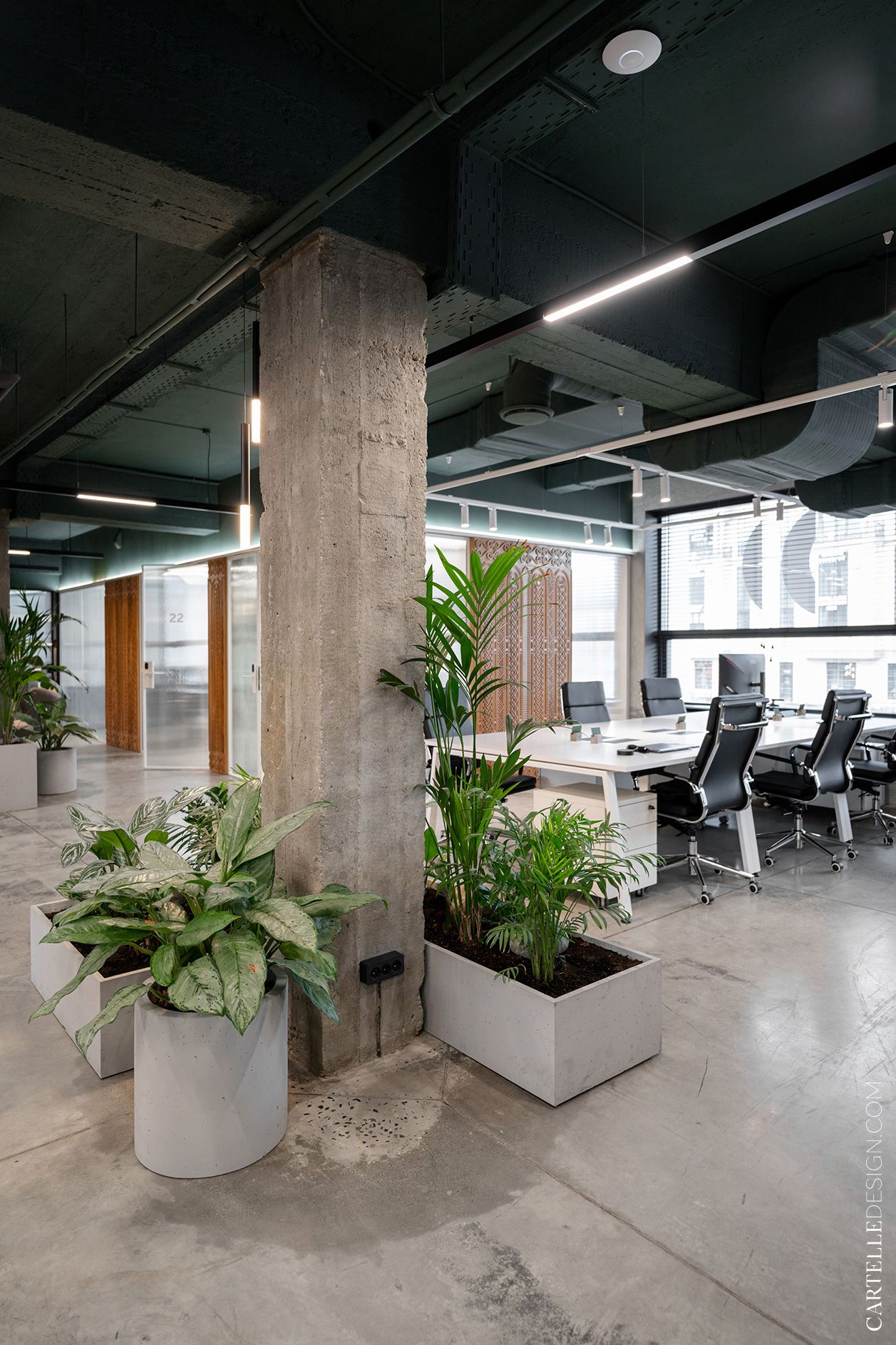
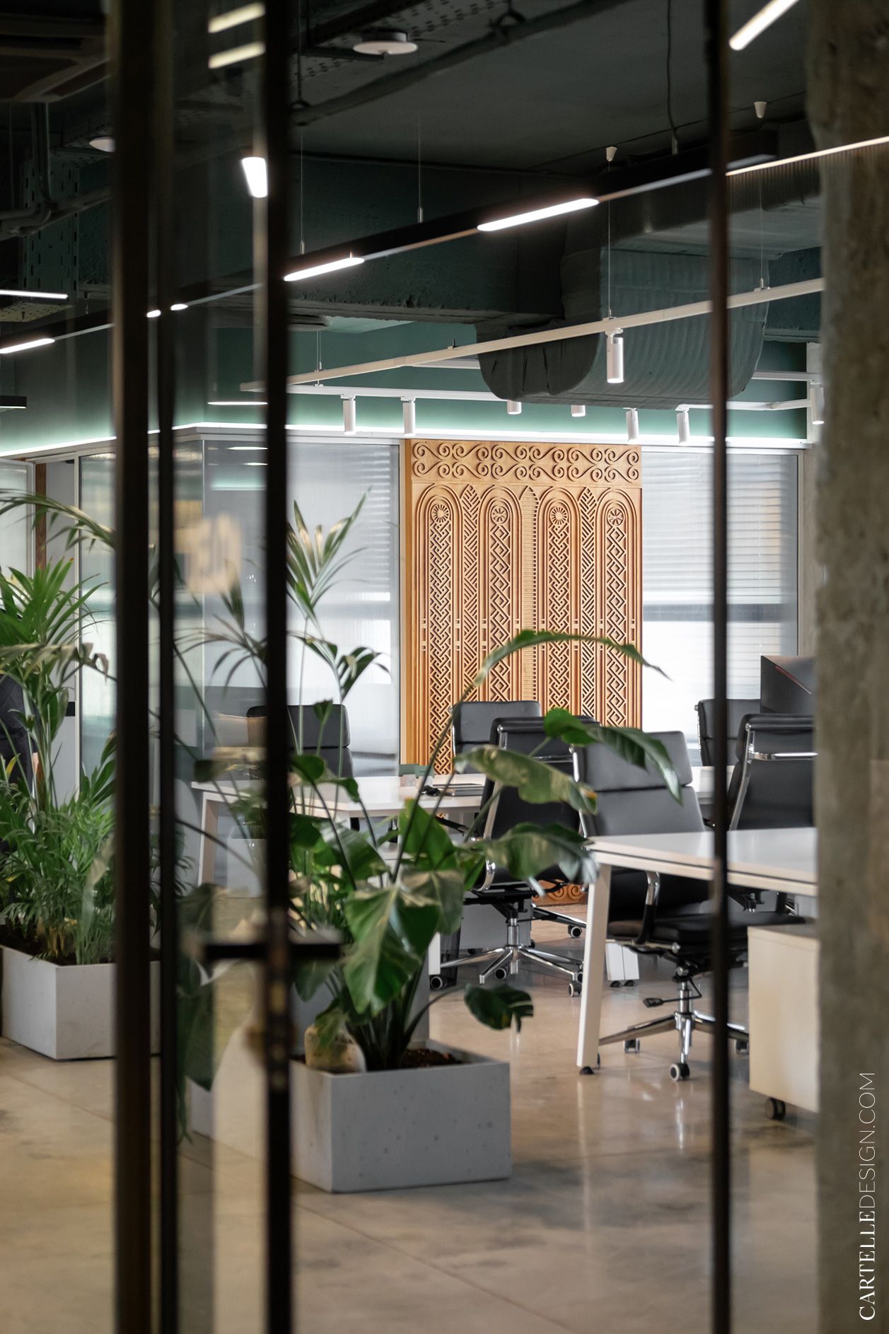
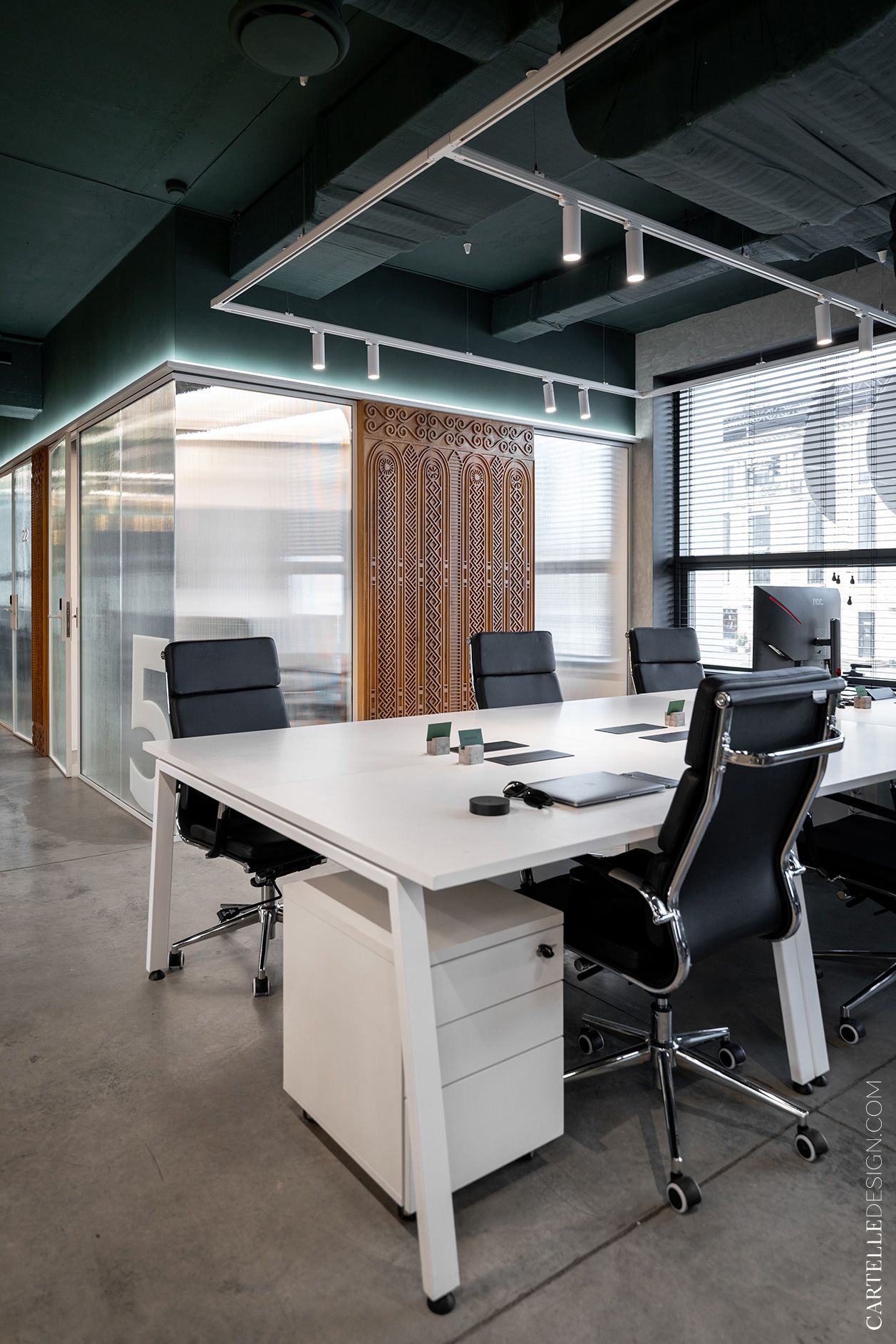
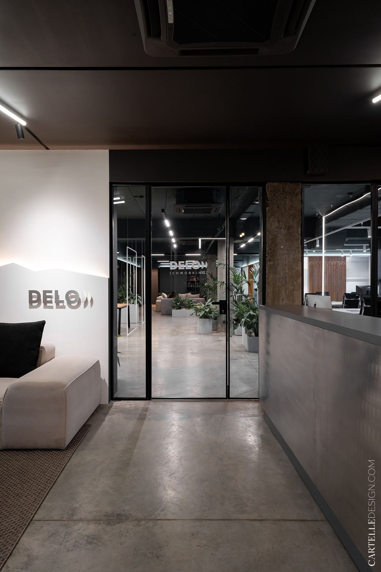
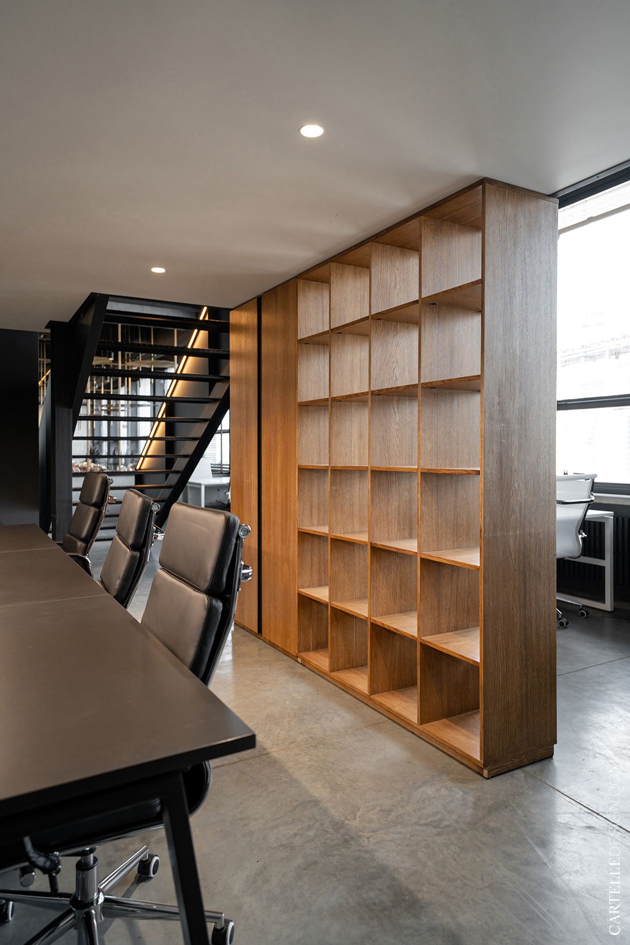
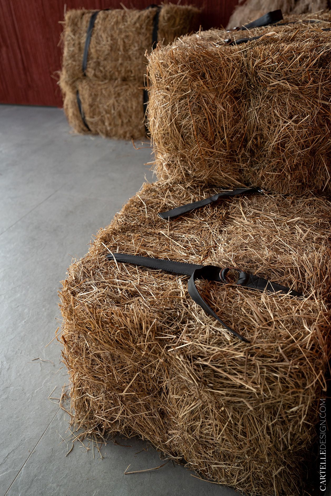
While working on the design, we started from the nature of the region. In the city, the land is dried up by the scorching sun, and all the mountains are green. We decided to use this combination in the interior - a combination of modern laconic techniques, natural materials, living plants and national motifs. Finishing materials are very simple. Almost all the walls in the coworking space are painted with paint. Several walls have rough textured plaster. The floors are poured from concrete.
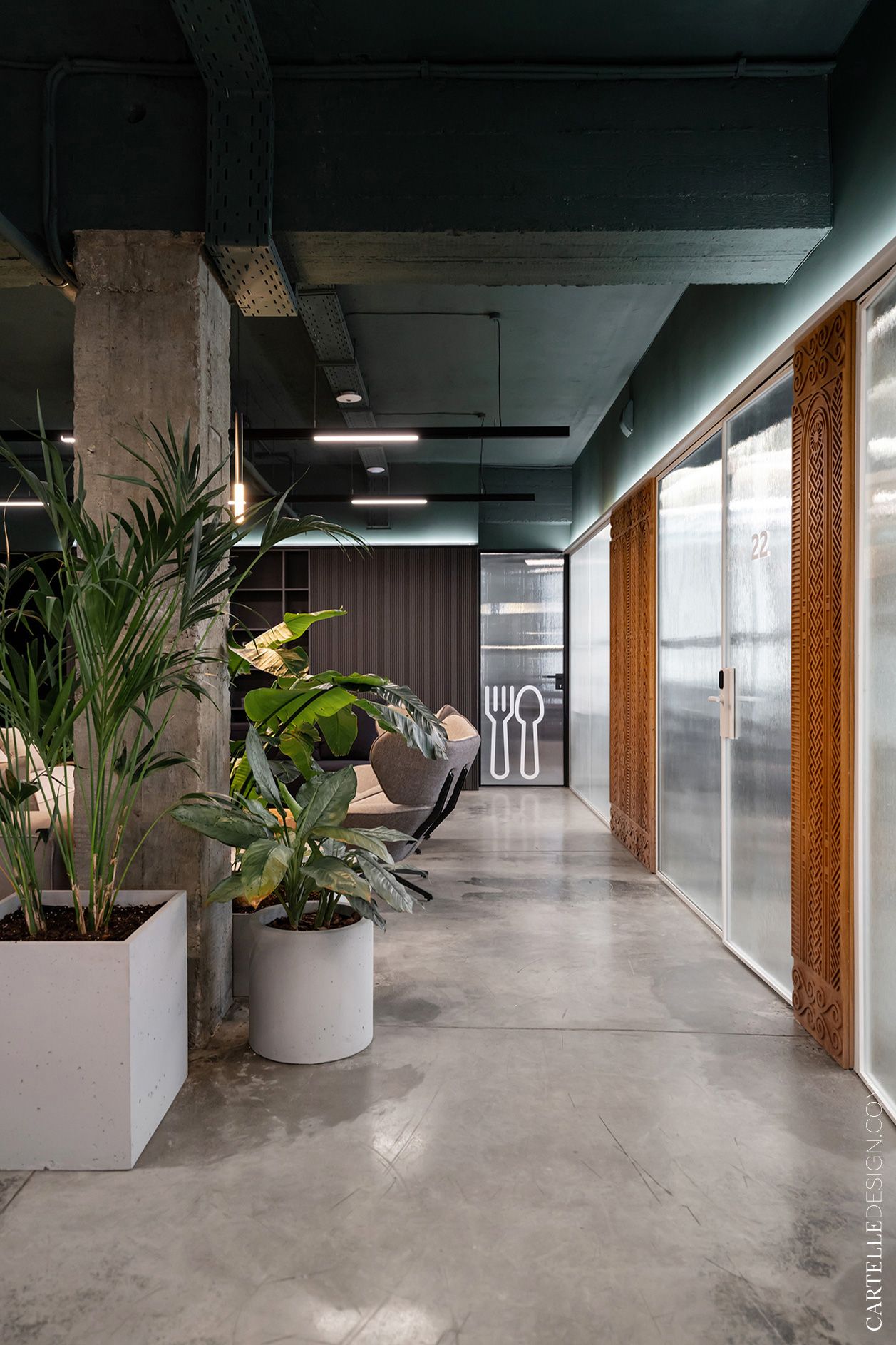
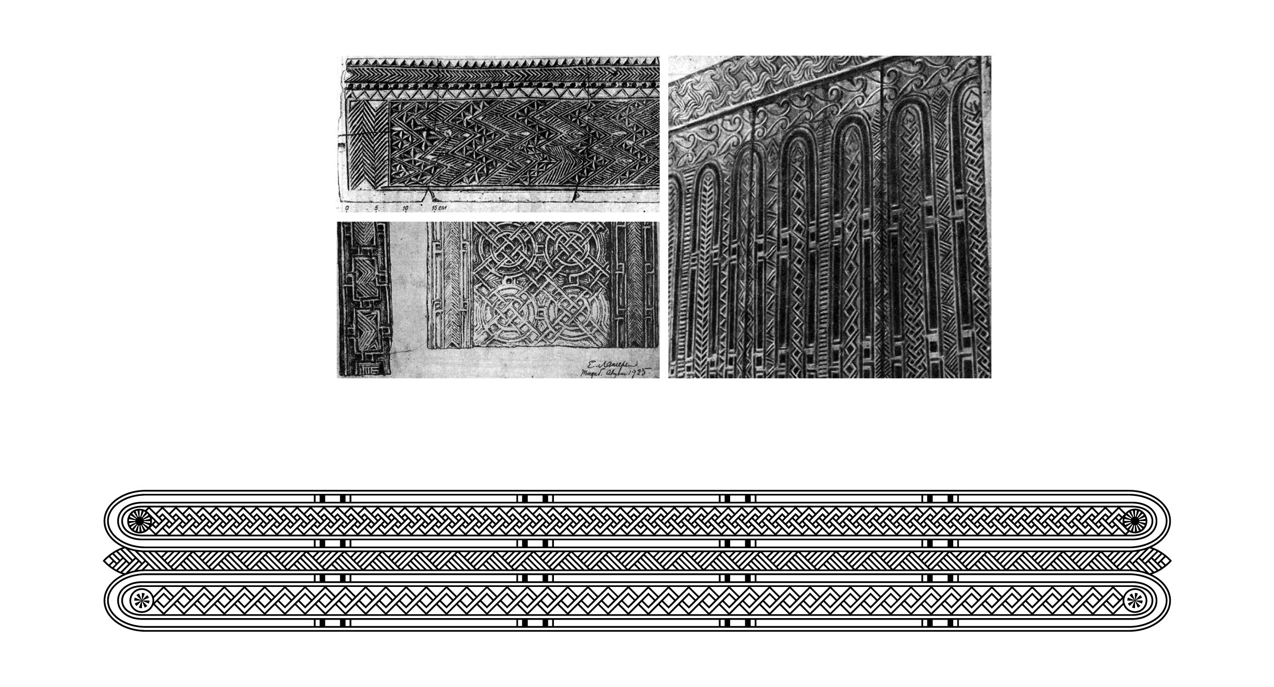
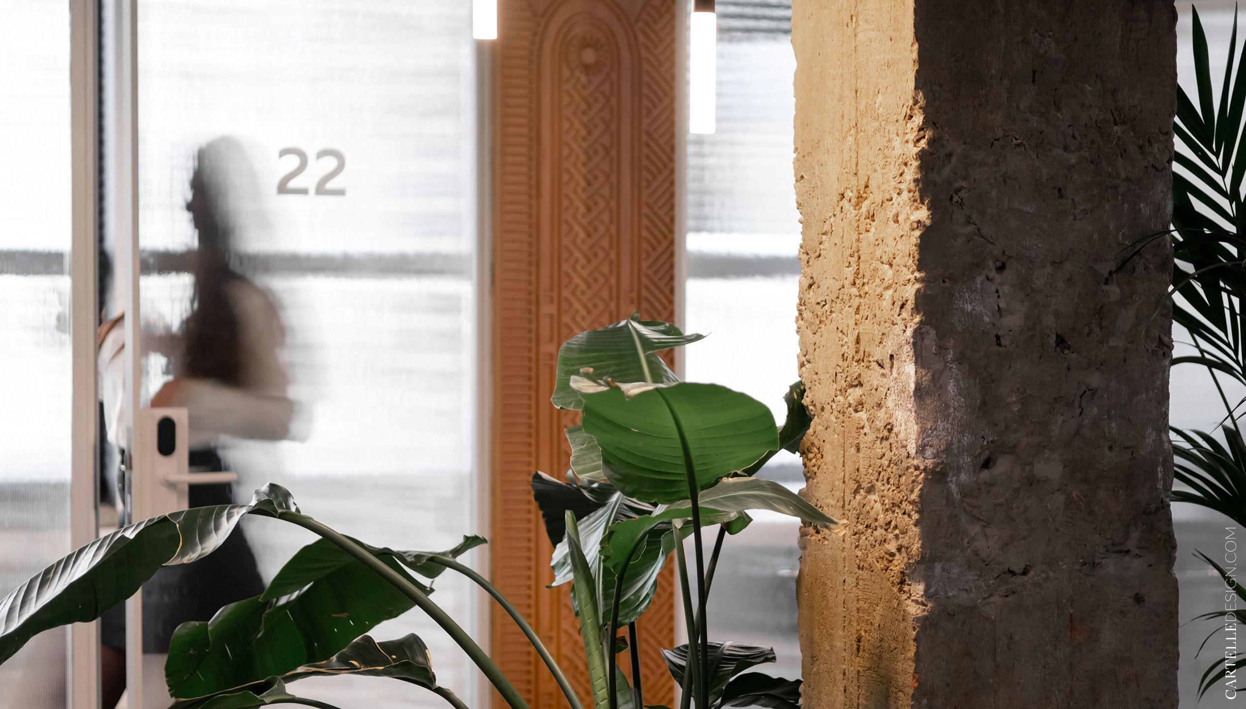
В проекте множестве перегородок из стекла и металла. Стекла использовали прозрачные, рифленые и черные - все в одинаковых рамах. Деревянные резные перегородки - яркий декоративный элемент интерьера. Рисунок резьбы мы разработали специально для этого проекта, отталкиваясь от традиционного дагестанского орнамента.
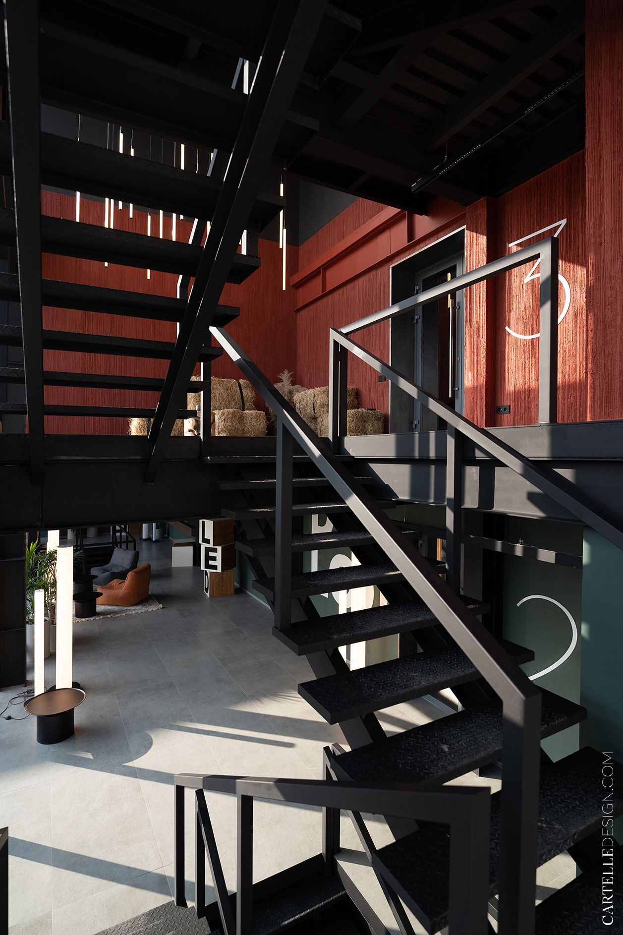
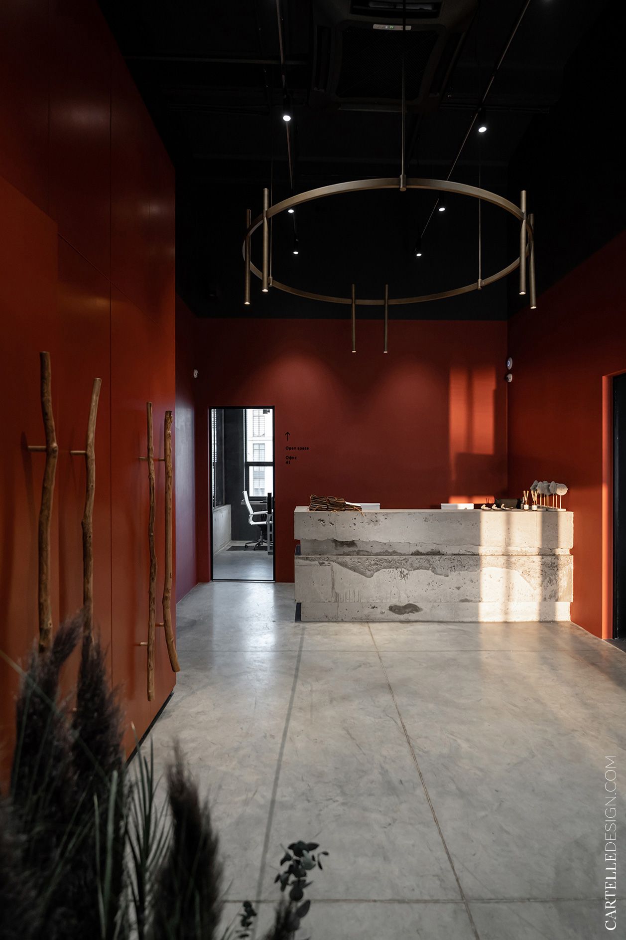
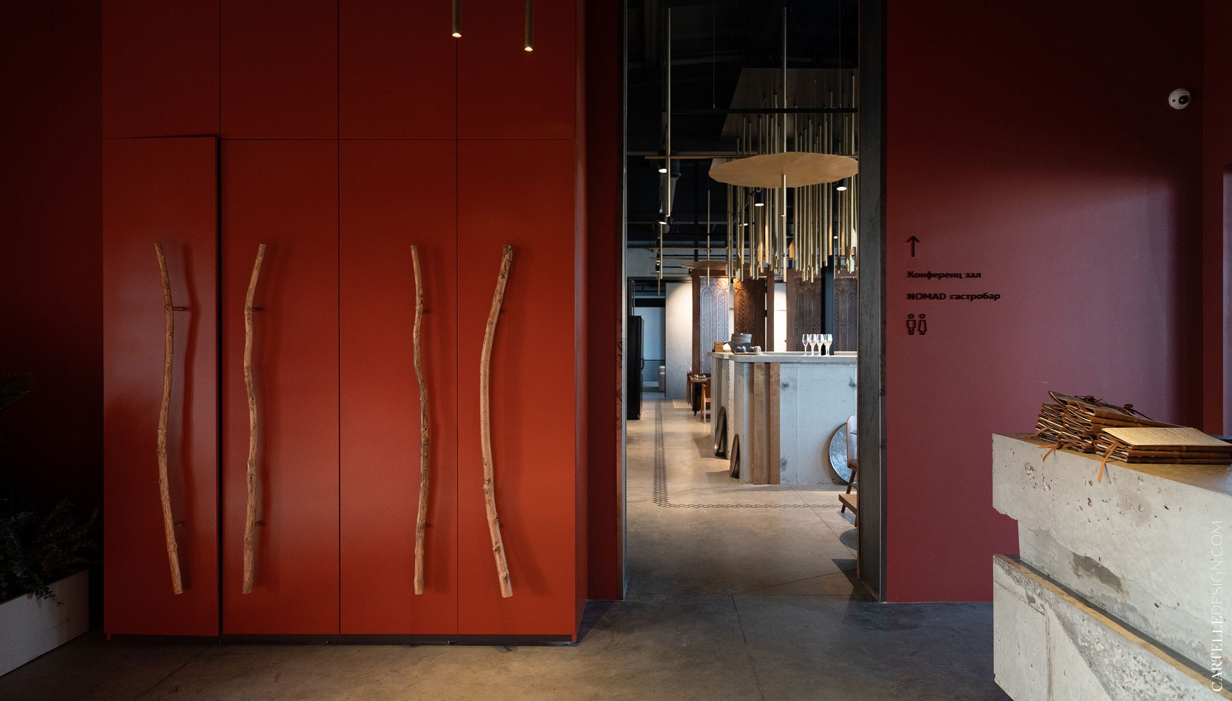
Neutral colors were taken as a basis - white, gray, black and the color of natural wood. It is complemented by accent colors. On the second floor, rich green, as a reference to mountain plants. On the third - red, symbolizing the hot Dagestan sun.
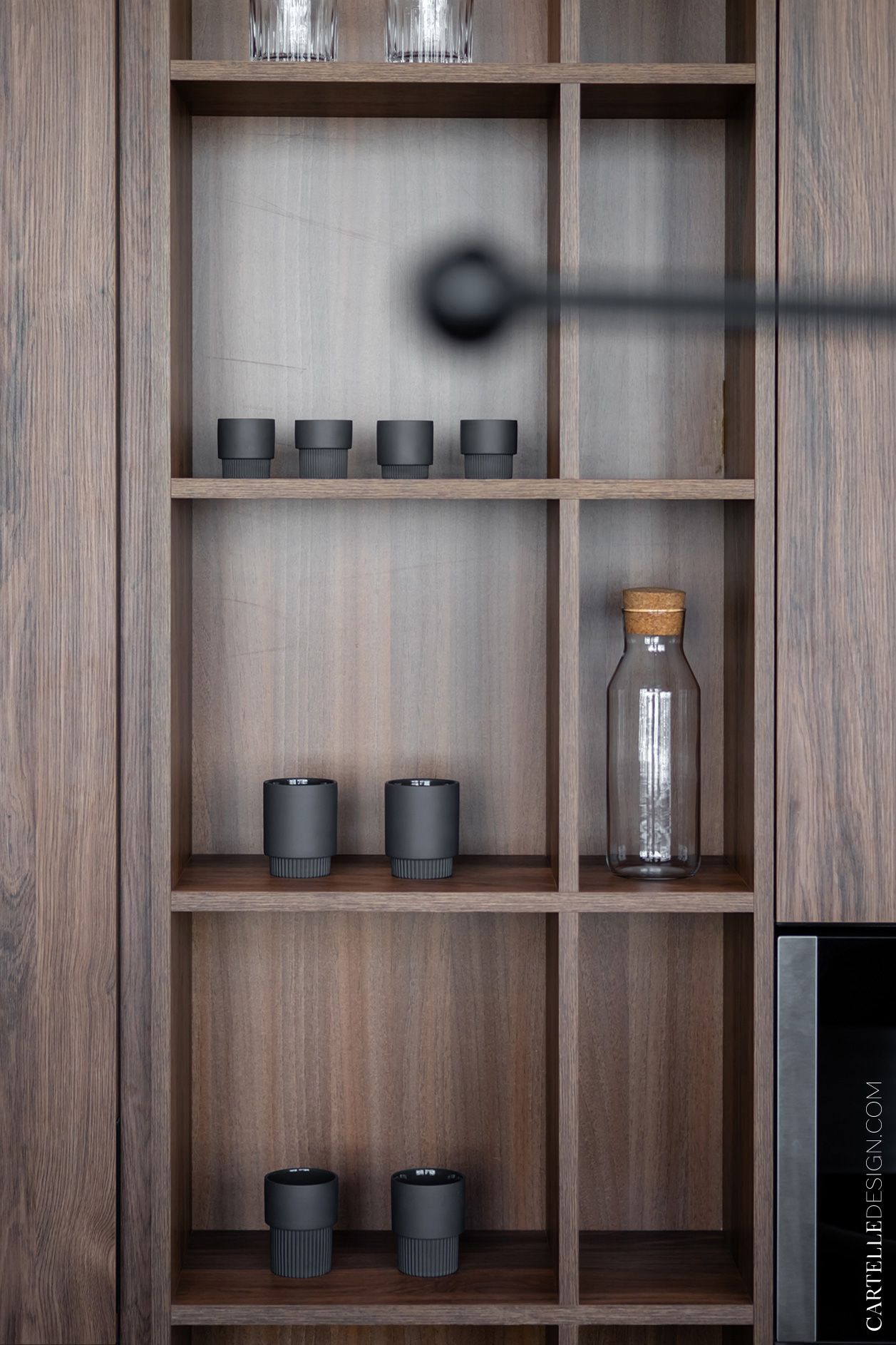
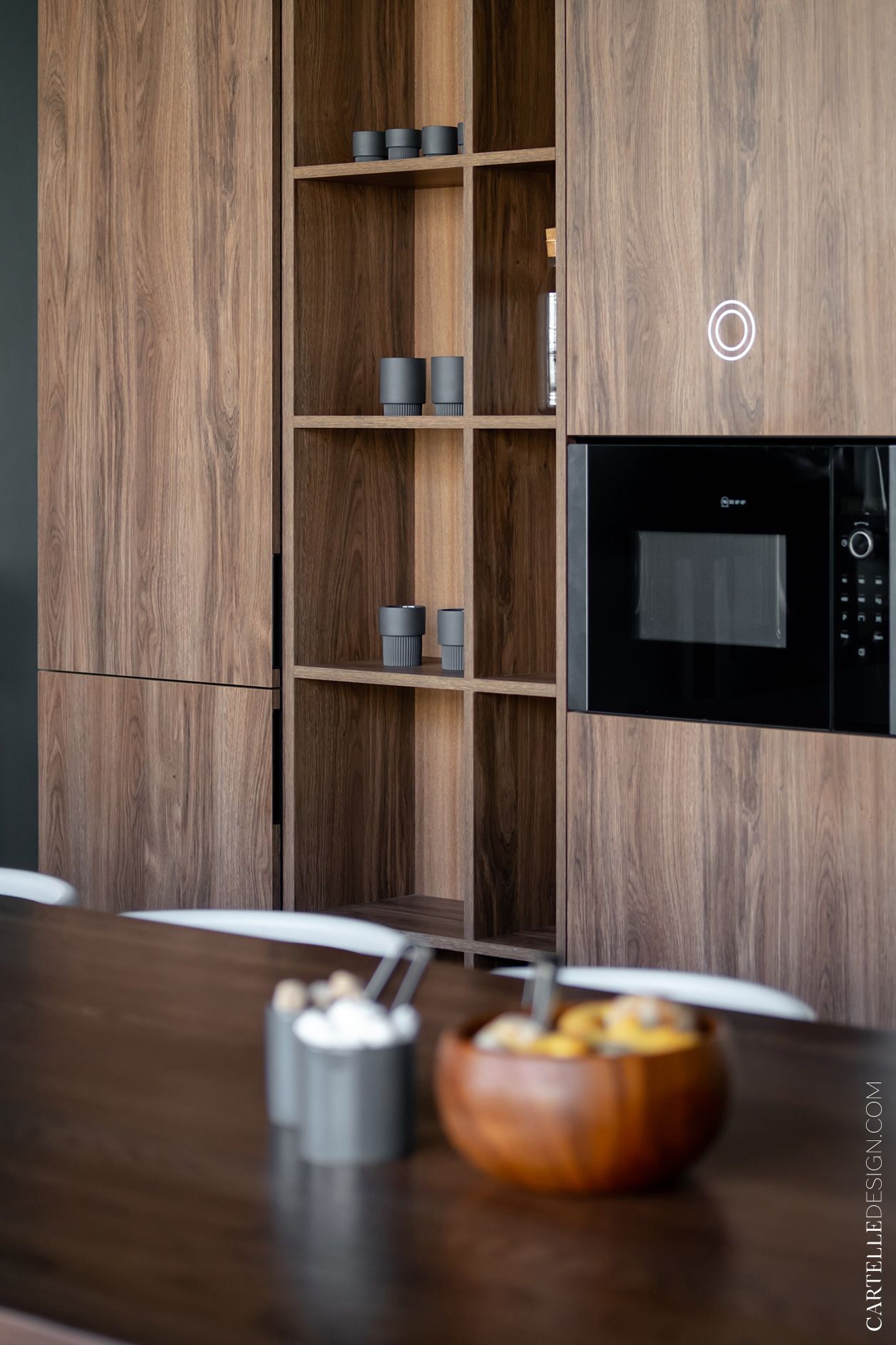
When completing the object, we focused on quality, practicality and comfort. Furniture was chosen in modern laconic forms. Most of them were made to order according to our sketch drawings. Tables and office chairs were ordered from Dezzaro, Kulagio meeting rooms, kitchen and cabinet furniture from Stylish Kitchens. Lighting - Artlight and Centerlight.
Each desktop has a built-in block with three sockets for equipment. In the kitchen - wireless chargers in the table. Each meeting room and skyperoom has an access control and management system (entrance by magnetic cards). In the meeting rooms, USB sockets and Internet sockets are built into the tables.
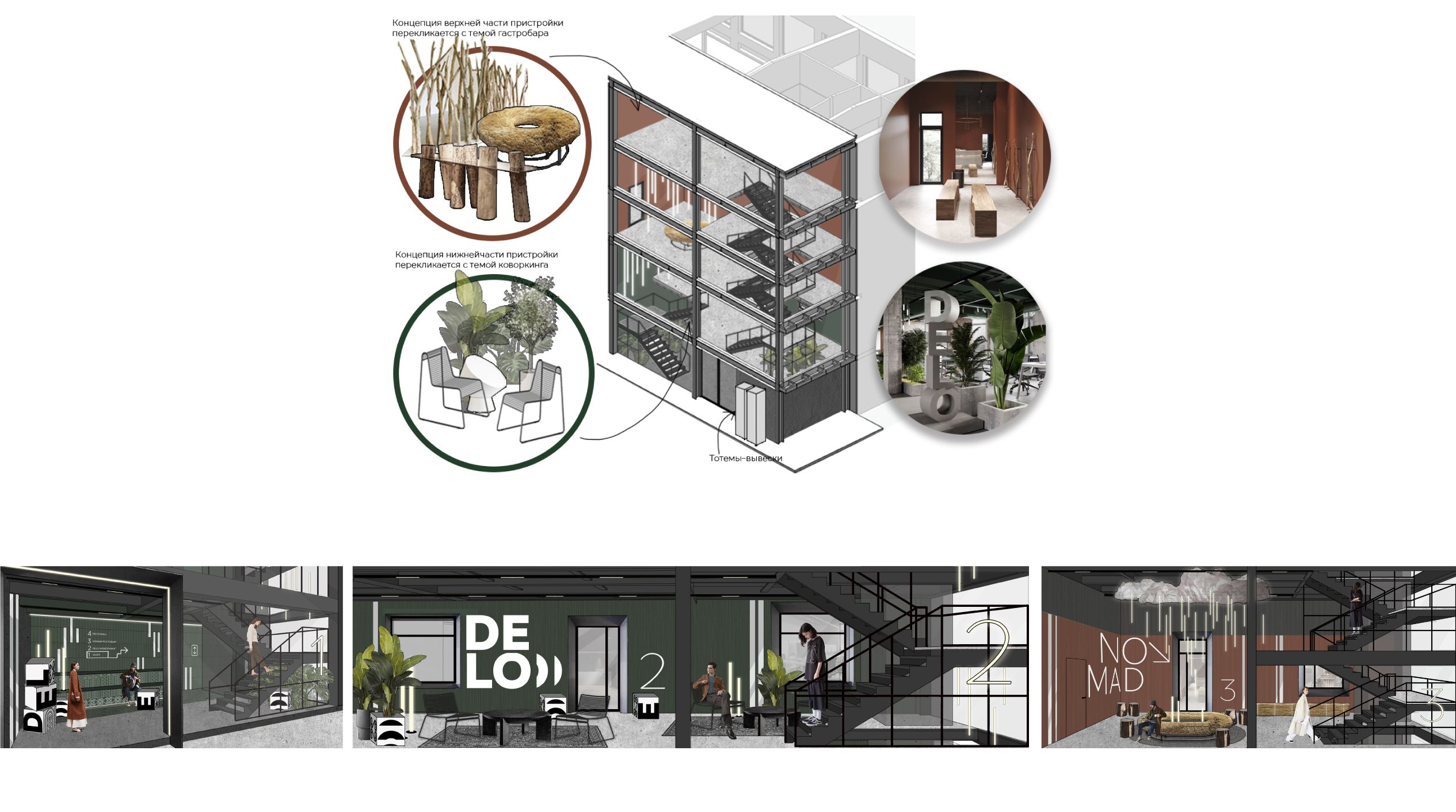
The promised interesting story about the extension. We had already completed the project and started implementation when Shamil (project manager) called us and said that the customer wants to build a four-story extension from the side of the yard. As Shamil later told us, extensions are the main national architectural feature of the region. Local residents are adding whole new rooms to apartments in panel houses. I had to quickly make changes to the project. But our extension solved several problems: a beautiful entrance group to the coworking space, additional space due to the transfer of stairs there, additional space for the service premises of the gastrobar (kitchen, warehouse). At the time of the photo shoot, not all the premises of the extension were completed, the general idea can be estimated from the collages.
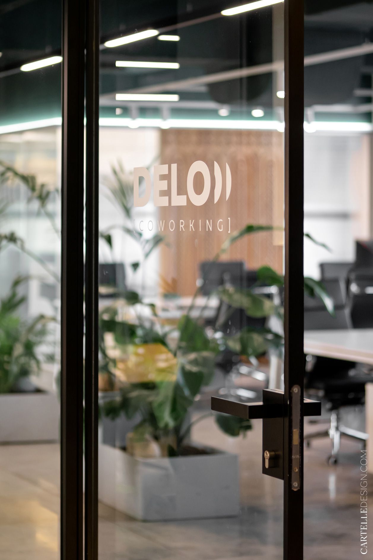
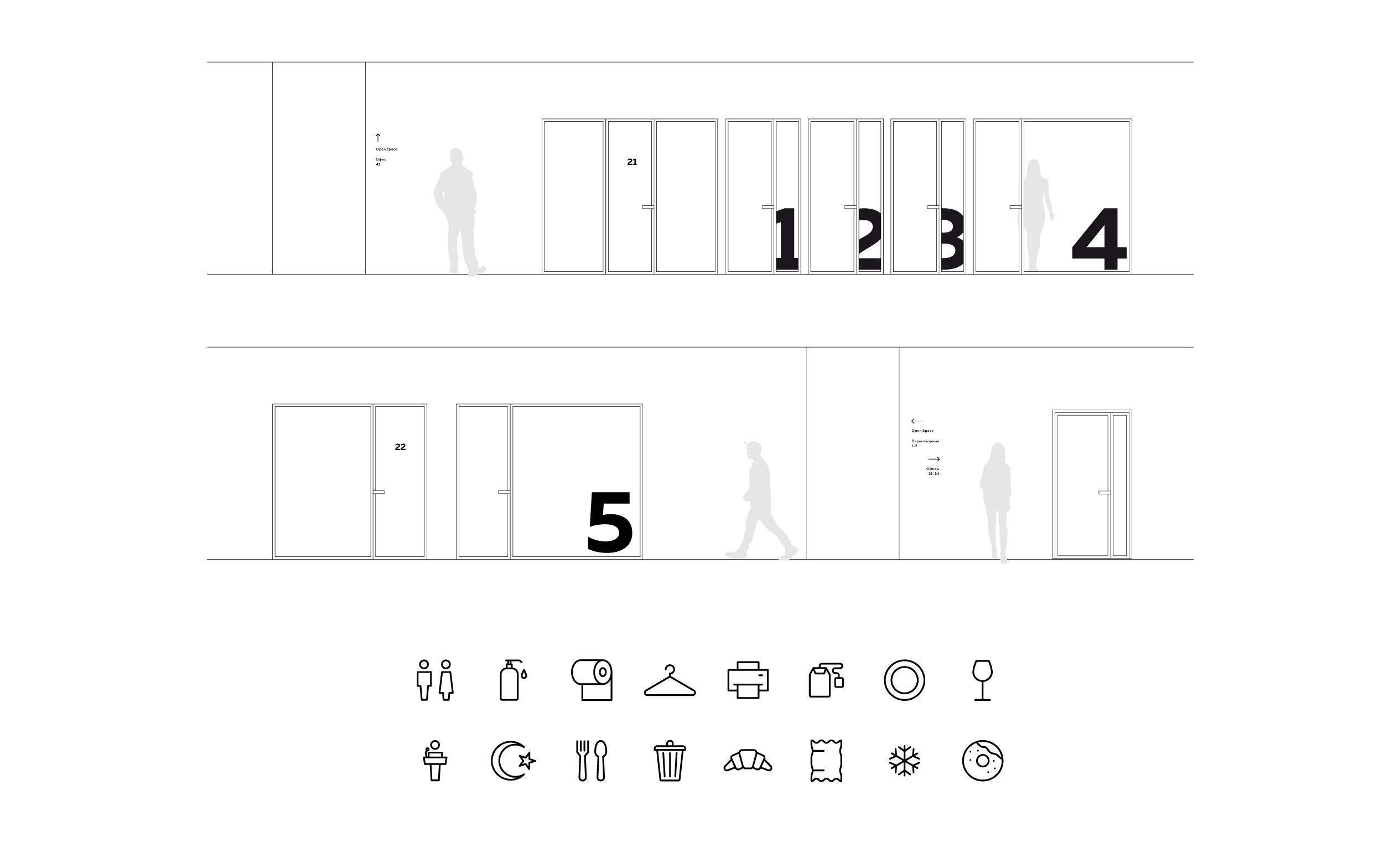
Navigation design was also done by our studio. The project has many premises for various purposes, meeting rooms, offices, etc. It was necessary to create an understandable, but at the same time concise system of identification marks that would fit well into the interior. We used two types of pointers. Pointers, office and floor numbers were carved from white and black plexiglass. Numbers of conference rooms - stickers on glass. The company logo is used as a graphic element on the walls of the meeting rooms and in the annex. The drawing was transferred to the walls using stencils.
The final stage of work on the project was the development of corporate identity, including naming. The client wanted a simple but memorable name associated with the services provided. Among the options were Place, Digit, Network, Spot, Workship. We settled on the Delo version, it seemed the most concise and capacious.
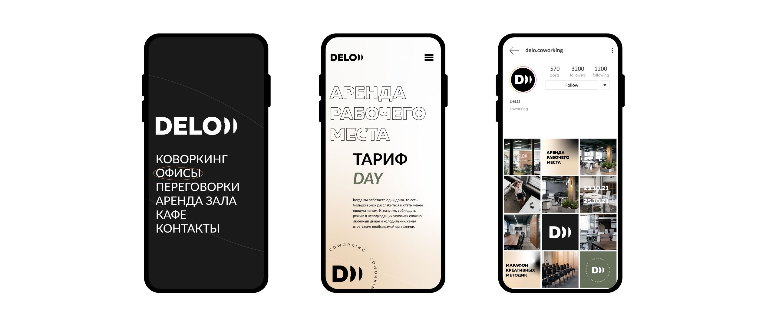
When developing a corporate identity, we primarily focused on the future audience of coworking. For a young and advanced audience - entrepreneurs, designers, IT-specialists, marketers, photographers, etc. Corporate identity should be modern, democratic, progressive, serious enough, but not too much.
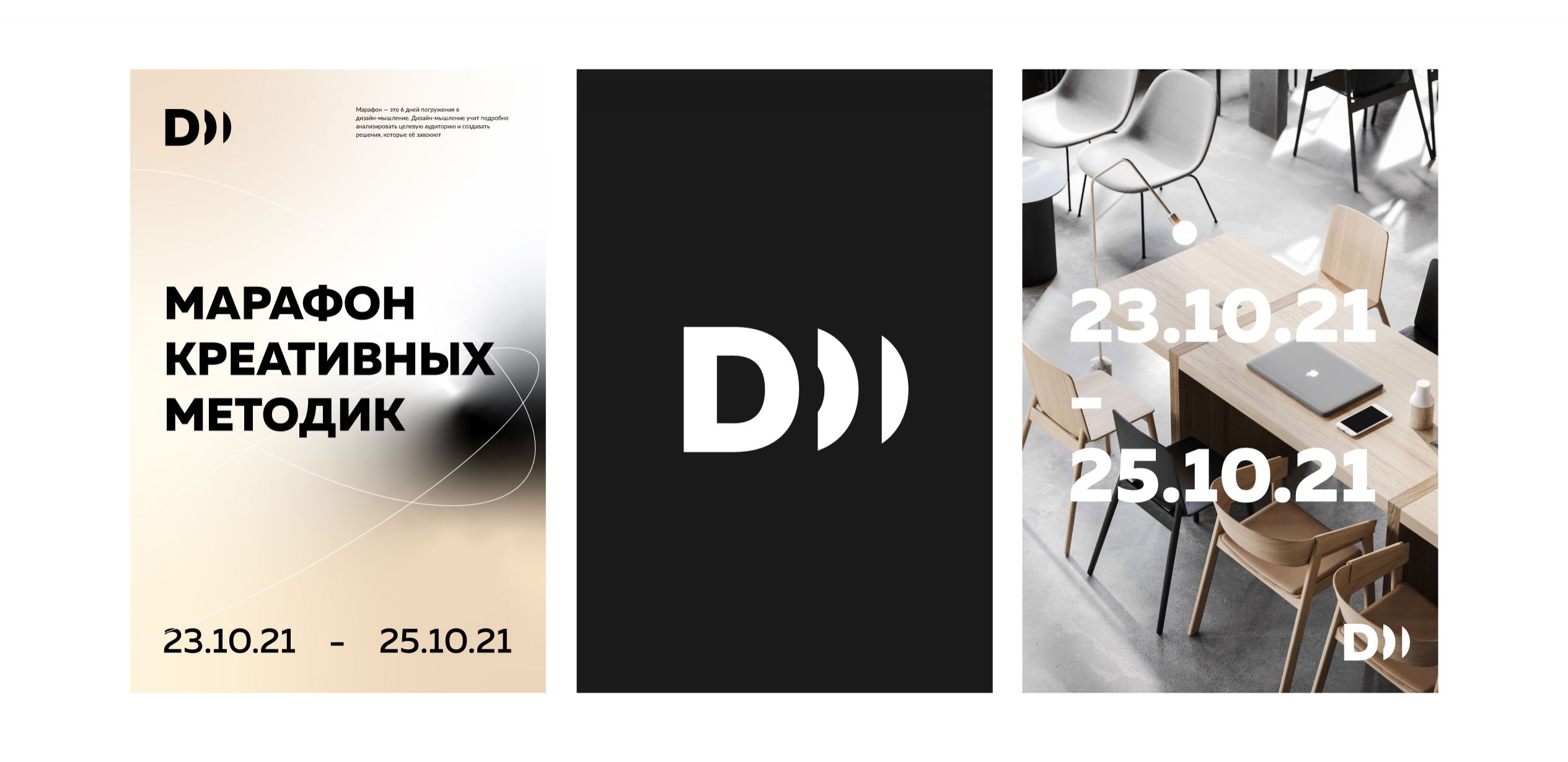
We have developed a laconic logo based on a grotesque font. It is based on the idea of a new nature of professional interaction. The boundaries between working time and leisure, the traditional organization of companies and freelancing are increasingly blurred. And the main link is the Internet, which allows you to create new communities.
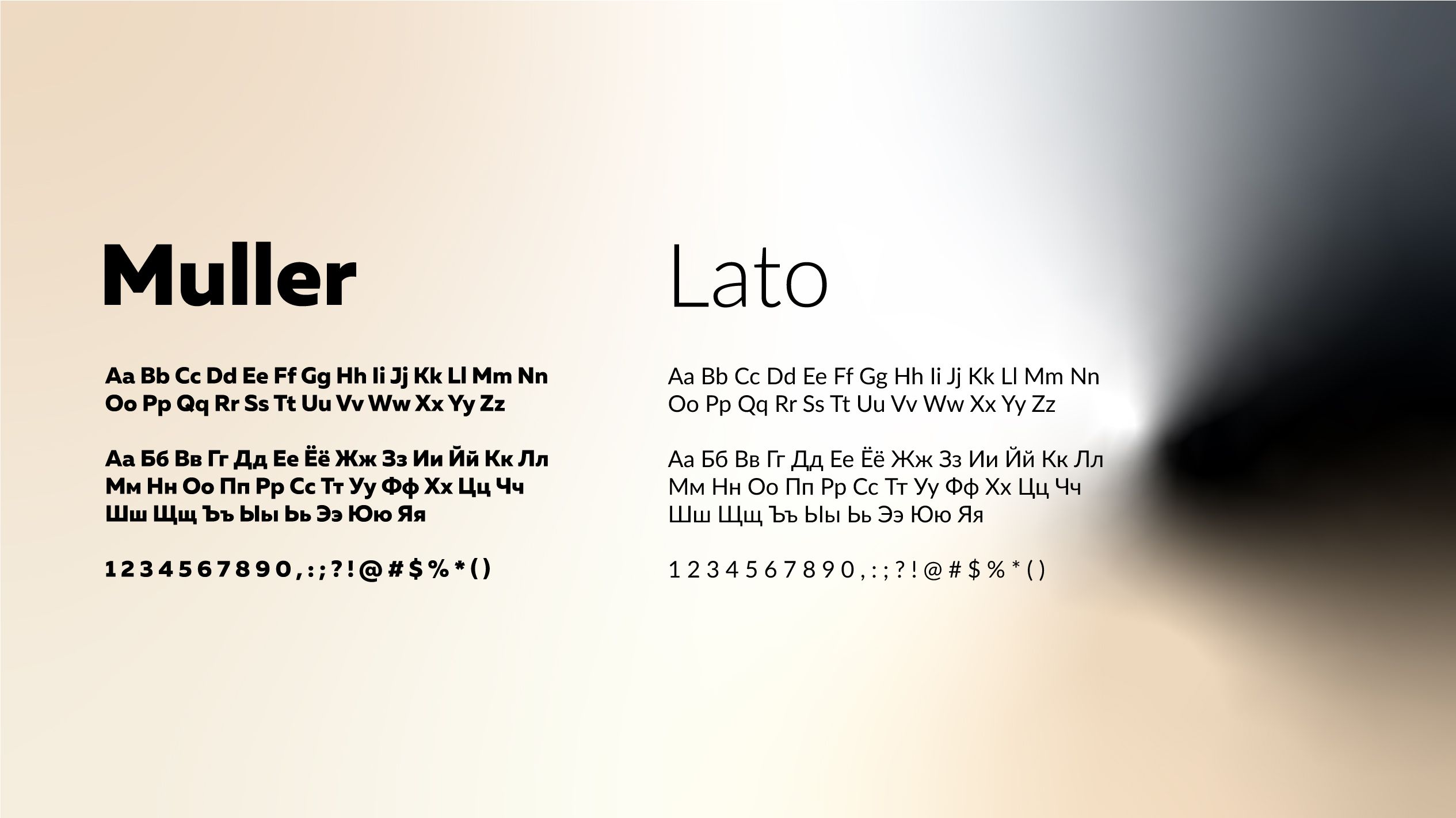
The main feature of the logo is that its first letter turns into a sign. This is very convenient for using the logo on social networks. A simple logo is complemented by a corporate substrate with a gradient fill. Corporate colors were chosen taking into account the interior: black, sand and green.


