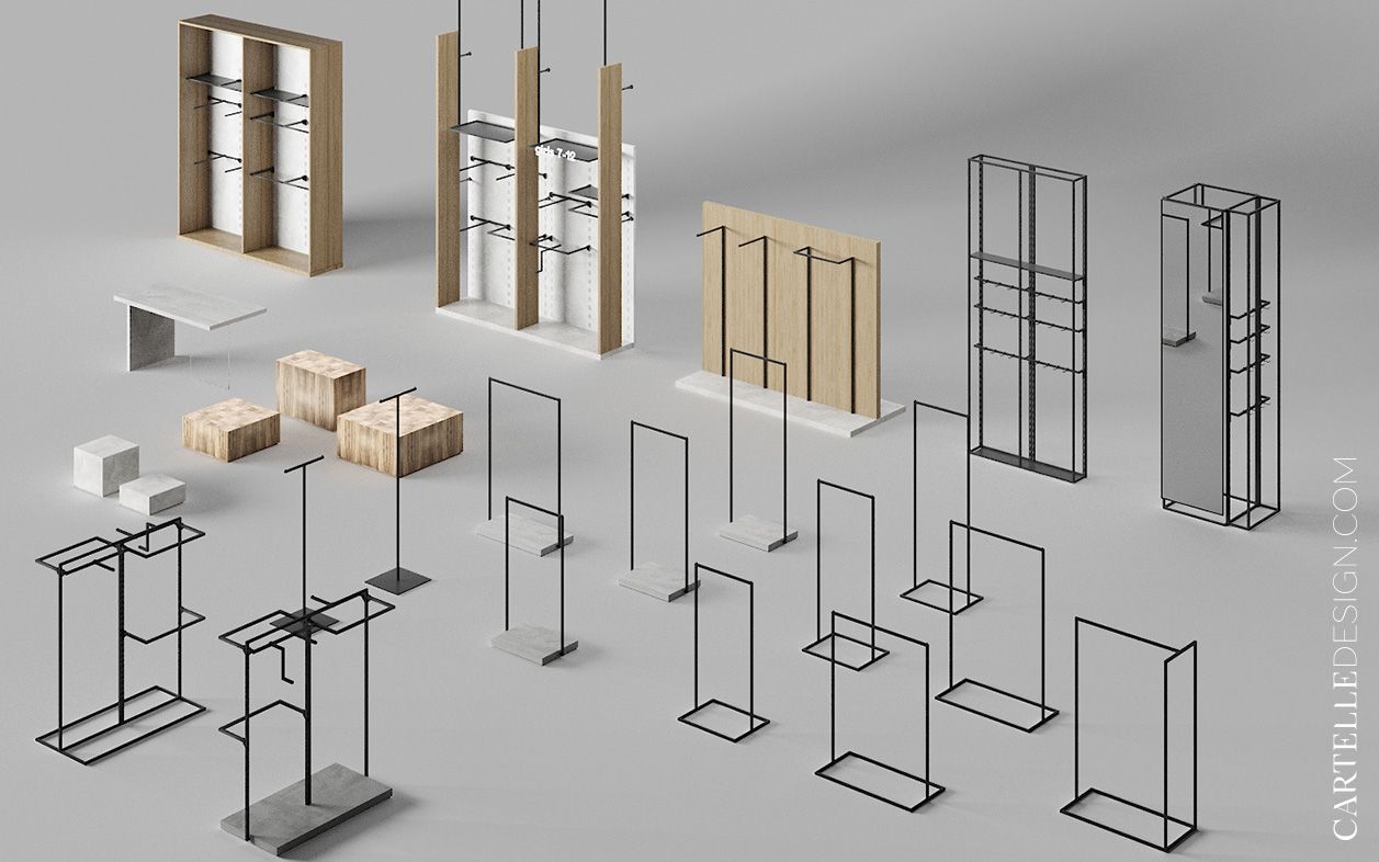
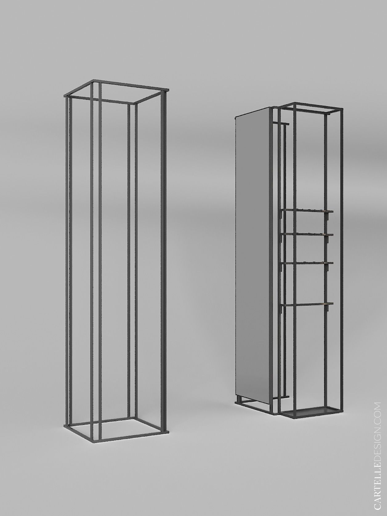
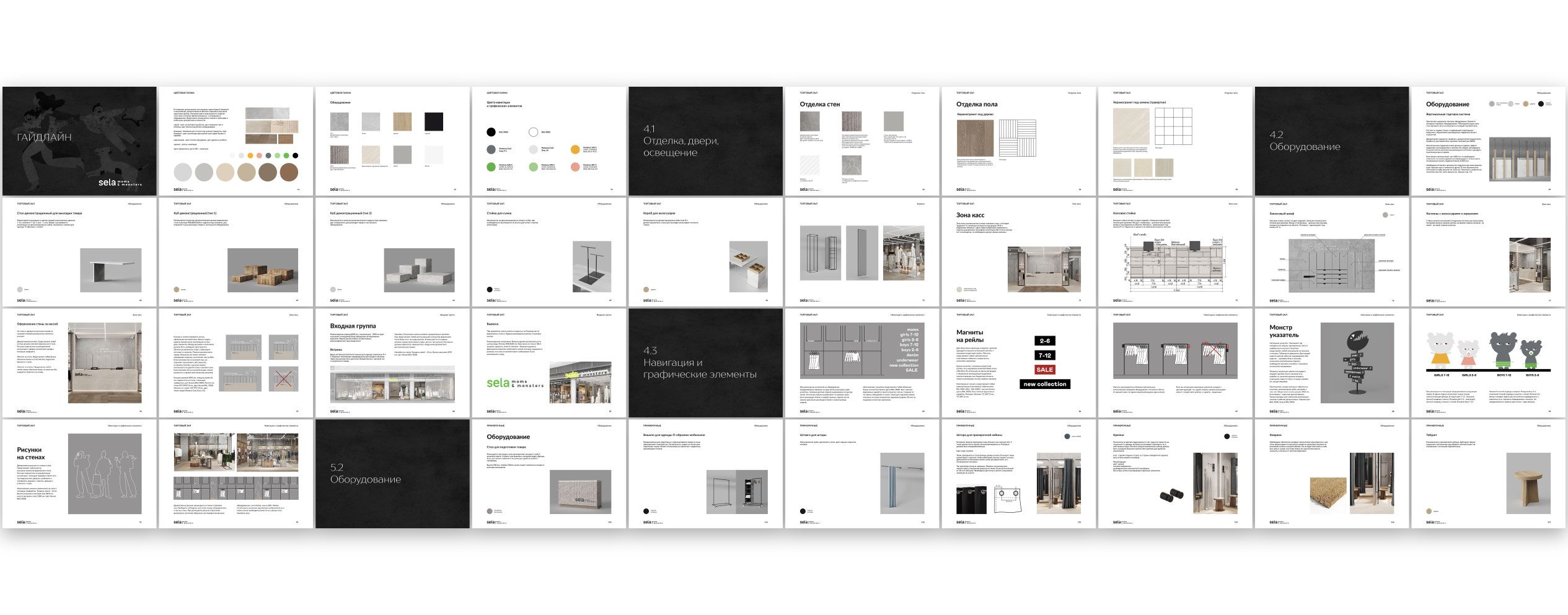
SELA contacted us. We were faced with the task of developing a new concept for the interior of stores. It was necessary to develop a design project and retail equipment for one store. And then draw up a detailed guideline, on the basis of which the company's team will be able to independently scale the design project for stores of different sizes and configurations.
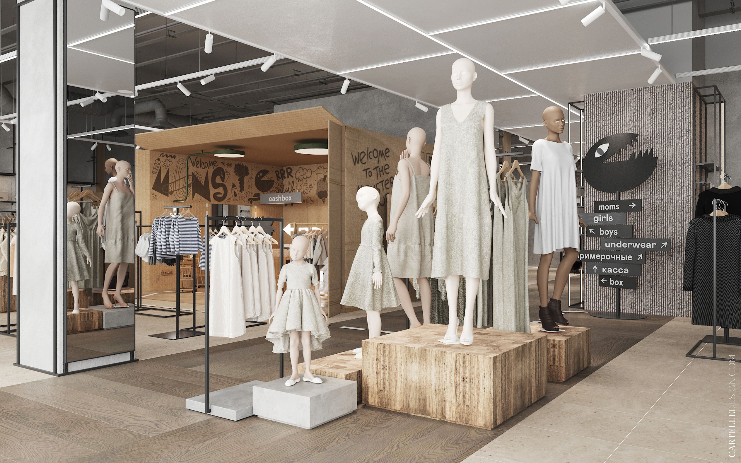
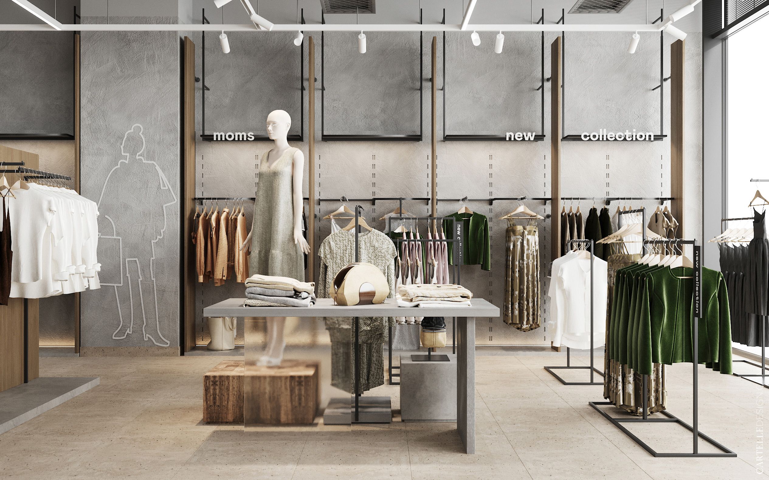
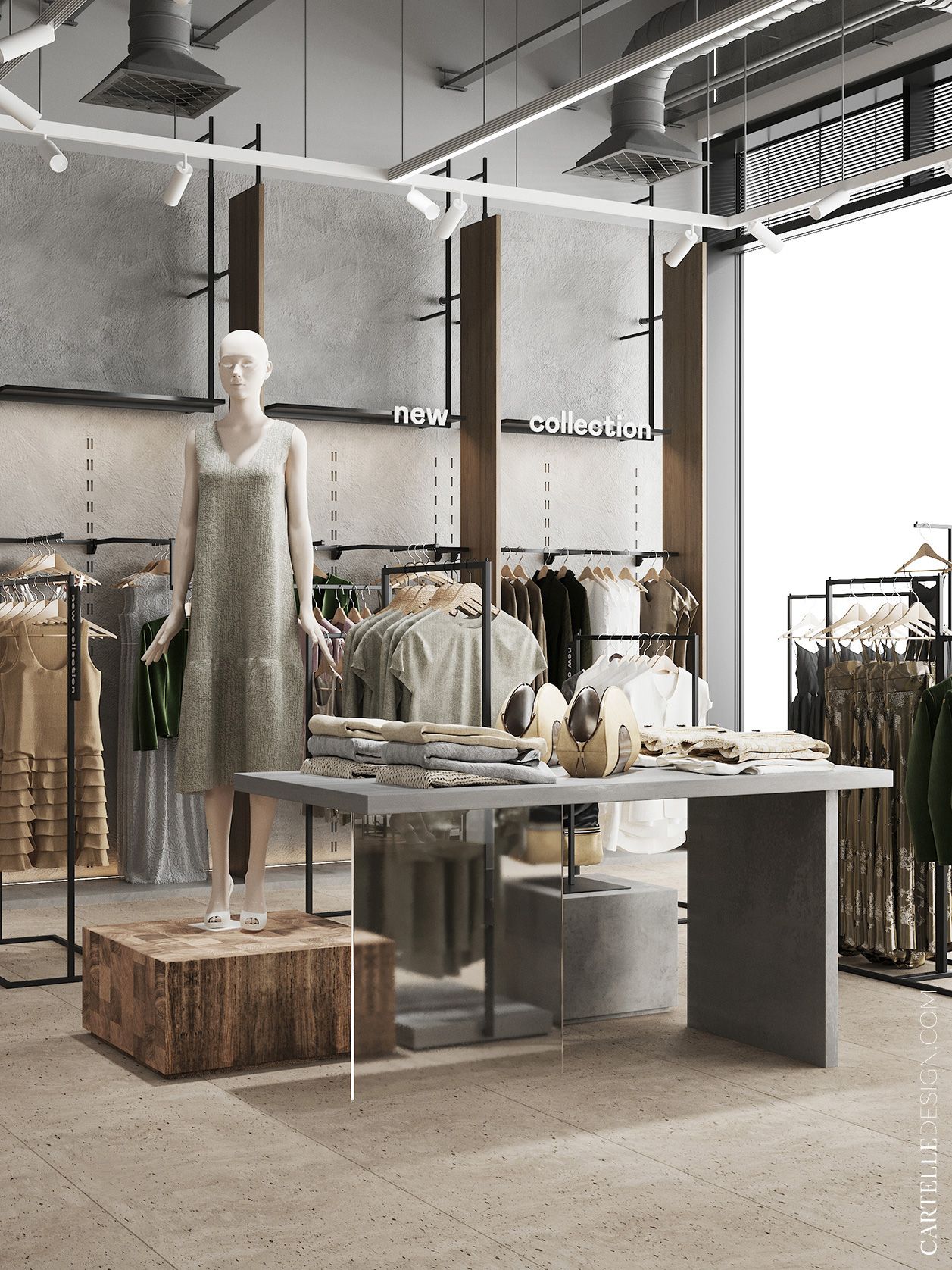
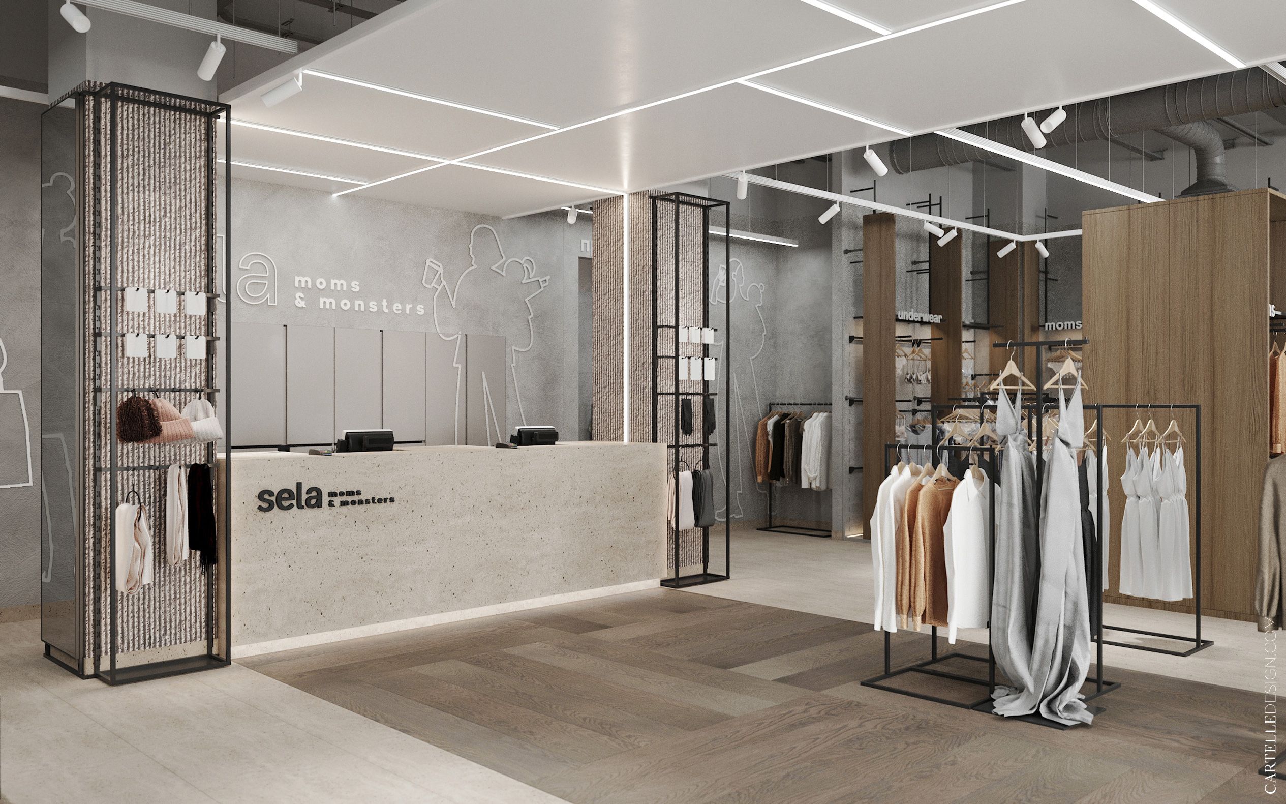
The new concept of Sela stores represents the idea of creating a stylish space for fashionable mothers and children. Spacious bright stylish interior with good navigation through shopping areas and a separate play area.
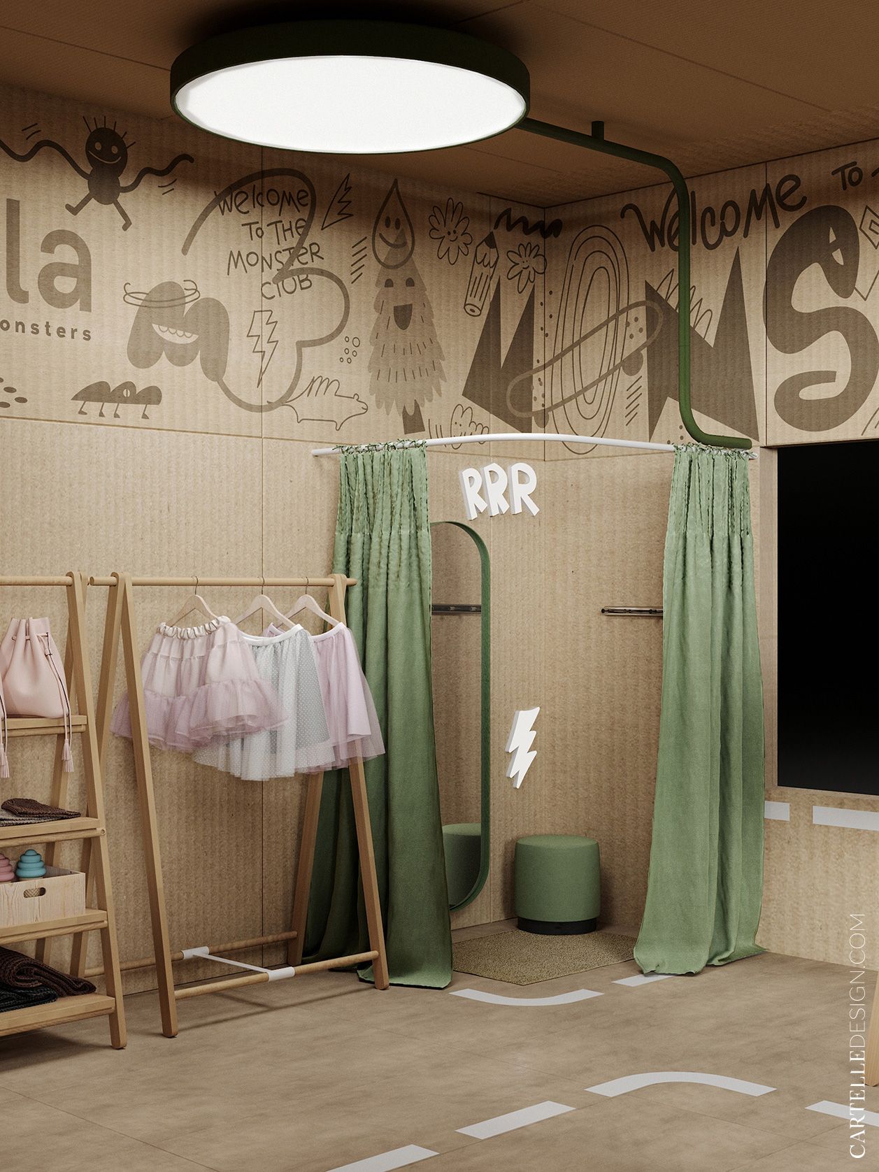
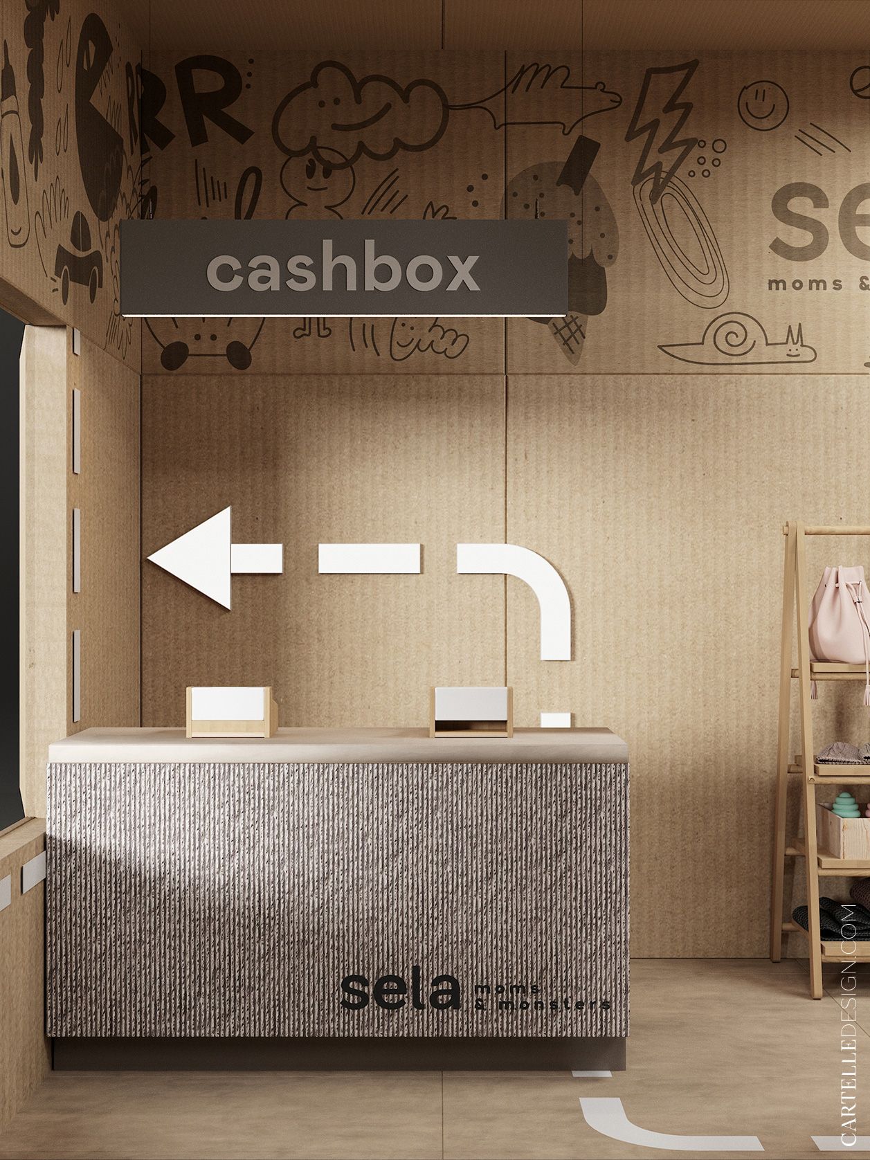
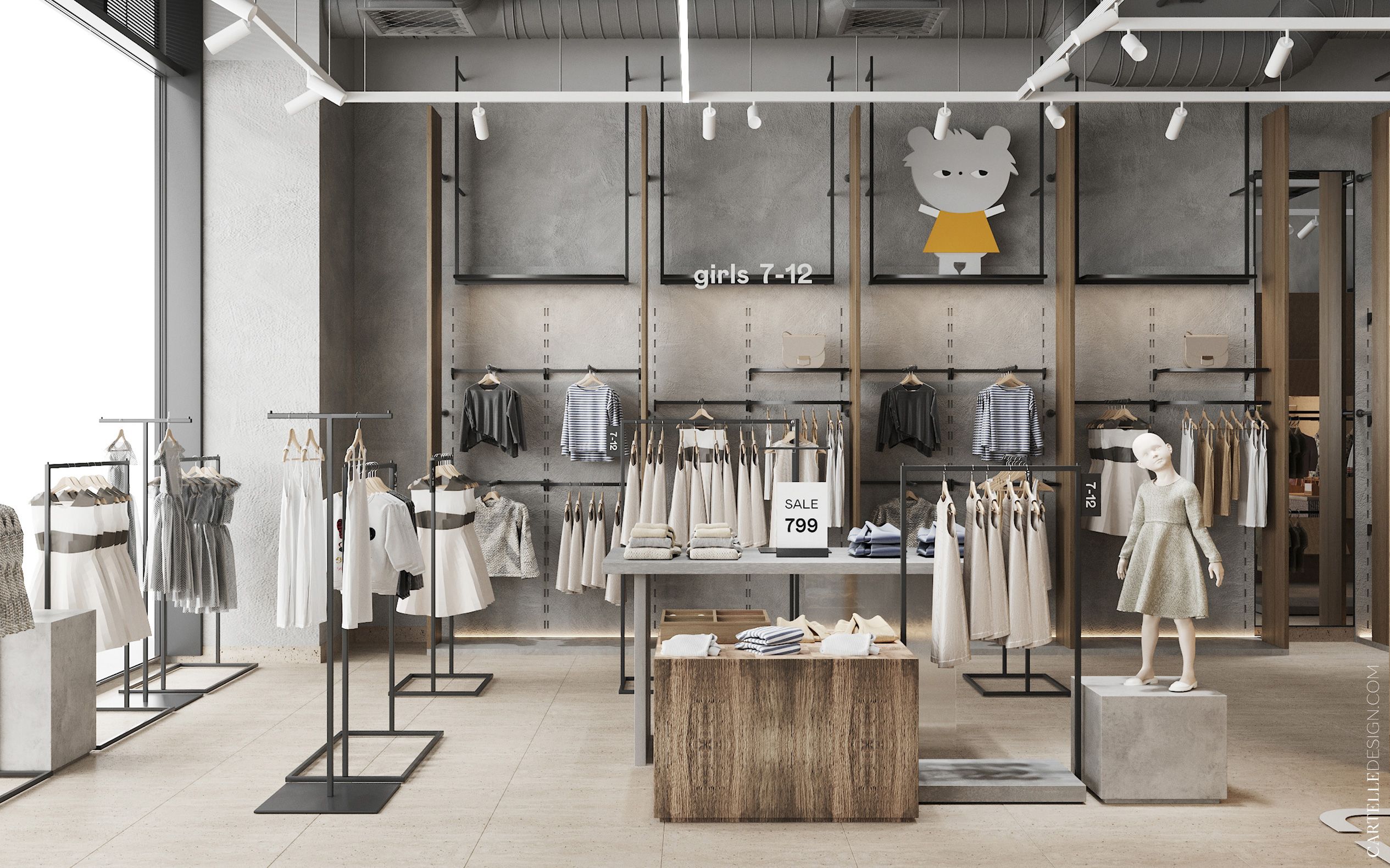
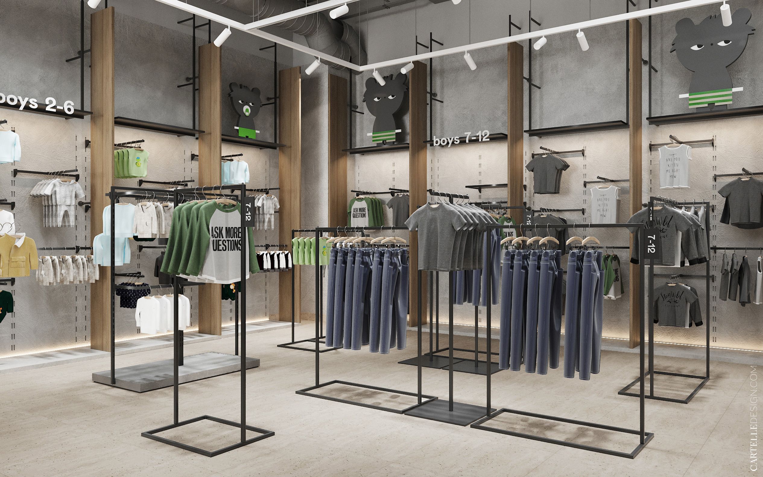
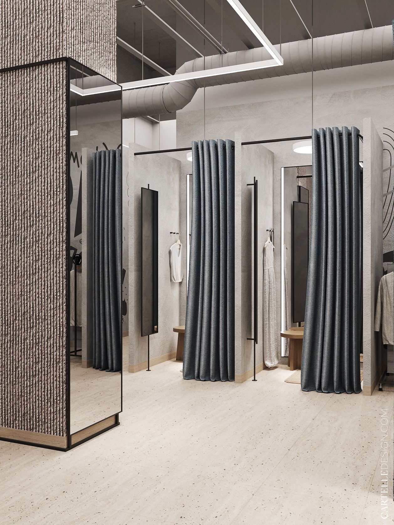
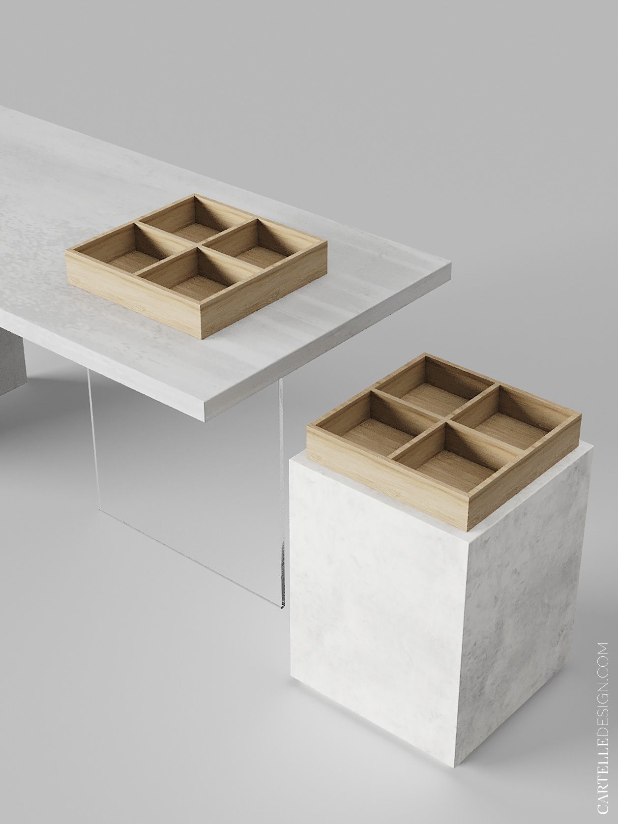
We used simple natural shades of stone, wood, concrete, craft paper in the decoration. The entire interior is done in neutral tones, with small accents in the form of green corporate color and bright images of Wiggy the bear.
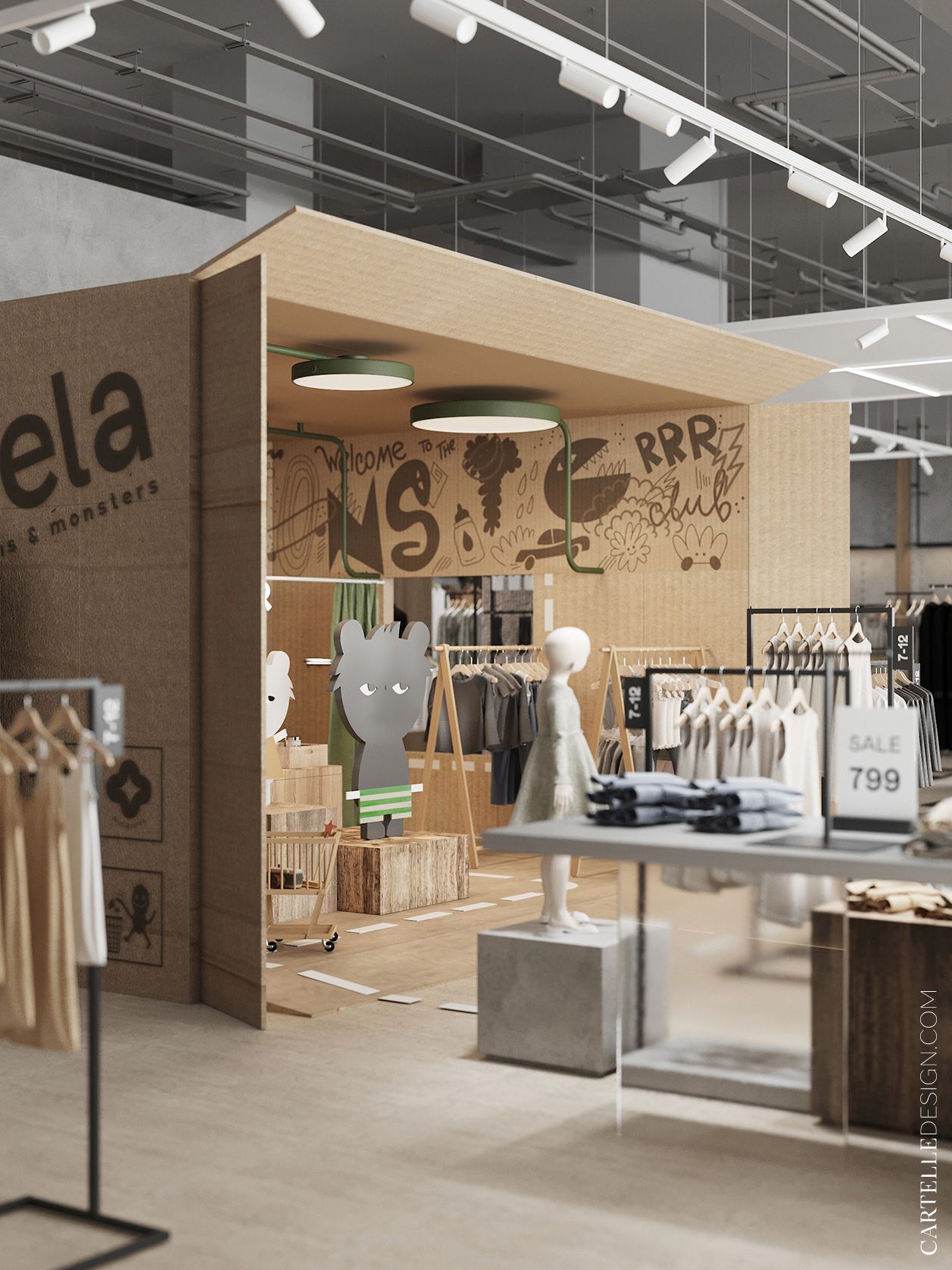
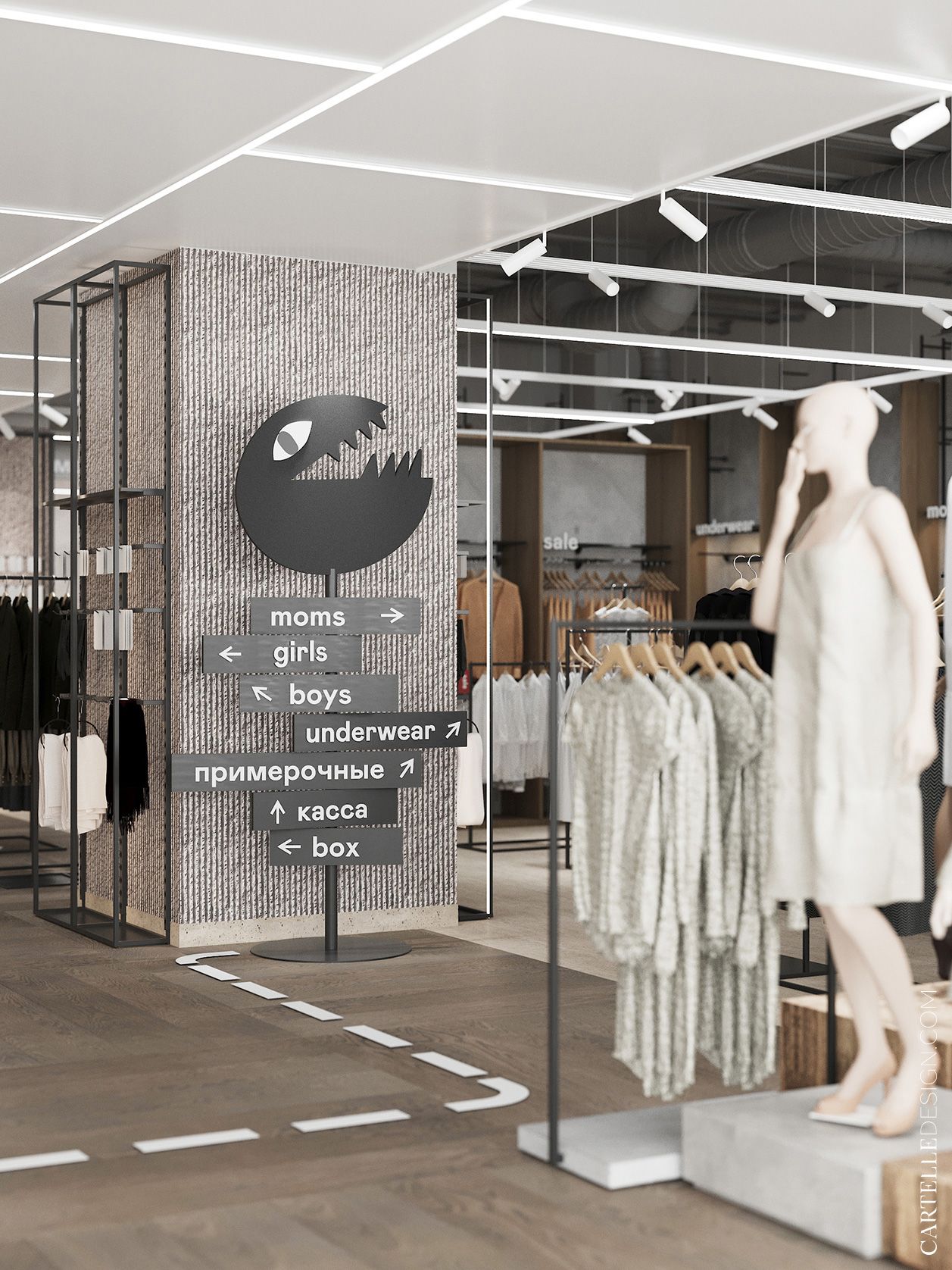
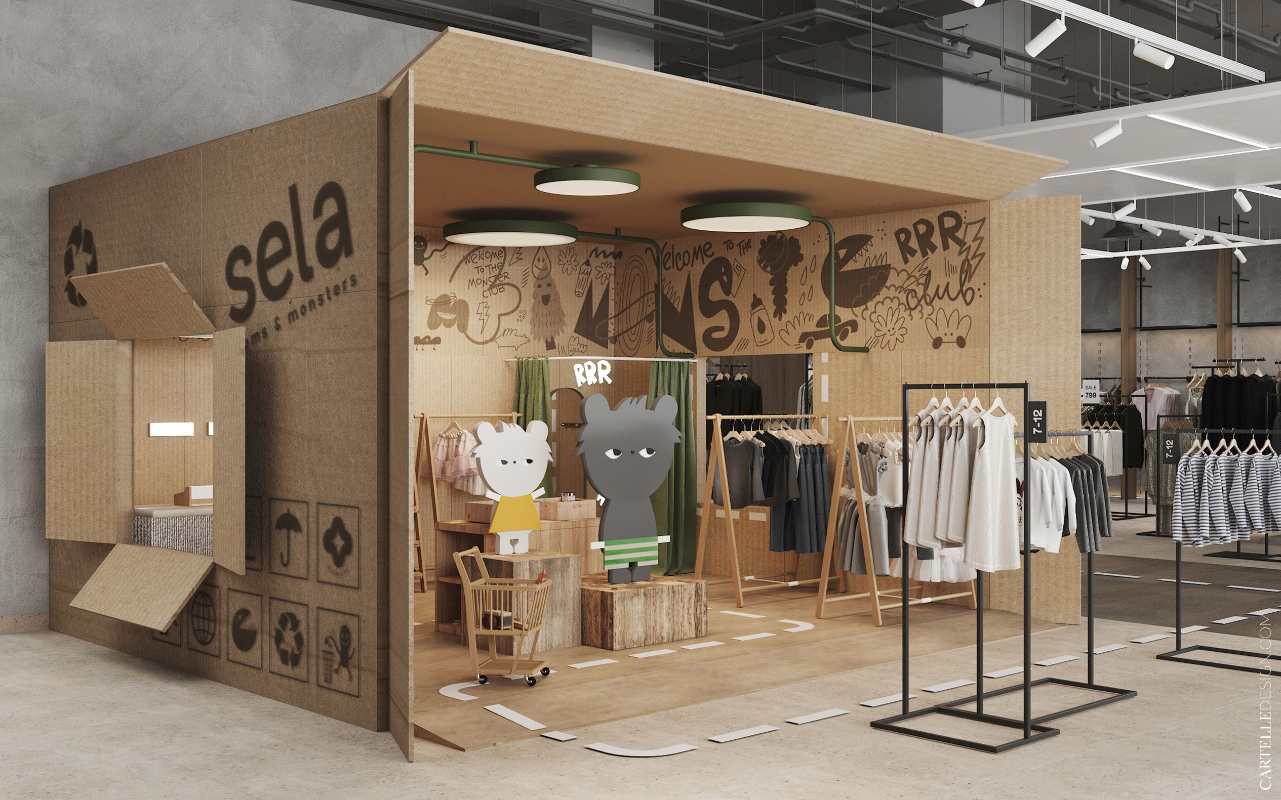
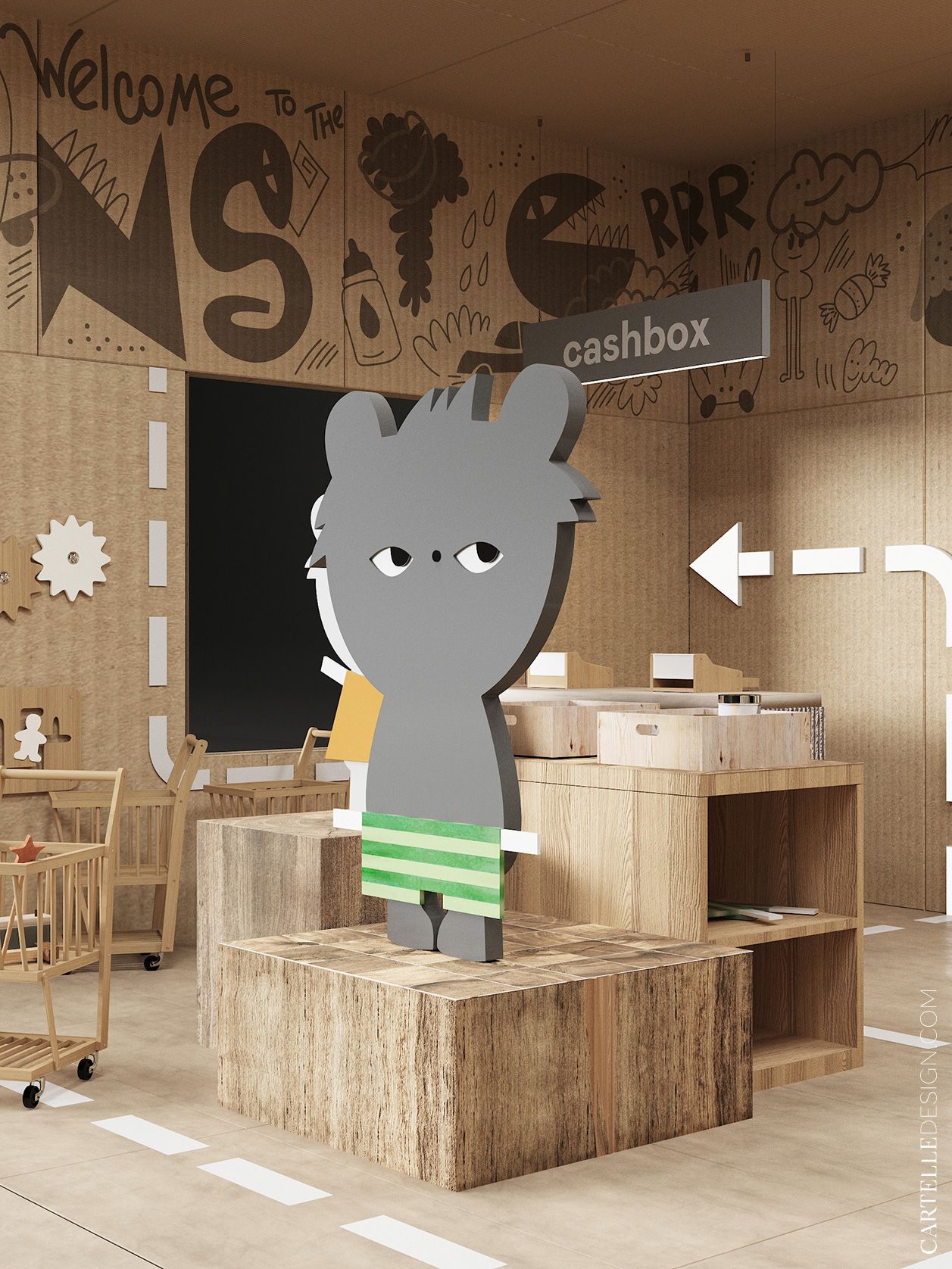
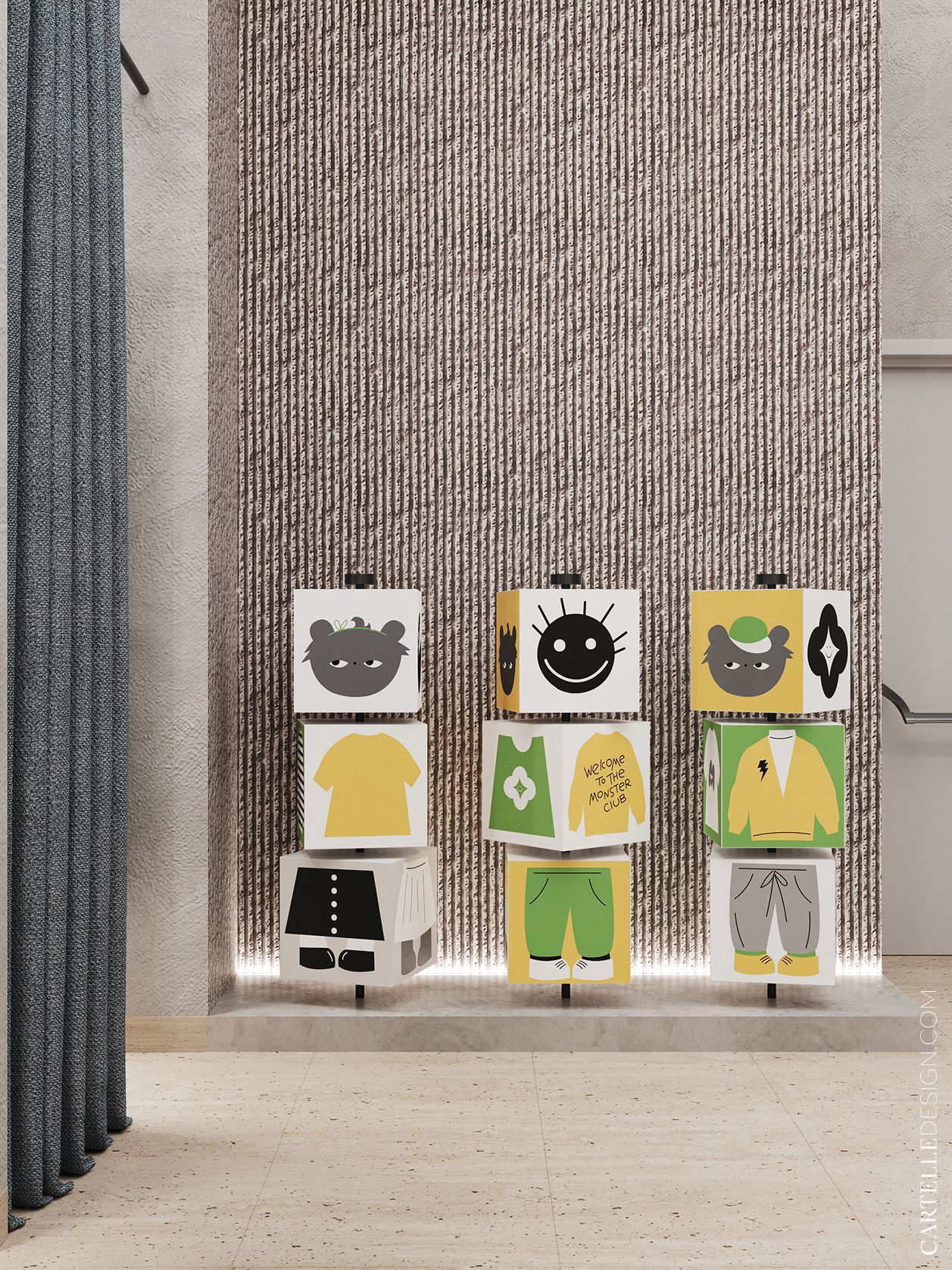
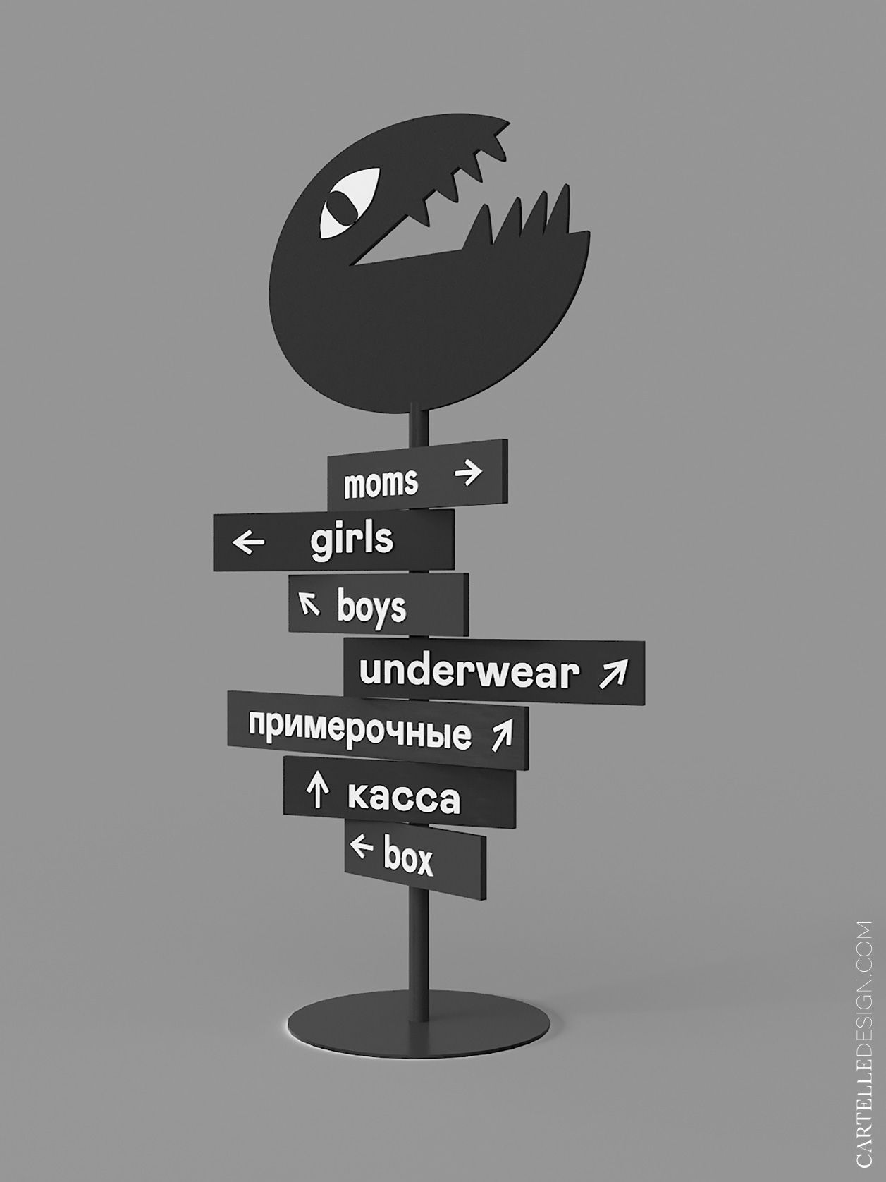
The main and most striking element is the game box area, with contrasting patterns on the walls and green lights inside. The hall is decorated with navigation in the form of a bear, as well as accent plates with the names of departments. Bright spots are only functional.
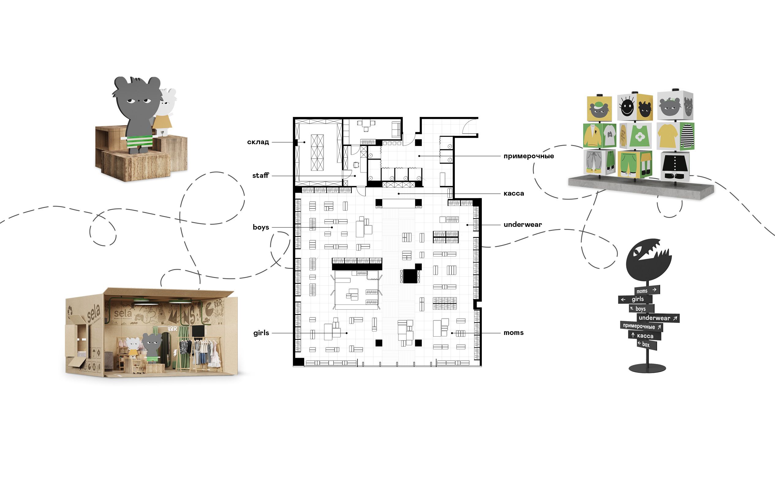
The store is divided into two large areas “clothes for mothers” and “children's clothes” with a contrasting stripe on the floor and ceiling. The children's play box is located in the children's half of the sales area. In terms of their content, the zones do not differ in color or equipment. The differences are only in the navigation elements.
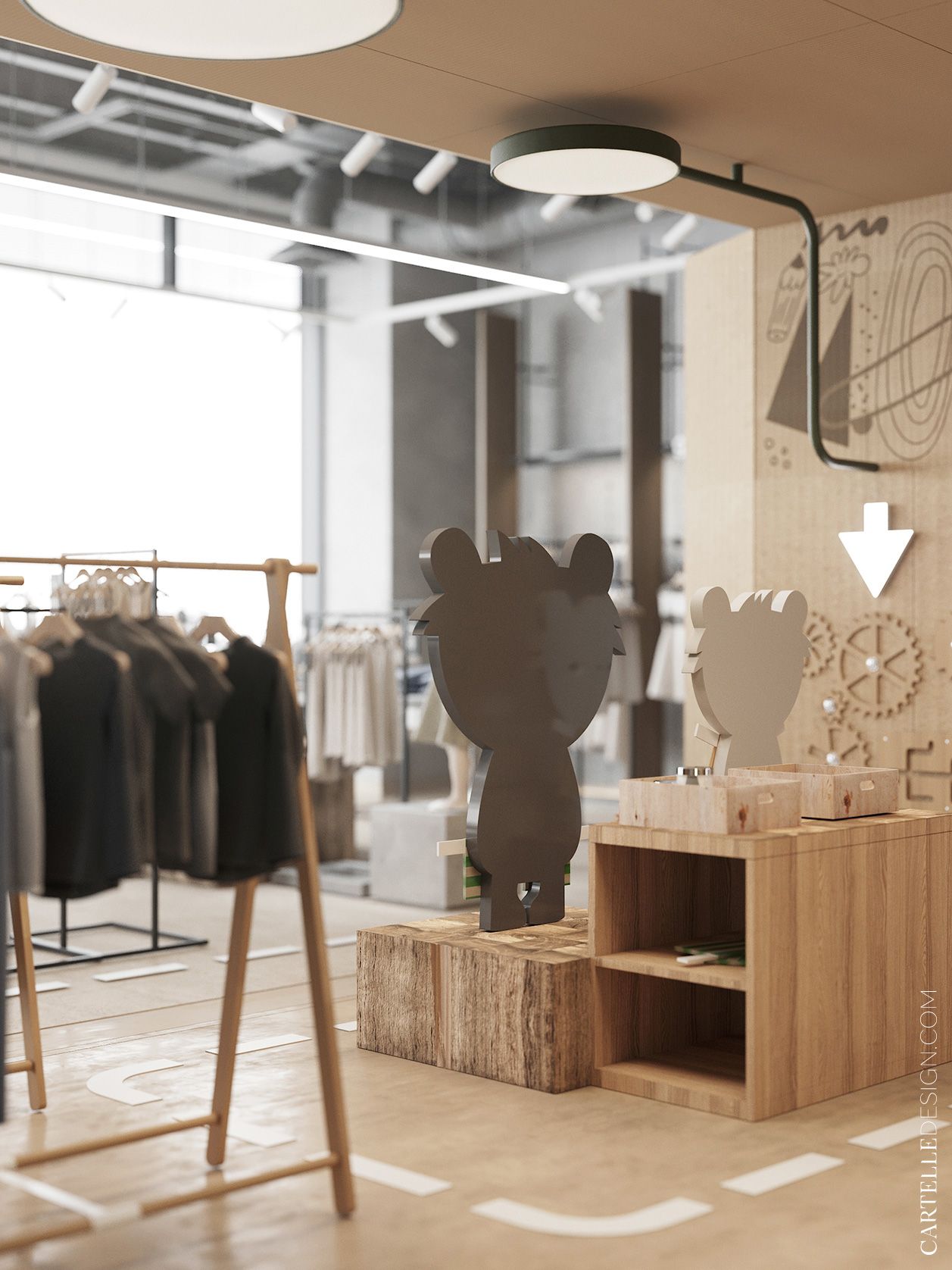
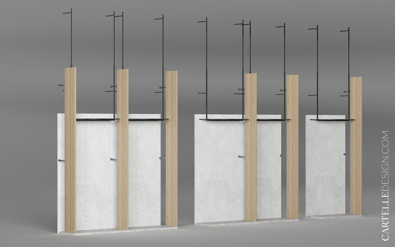
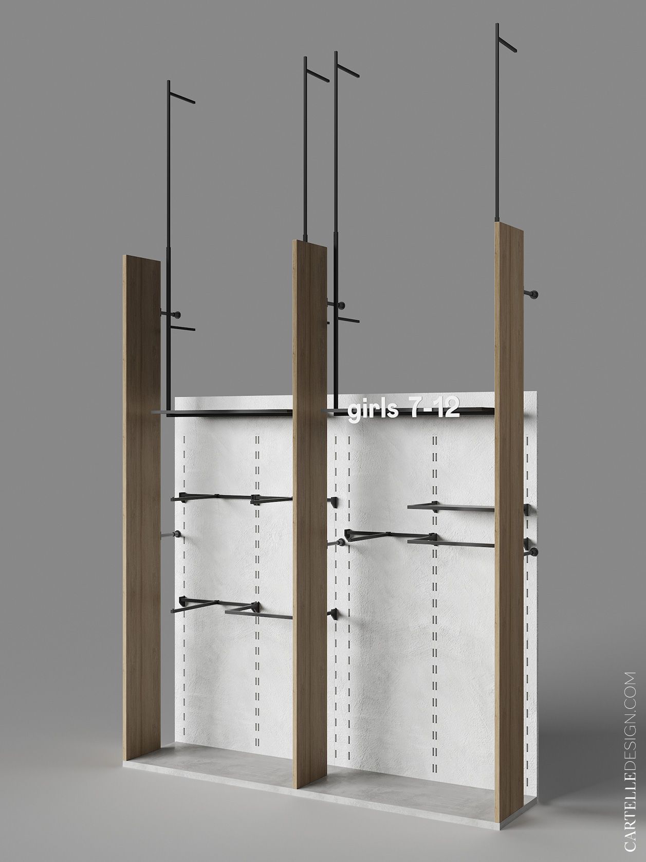
The color scheme of finishing is the same for all zones. The decor is bright navigation placed on the shelves along the walls of each zone - Wiggy bears. As well as signs with words and age on clothing equipment. Opposite the entrance we place a navigation stand in the form of a monster indicating the zoning of the store.


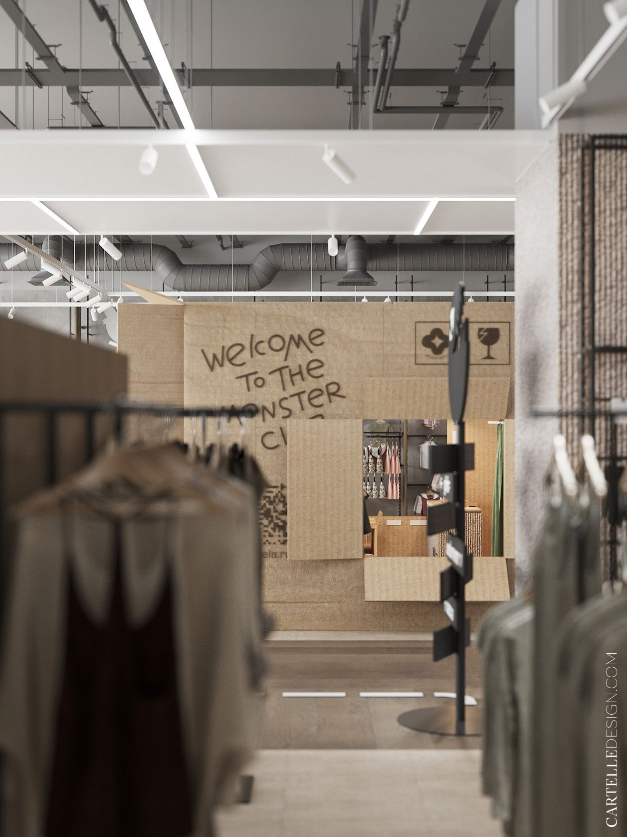
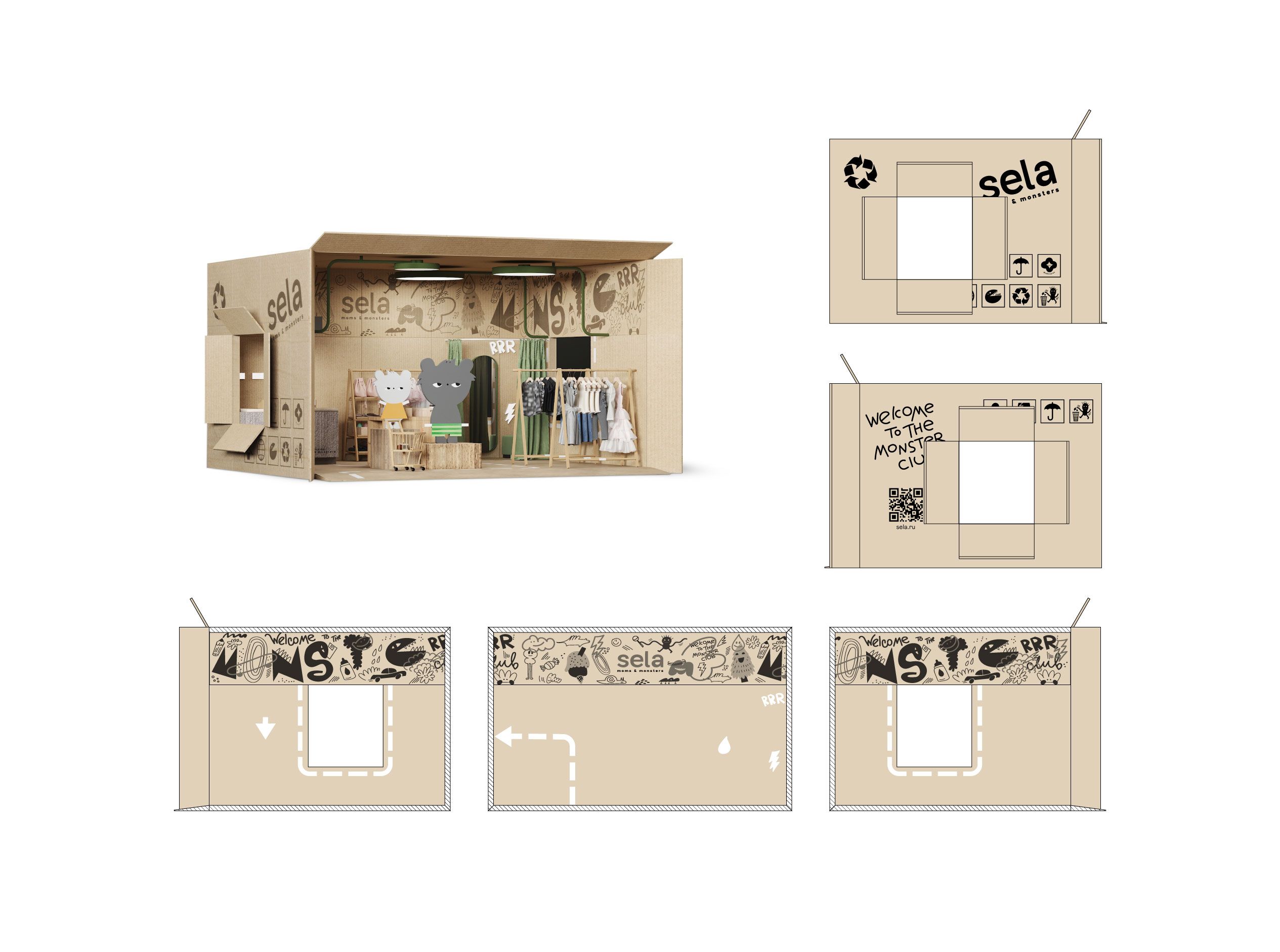
The idea of the box as a space for a play area comes from several associations. Firstly, the box as a pleasant reminder associated with purchases, parcels, gifts. The box is like a hiding place, a shelter, a place to hide. And, the box is like a place where you can put your little monsters and forget about them for a while.
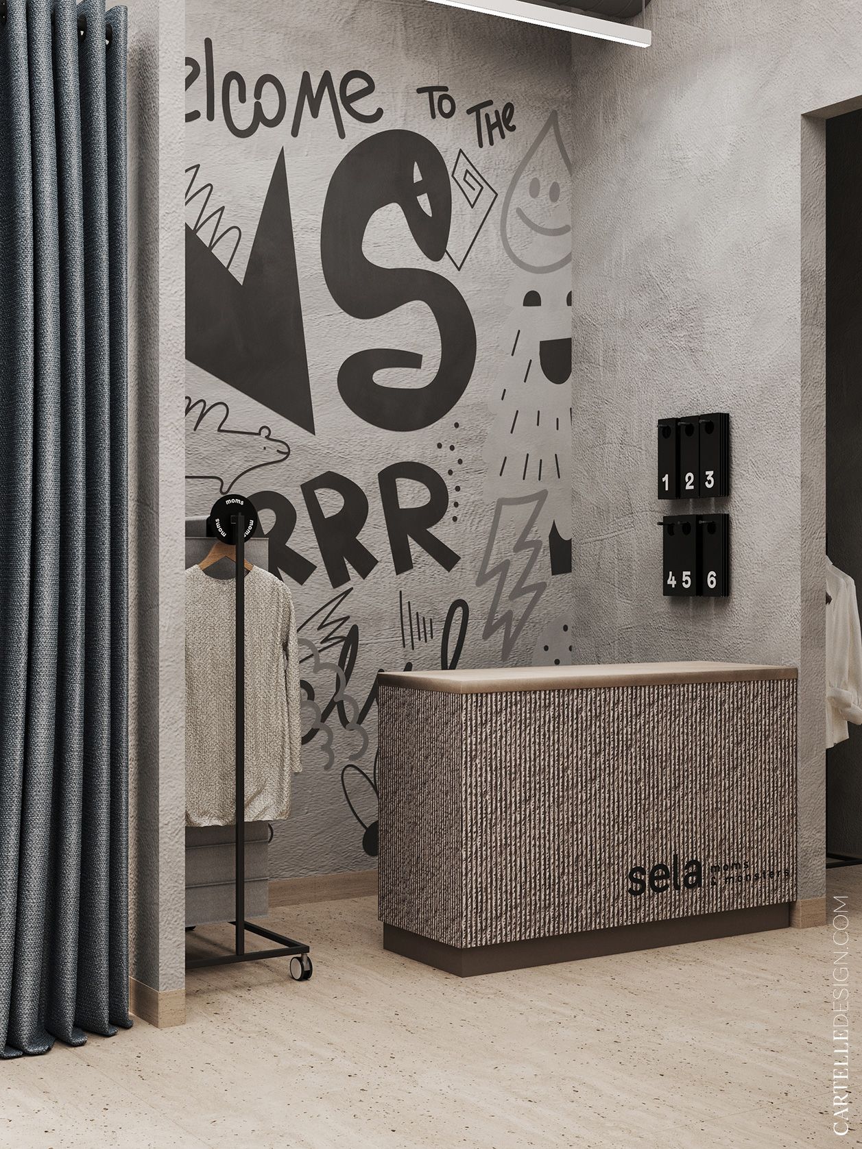
Everything in the box is like a toy, small, tactilely pleasant. Even Wiggy figurines resemble cardboard dolls. The equipment is furniture for the dolls, navigation in the form of dotted lines resembles the path on the map leading to the treasure, and the lighting is sprouts that have made their way through the walls of the box. The whole room is summed up by the signature print on the walls, which also adds frivolity, as if it was painted by children.
The final stage of work on the project was the creation of a large guideline. Its task was to convey to each team member the general concept, principles and provide comprehensive information about each design solution that was used in the project. This will simplify the work and maintain a common style in different stores.


