Office for the IT company Xpate. The guys rented a new office in the city center. The business quarter is located on the territory of a reconstructed gas plant. This is a beautiful loft area with pleasant architecture. The office is located in one of the renovated gas tanks - a round brick building.
Our task was to create a comfortable room for work with minimal investment and in a short time. The guys liked the atmosphere of the space that was created by the previous tenant - a chaotic structure, bright colors and cozy corners. And we needed to completely redo the functionality of the room, while maintaining the overall mood of the interior.


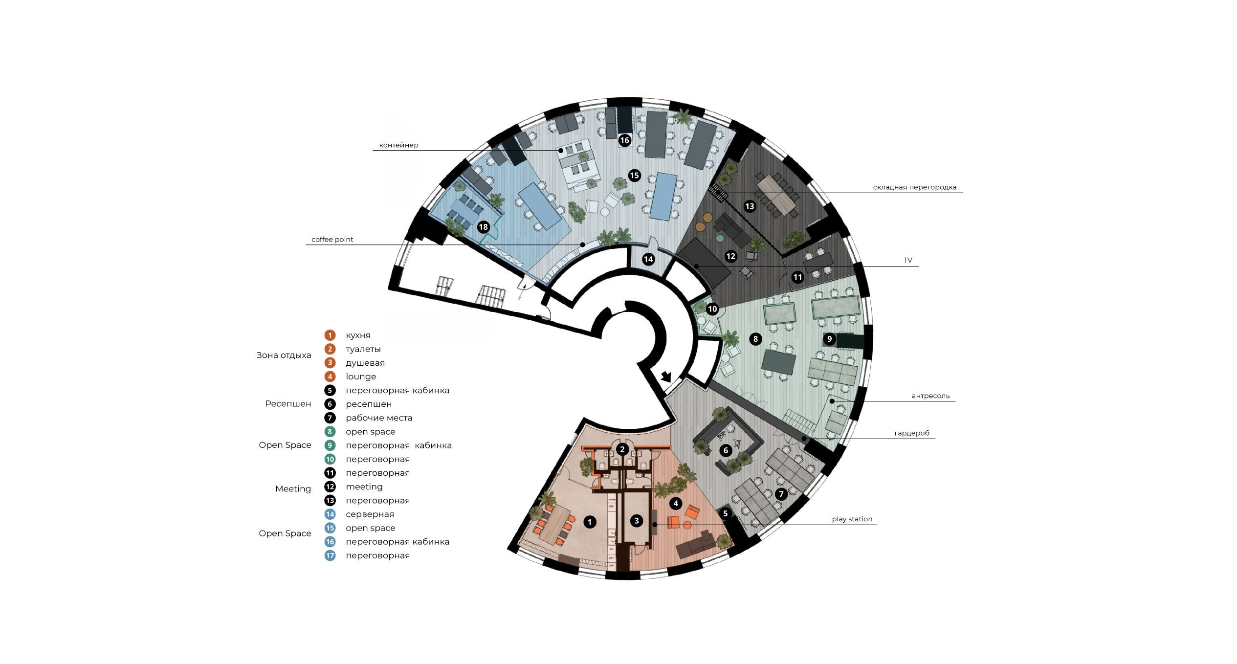
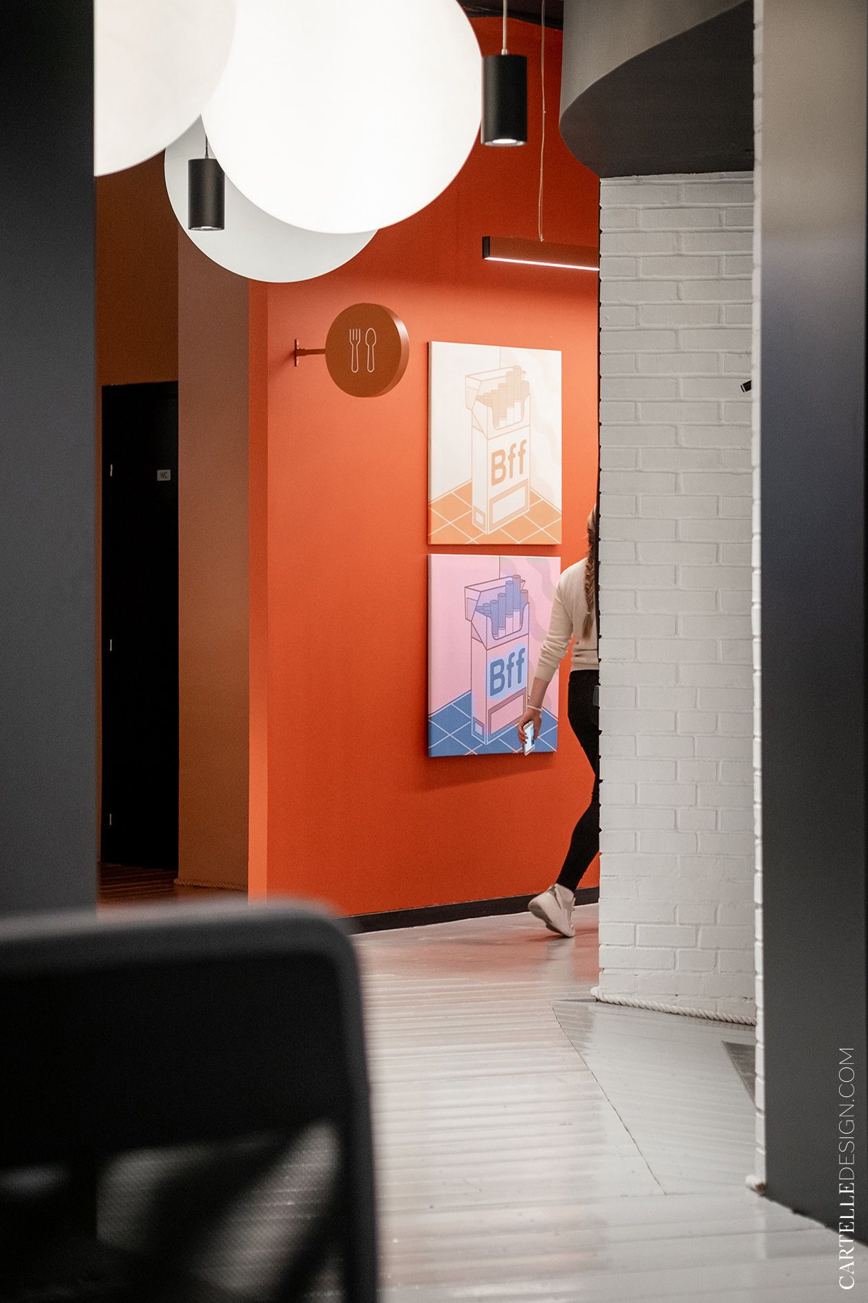
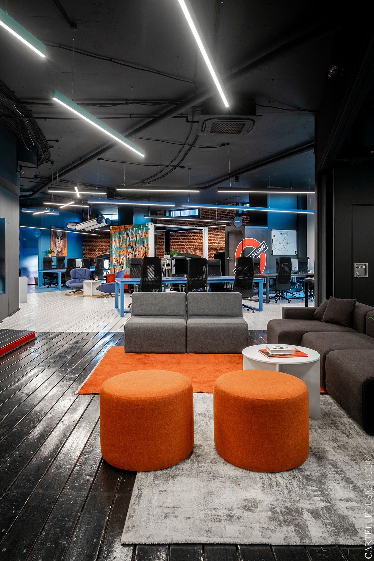
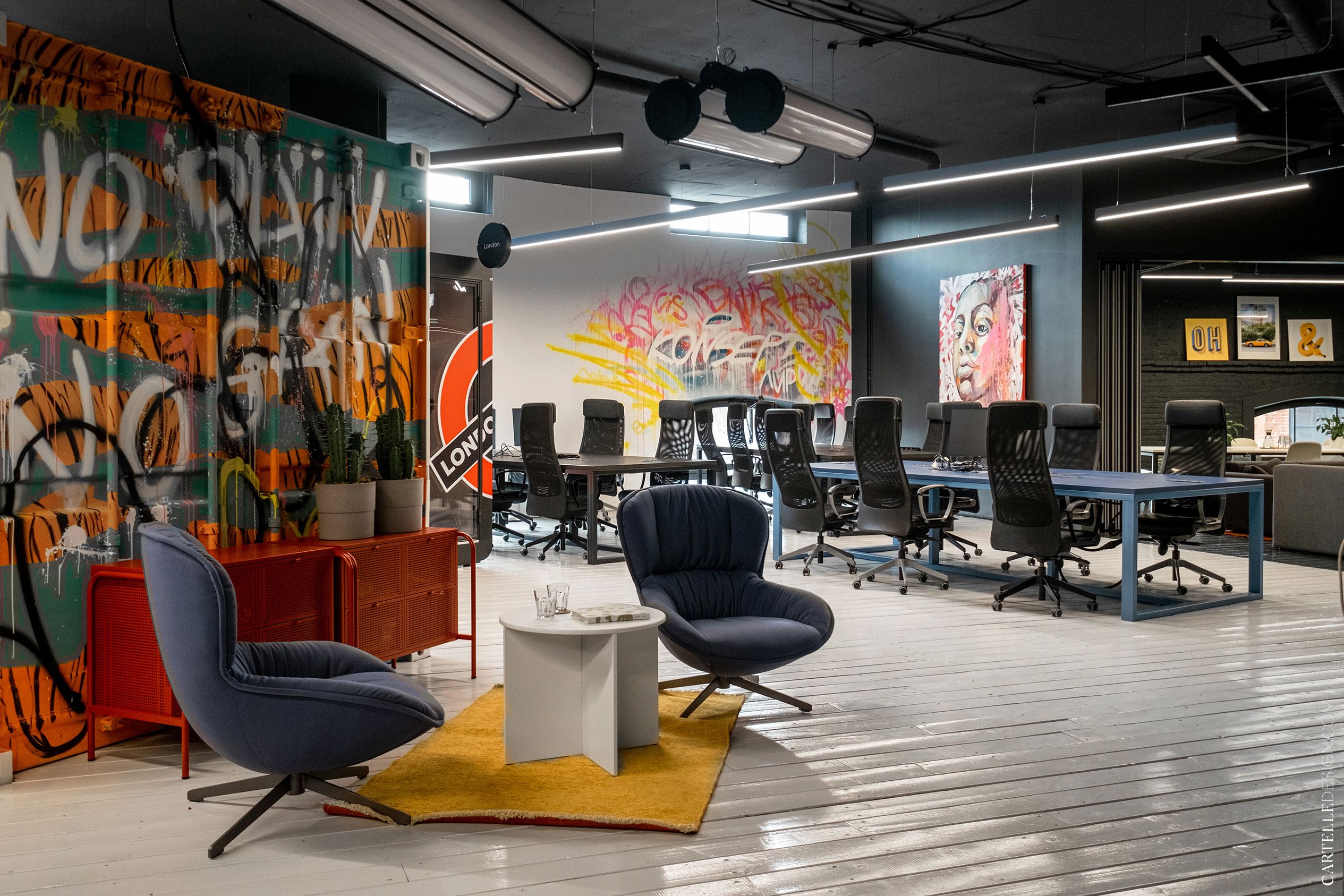
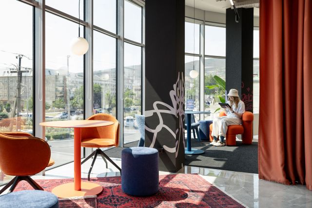
The main idea of the project was to create an office that is not associated with boring routine. We planned to add a lot of bright colors, paintings, graffiti, references to different cities, films, etc. to the interior. All this could easily turn into complete chaos. But the circular layout of the space helped us. We have cut the room into 6 segments. Each segment is decorated in its own style with its own accent color. The entire office is a single space, but only one or two zones at a time fall into the field of view. It is as if you are flying in a pipe, the walls of which change color: orange lounge area, white-green open space, black meeting, blue open space.
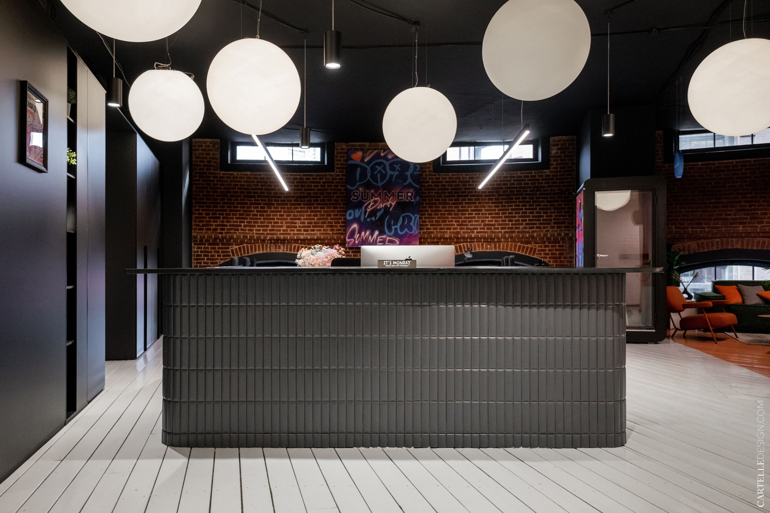
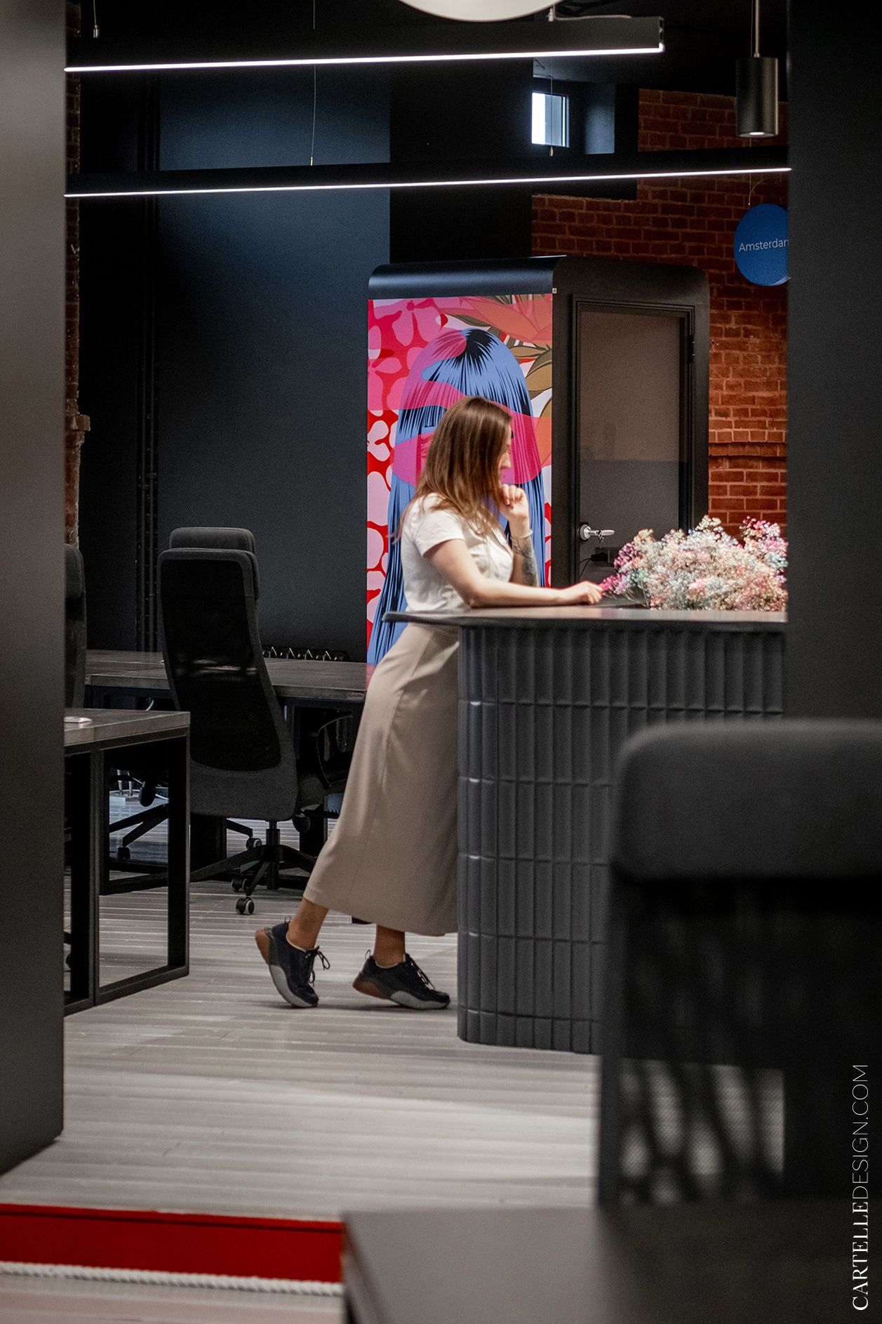
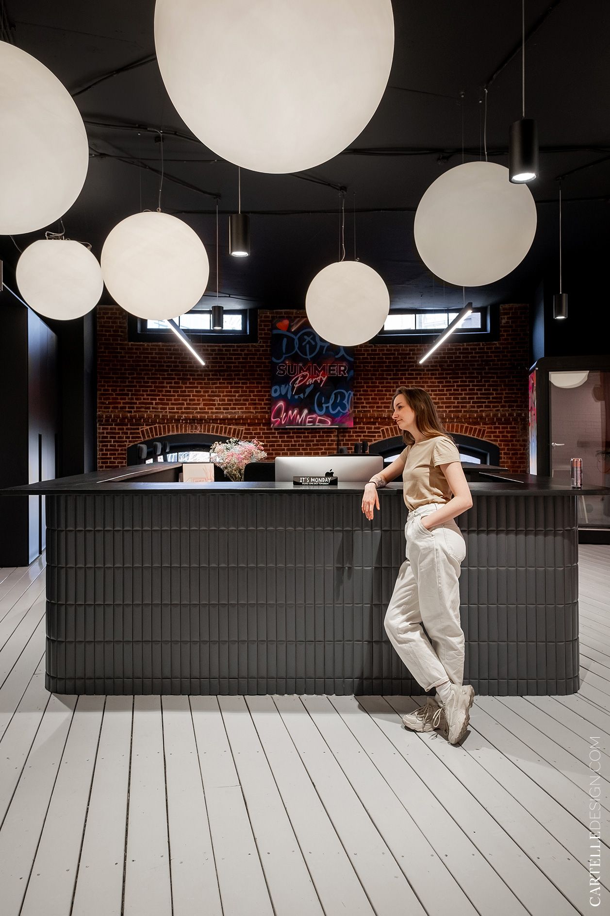
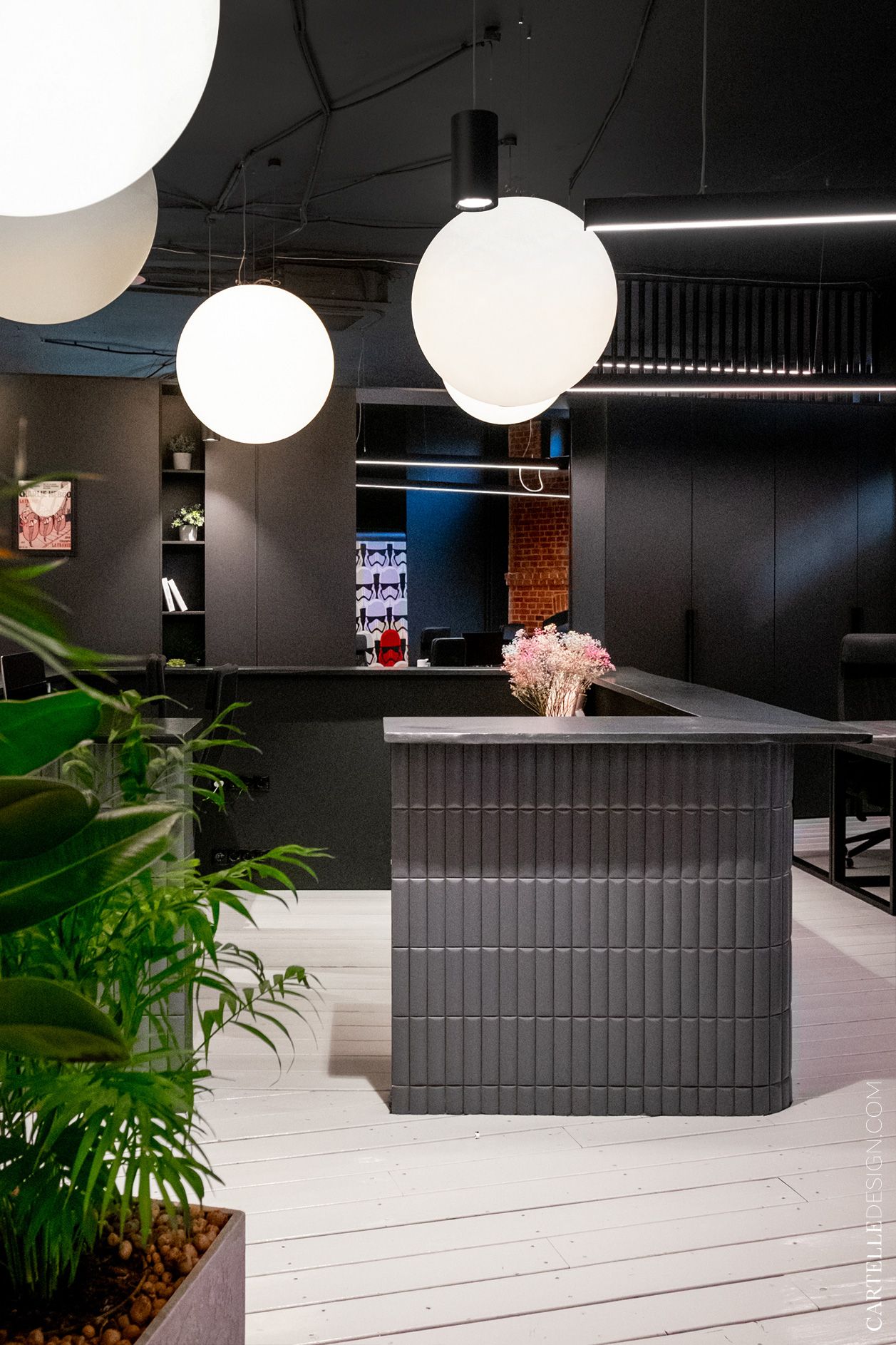
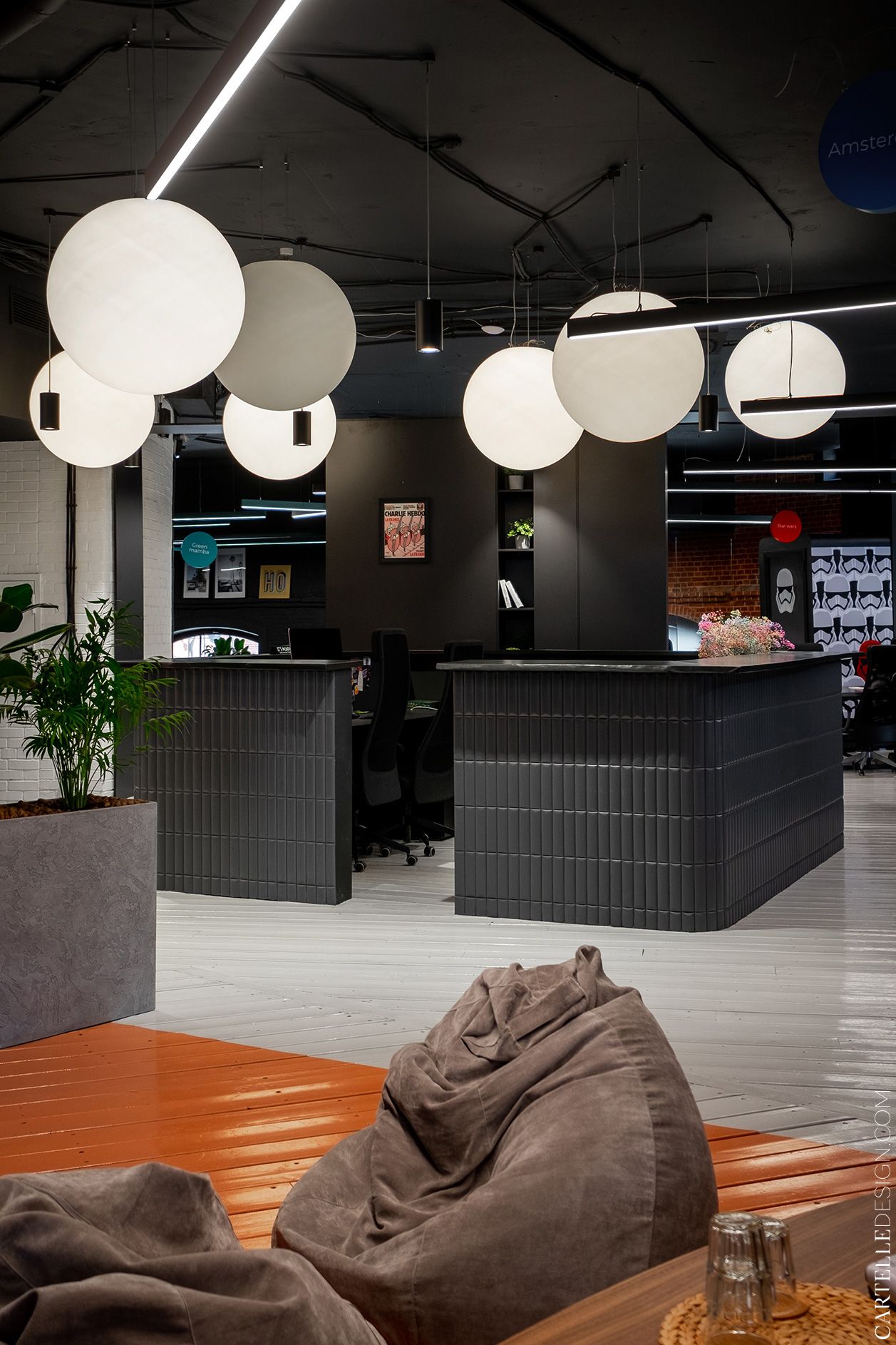
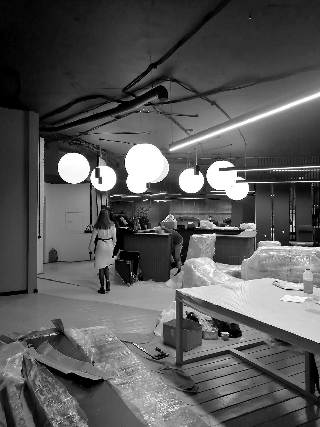
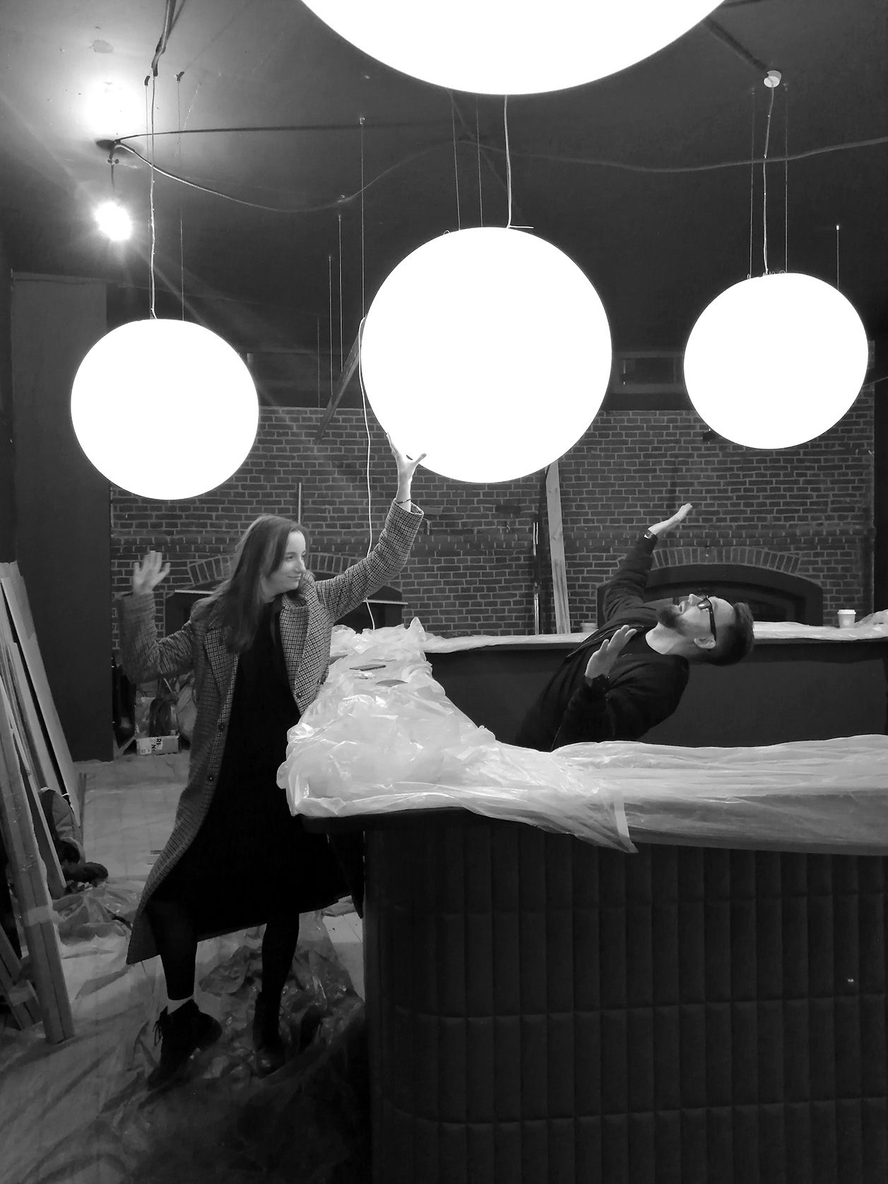
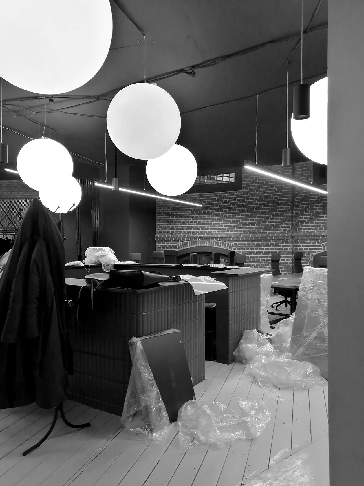
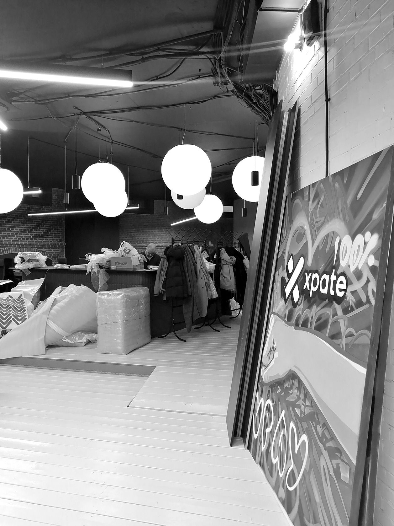
At the entrance to the office we are greeted by a reception desk faced with relief tiles and large round lamps from MDM-light. The project had a tight deadline and a limited budget, so we kept the wooden flooring. It was painted with different colors of paint to visually separate the different zones.
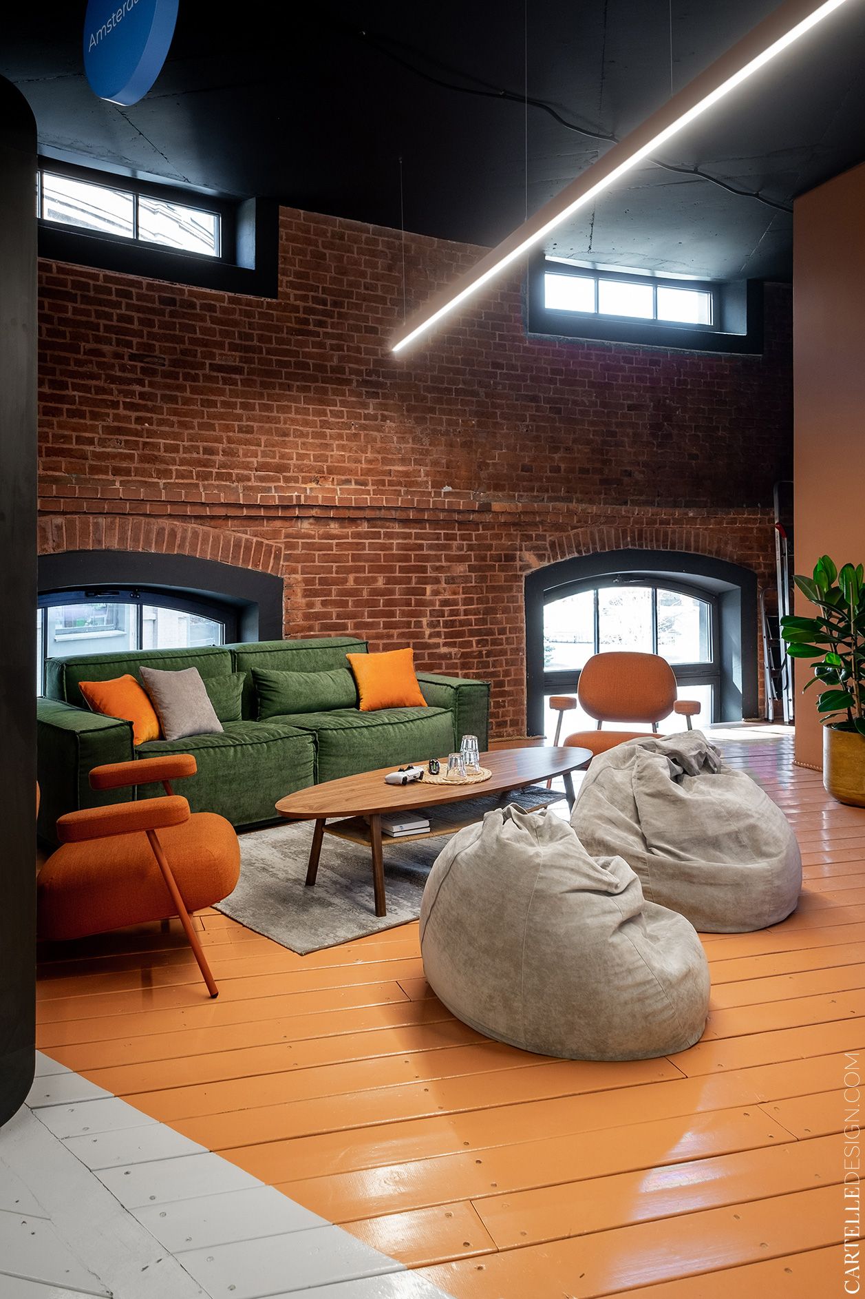
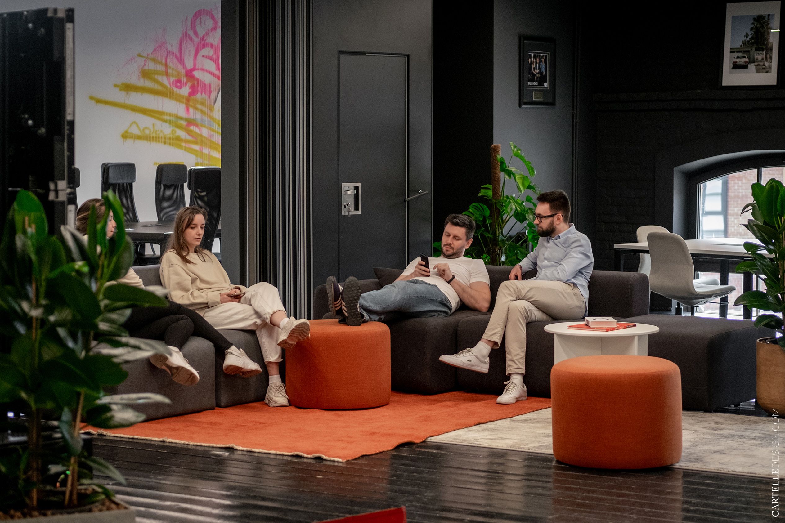
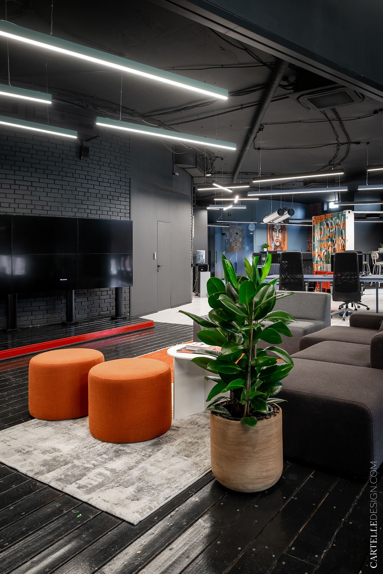
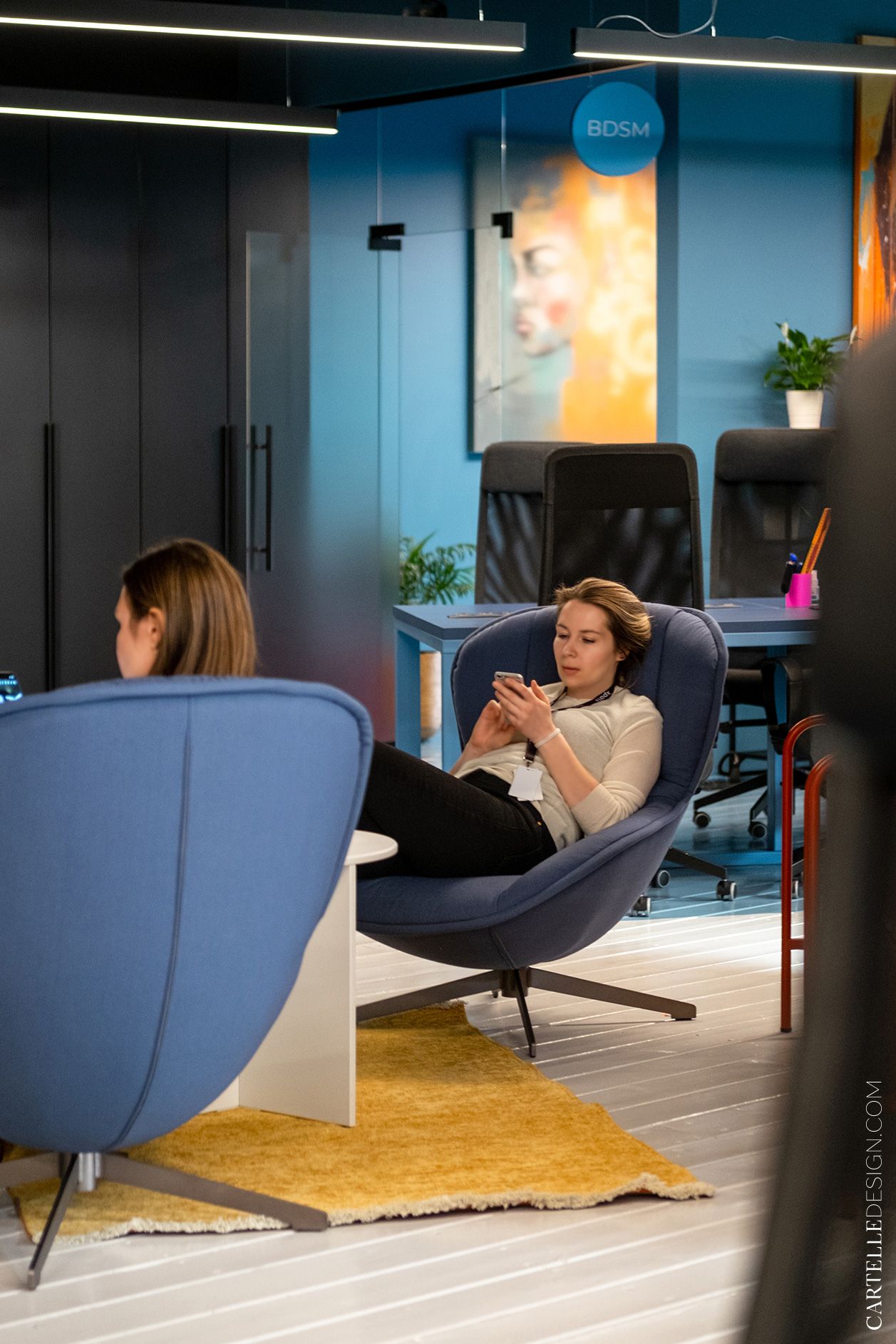
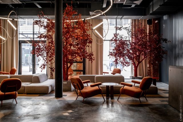
The kitchen, toilets, shower room and sitting area are located on the right in the orange segment. In the lounge area there is a sofa, armchairs and a table - Delo design.
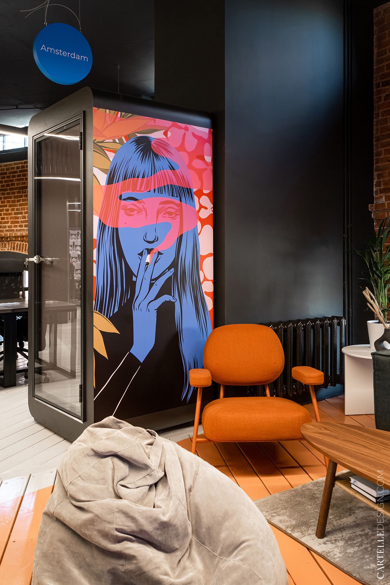
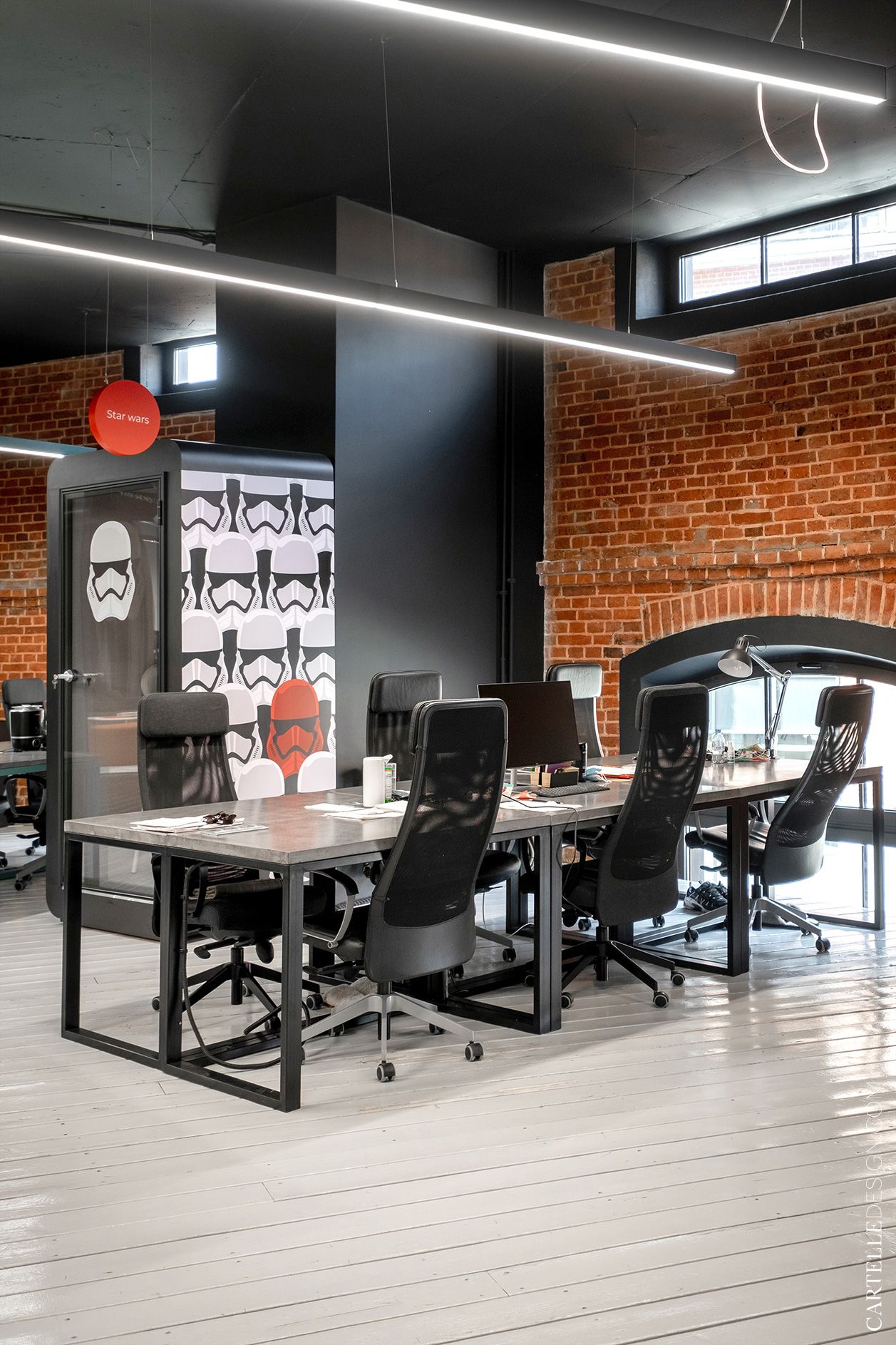
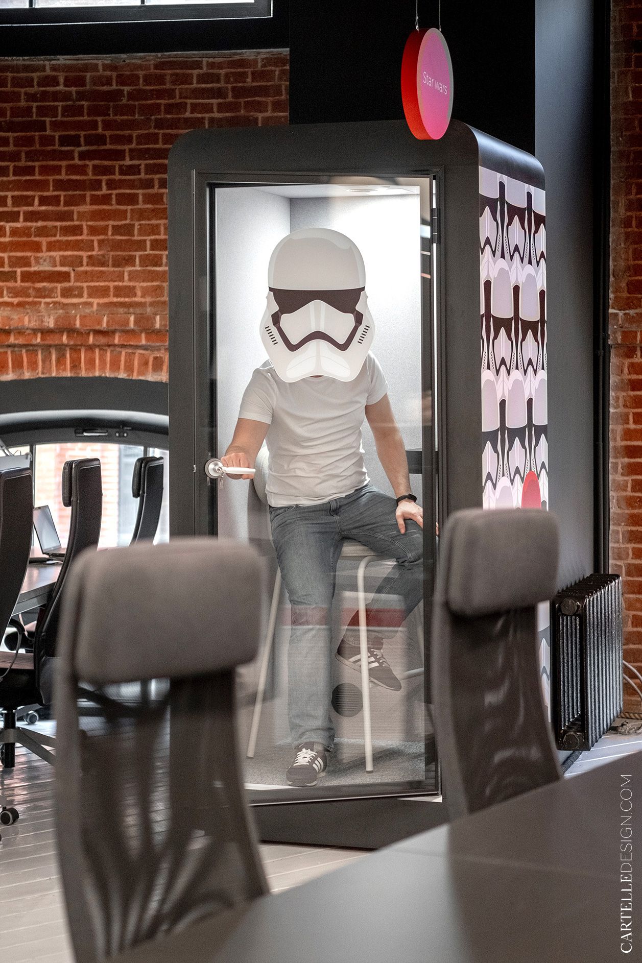
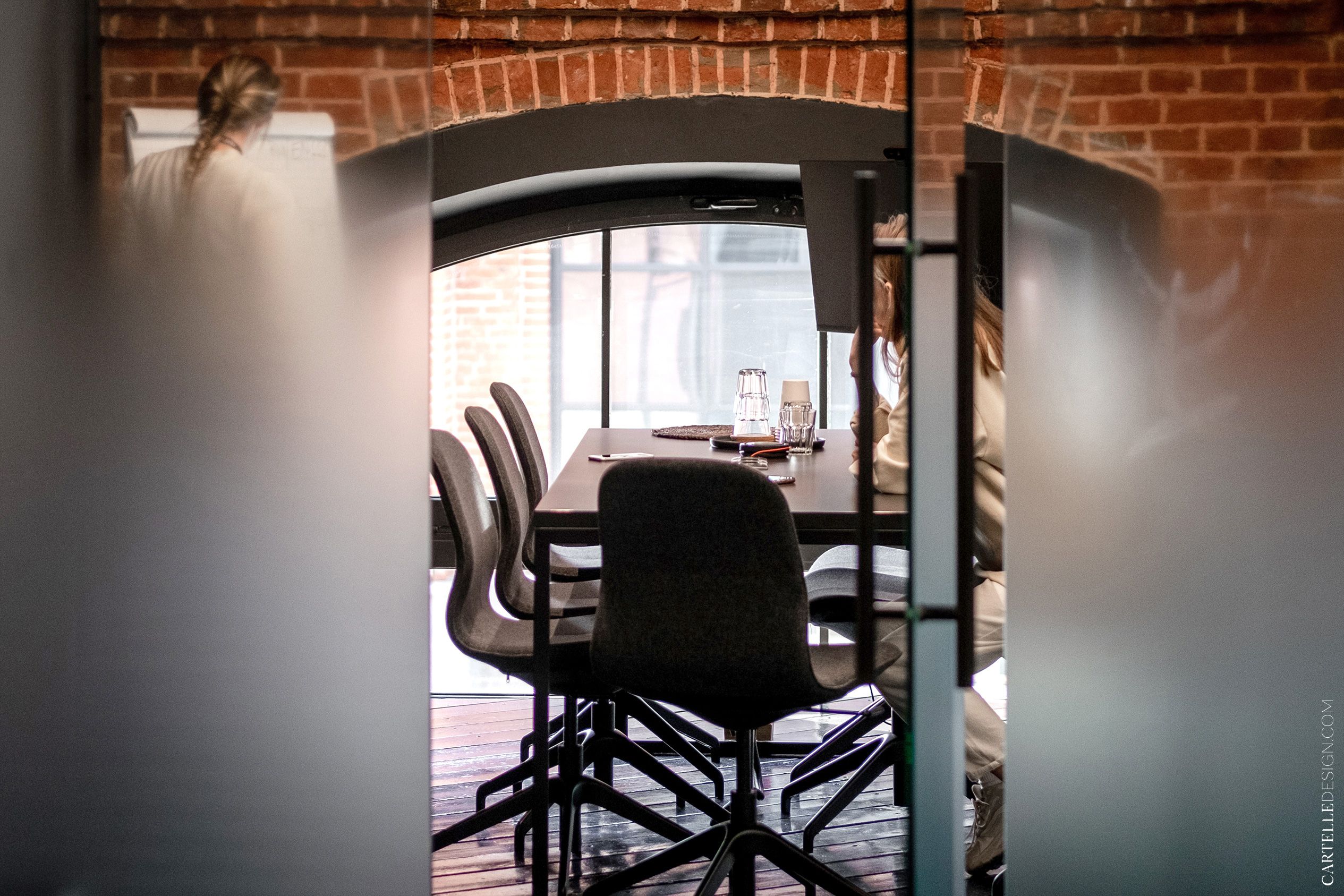
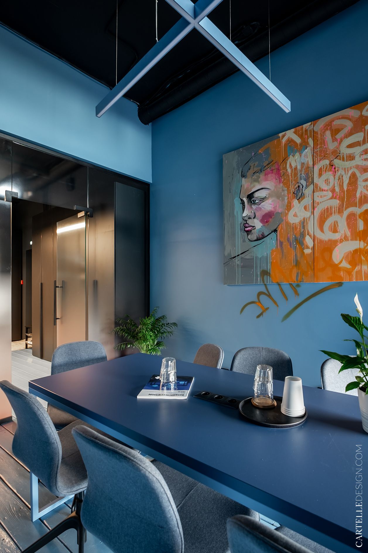
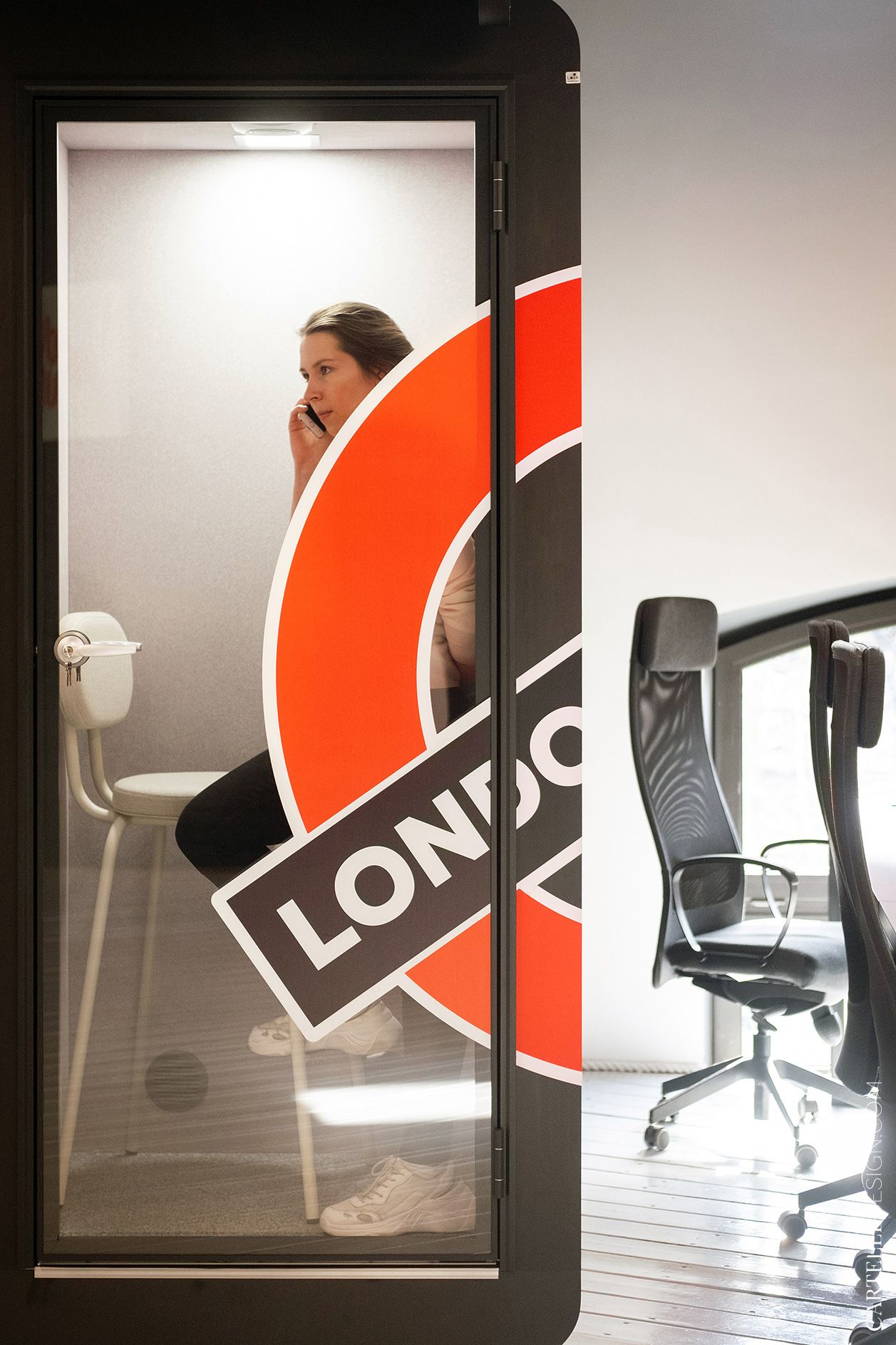
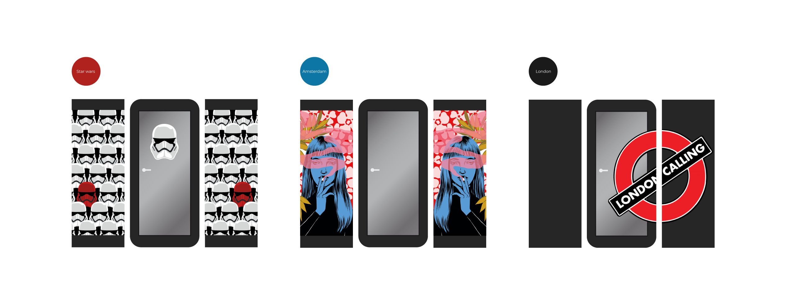
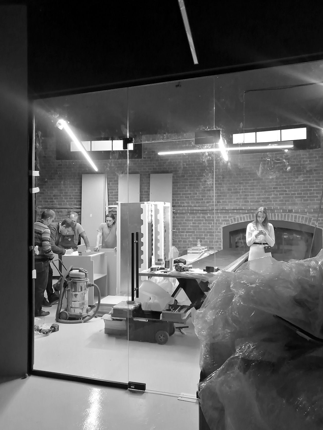
The customers asked to provide for a sufficient number of meeting rooms. The office has 4 meeting rooms of different sizes and 3 acoustic booths. Each meeting room has its own name and graphic design.
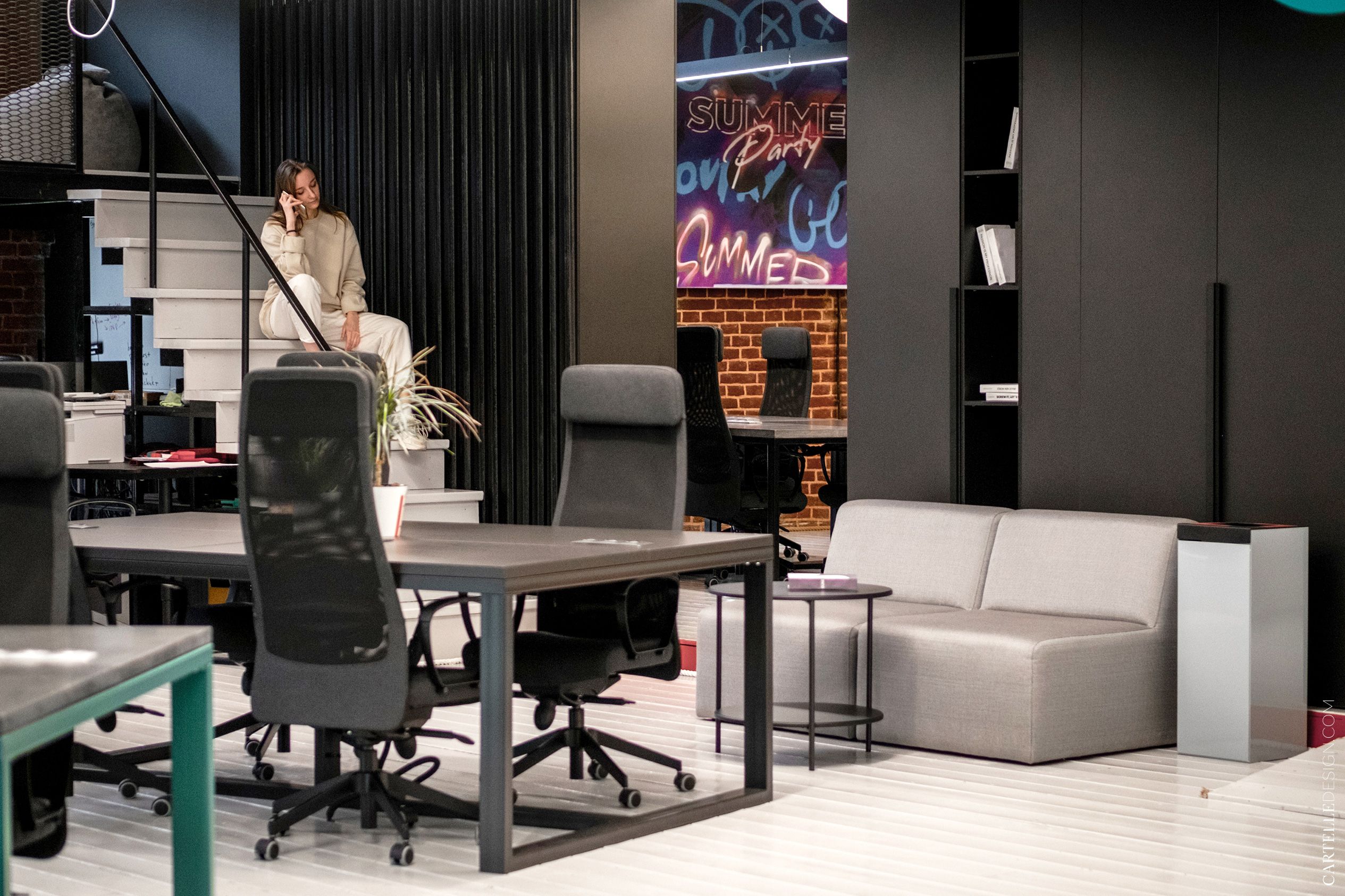
There are several workplaces behind the counter. It is difficult to place rectangular furniture in a space with a circular layout. Therefore, we placed a large storage system with a wardrobe perpendicular to the walls. It zoning the space.
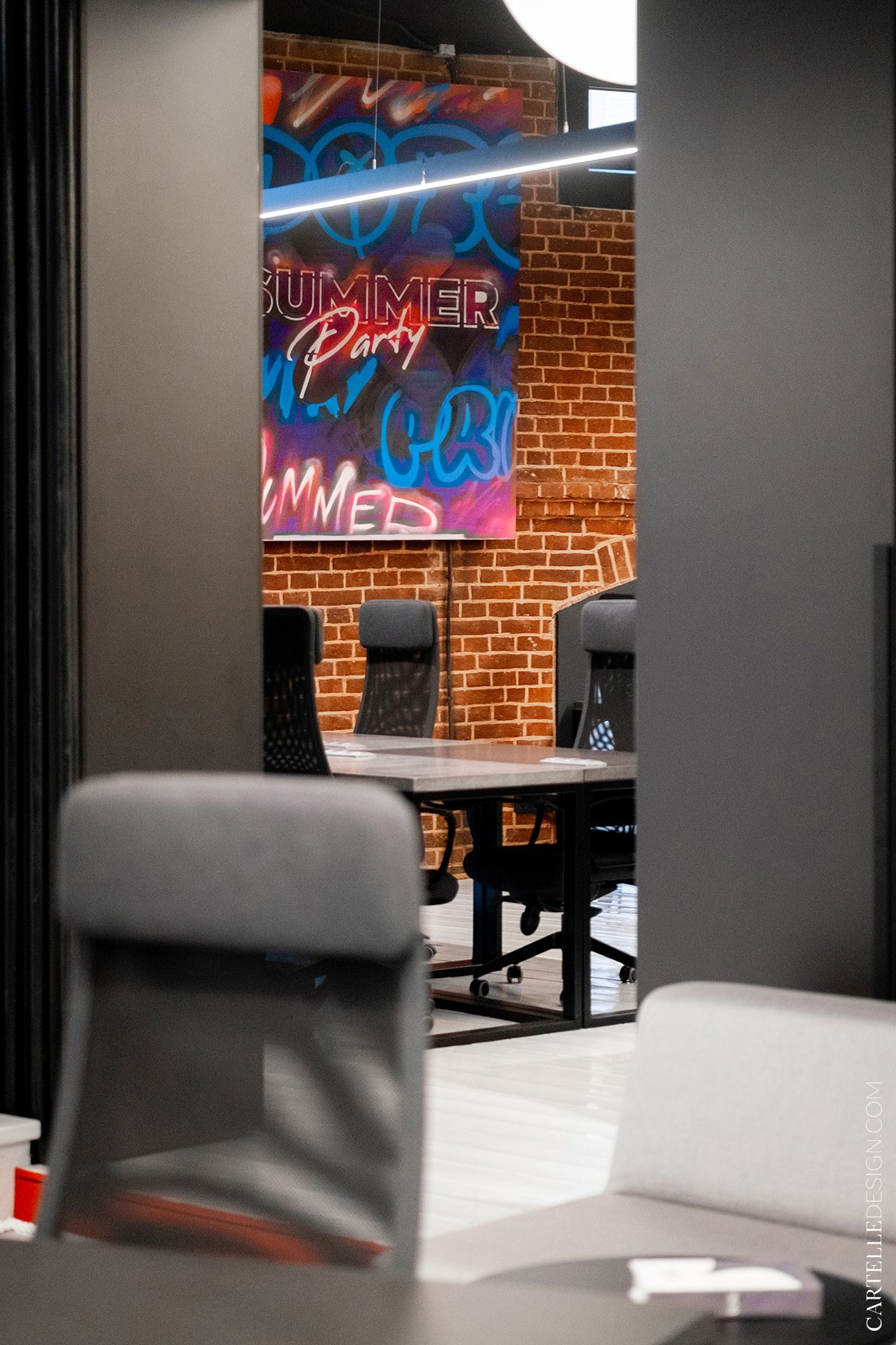
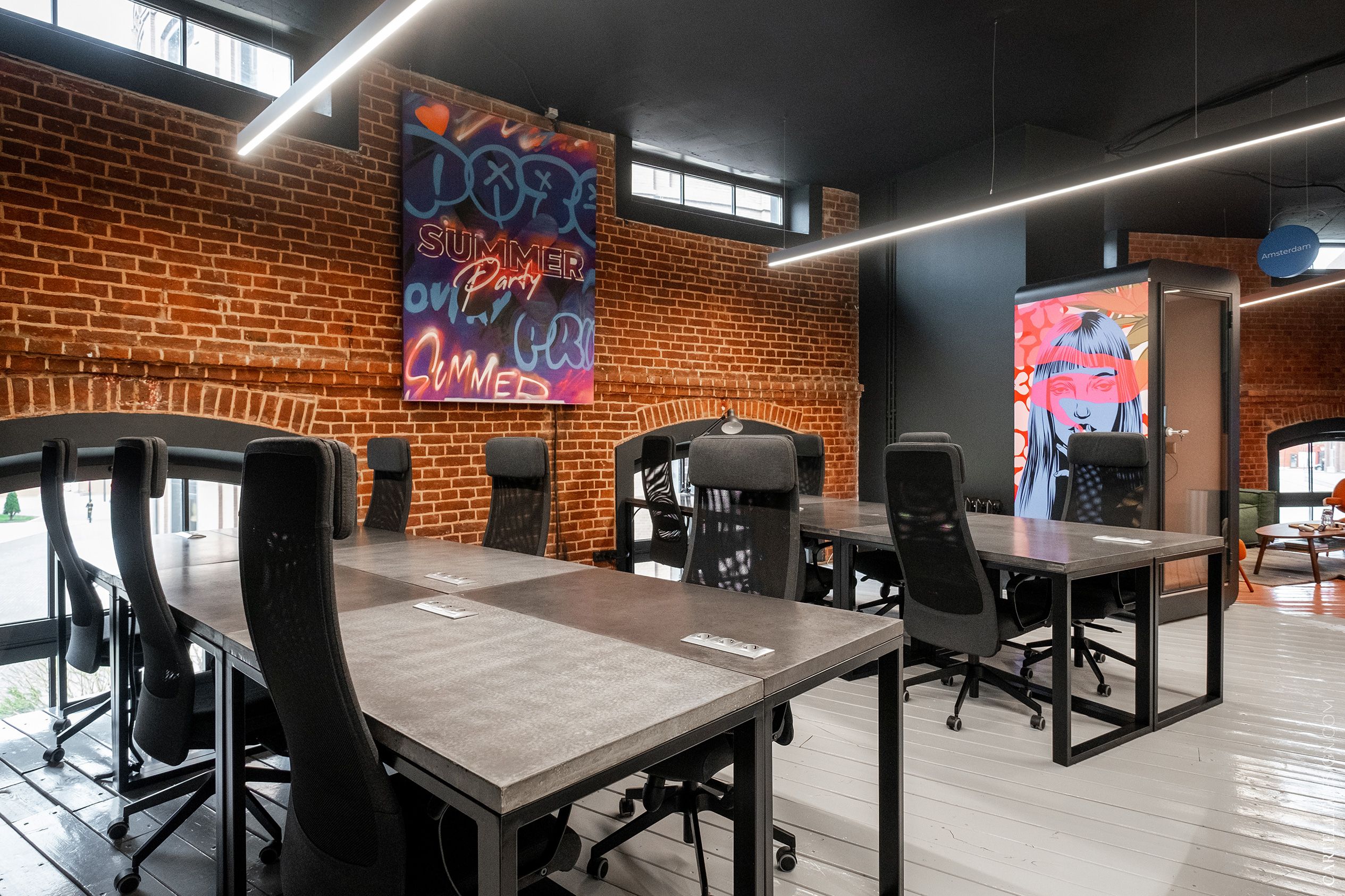
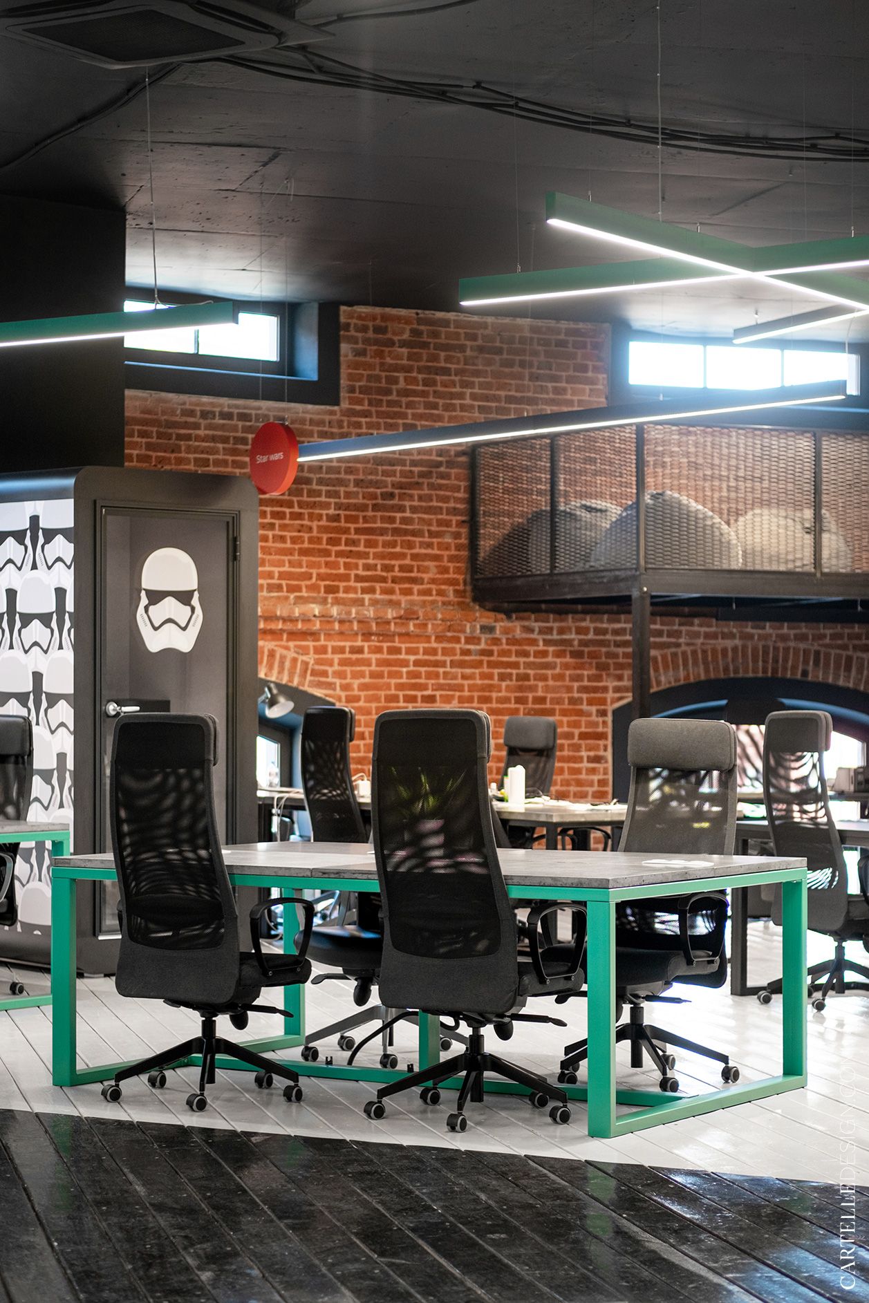
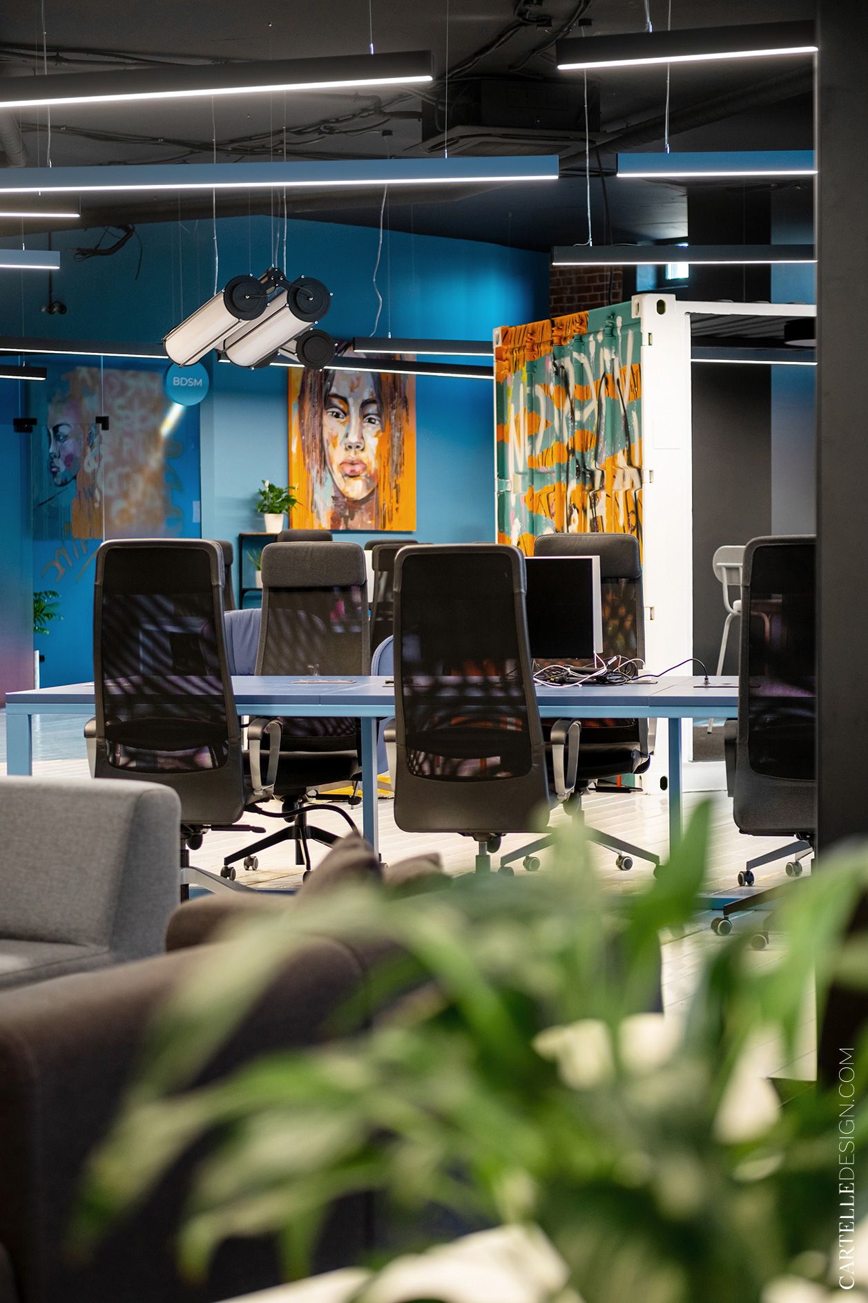
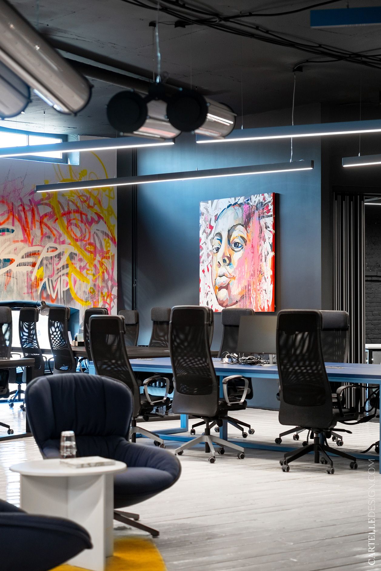
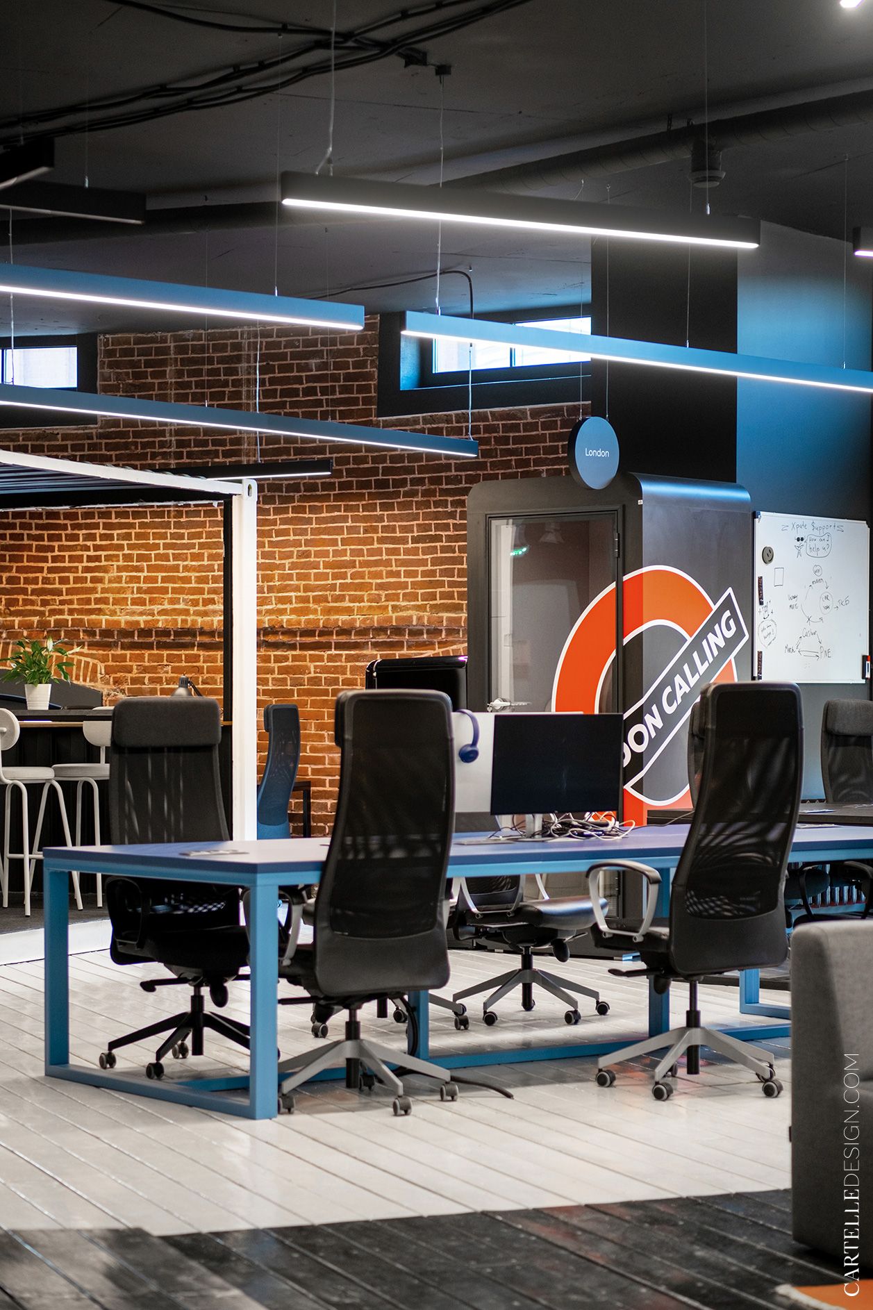
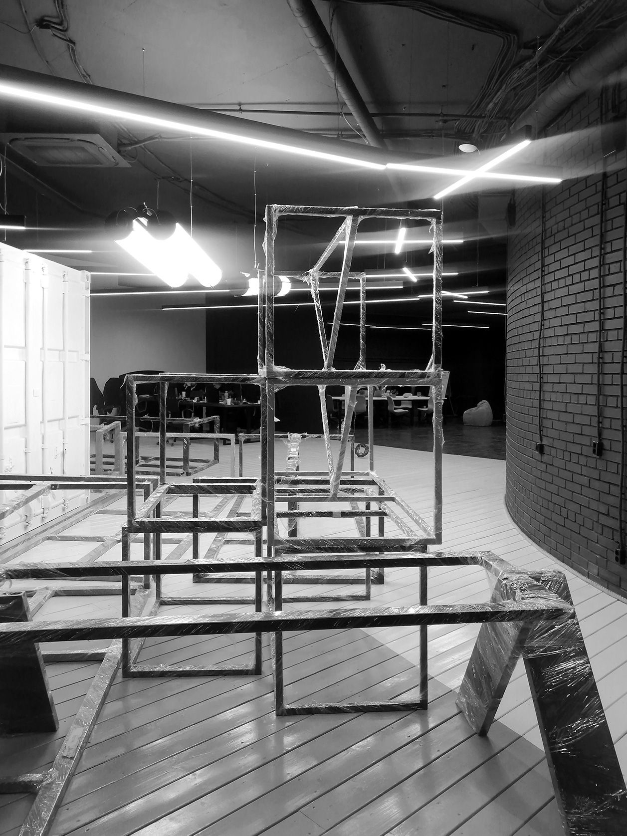
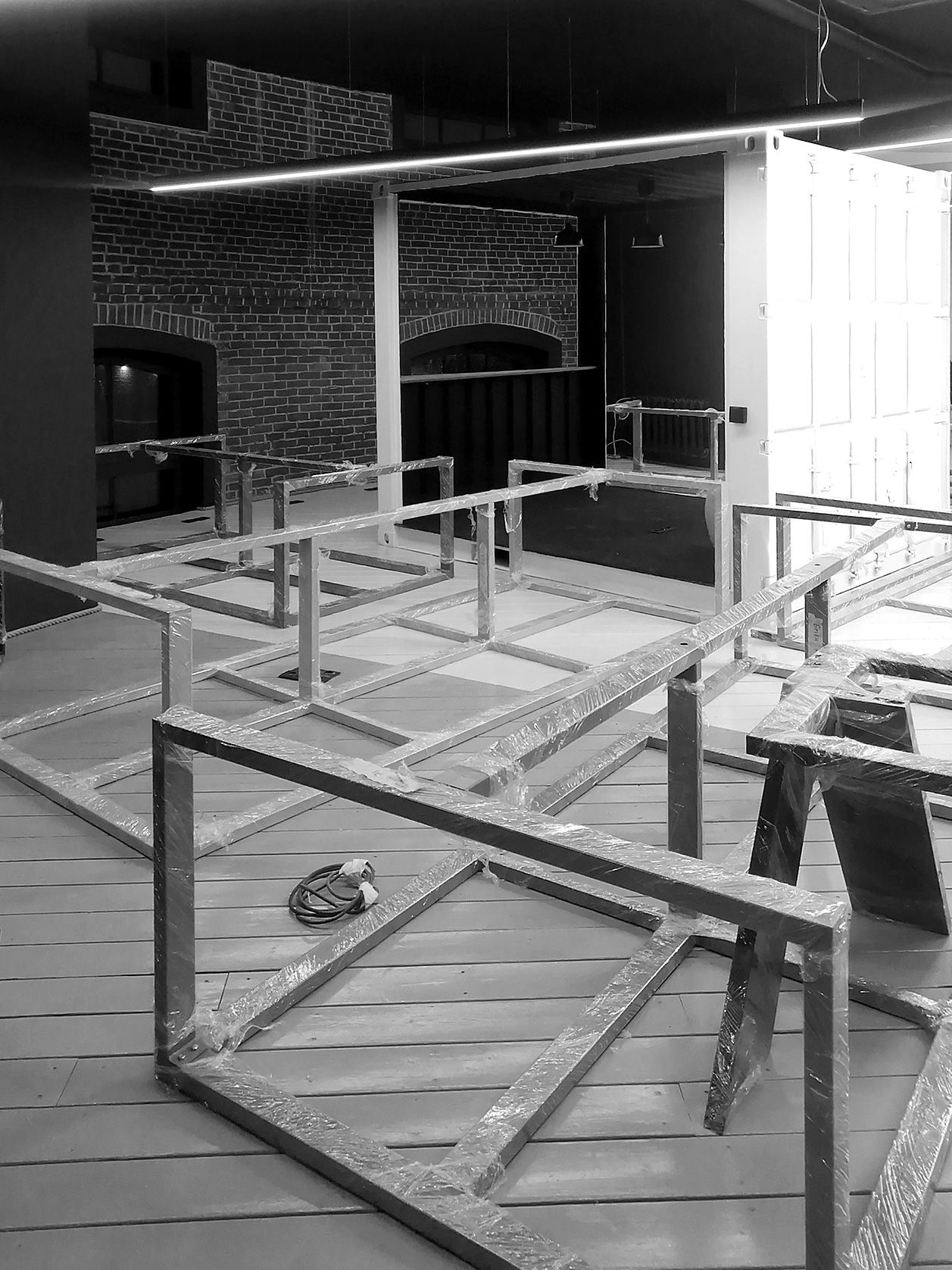
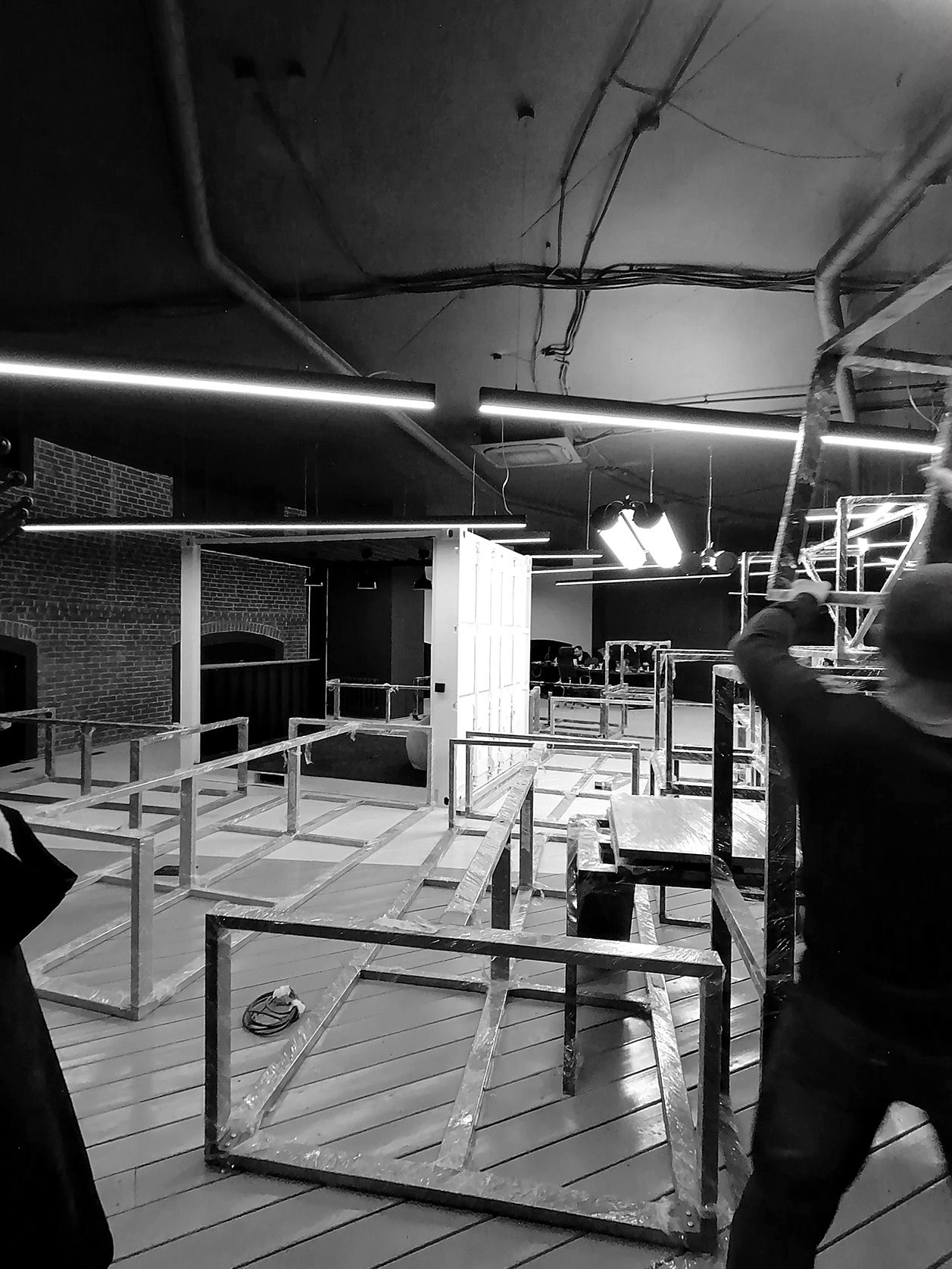
A large open space for 66 workplaces is divided by a multifunctional meeting area. This half has brick walls, a light floor, and green accent tables. The tables were made according to our sketches by Hardkea. The tables have built-in sockets, they are connected through a cable channel in the floor. We bought work chairs in the IKEA.
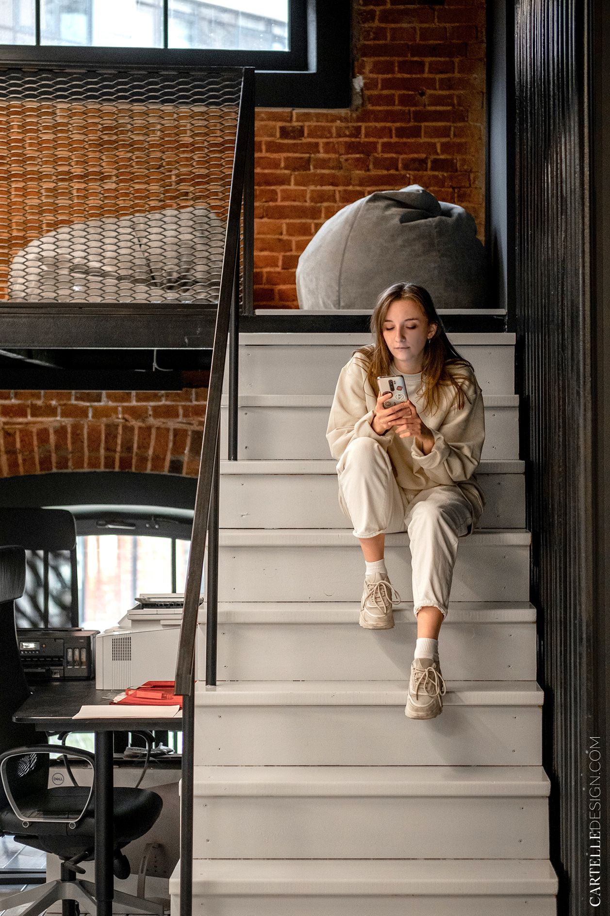
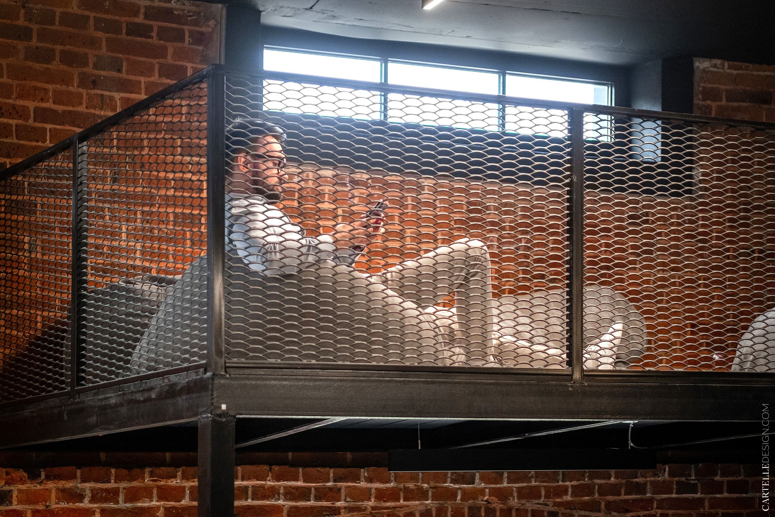
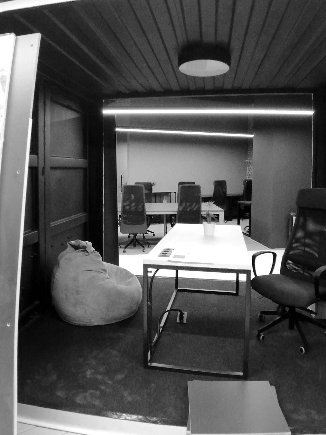
There is a small mezzanine at the entrance to the open space. On the beanbag chair, you can take a short break or work with a laptop.
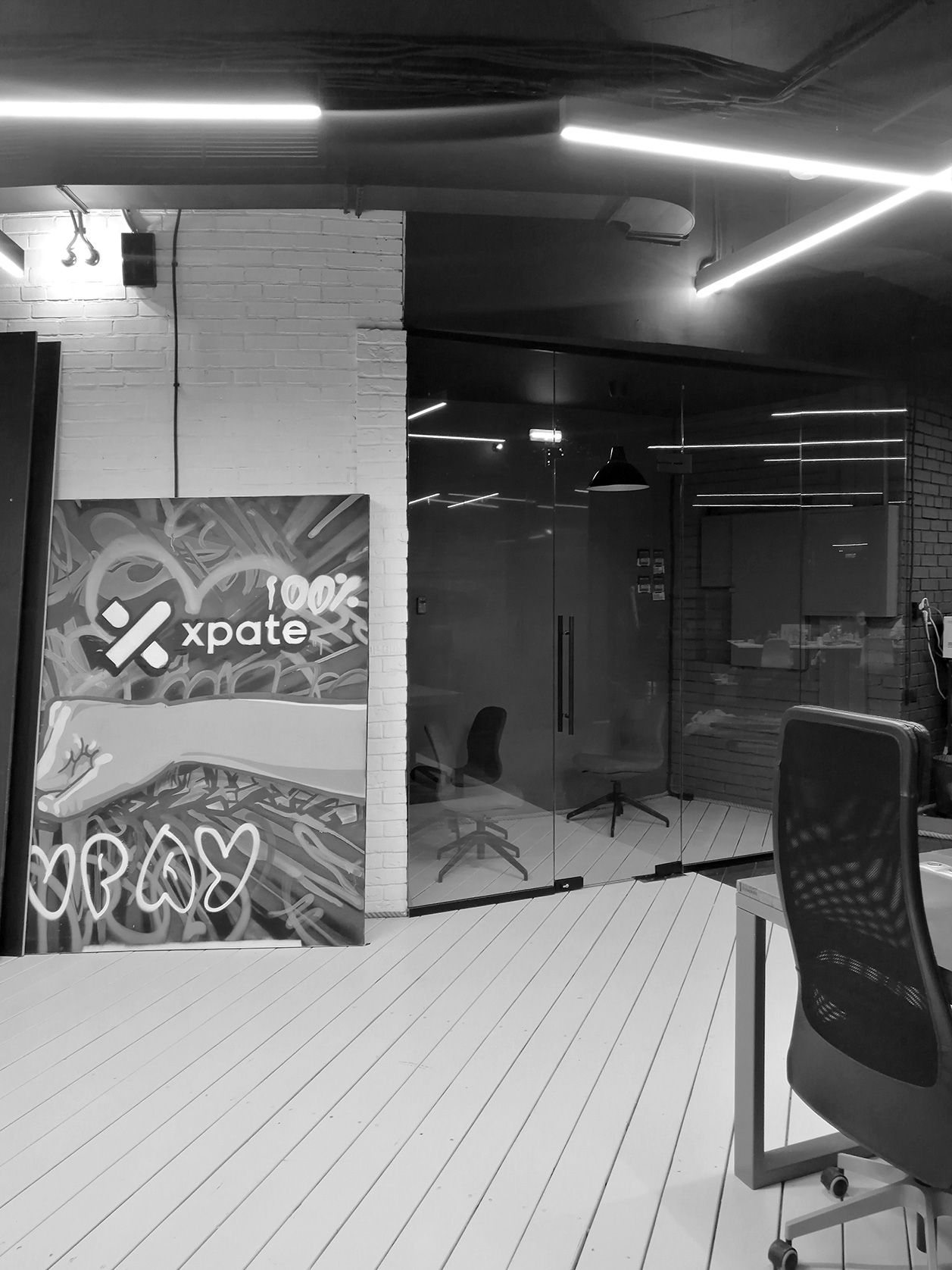
In this part of the open space there are two meeting rooms for two and four people. The meeting rooms are separated by glass partitions with a translucent green gradient. The gradient is a reference to the corporate identity of the company. It allows you to make meeting rooms more private while maintaining a sense of a single space.
Meeting is a transforming room in the center of the office that divides the open space into two parts. It can be used as a meeting room for 10 people, completely isolated from other parts of the office. Or as a common lounge, where the entire office can watch a movie or arrange a video conference.
We placed a soft panel there and made a folding soundproof partition with a door. The table in the meeting room is also foldable. If necessary, it can be assembled and organized into a large common space in front of the screen.
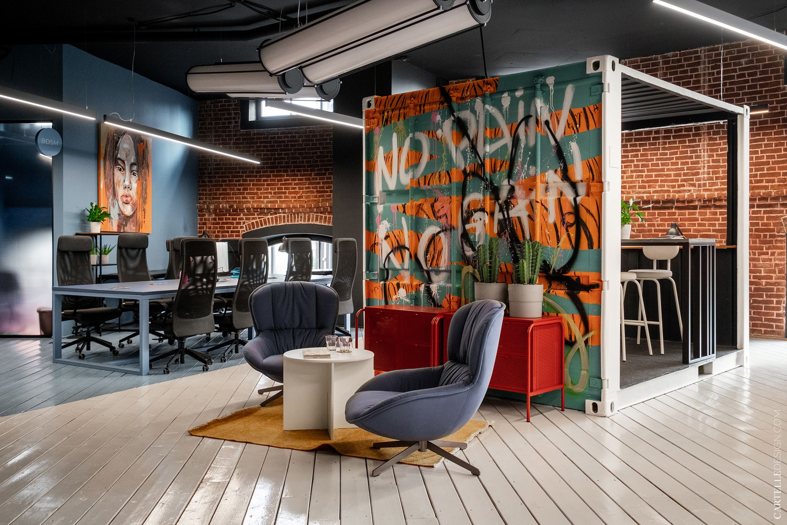
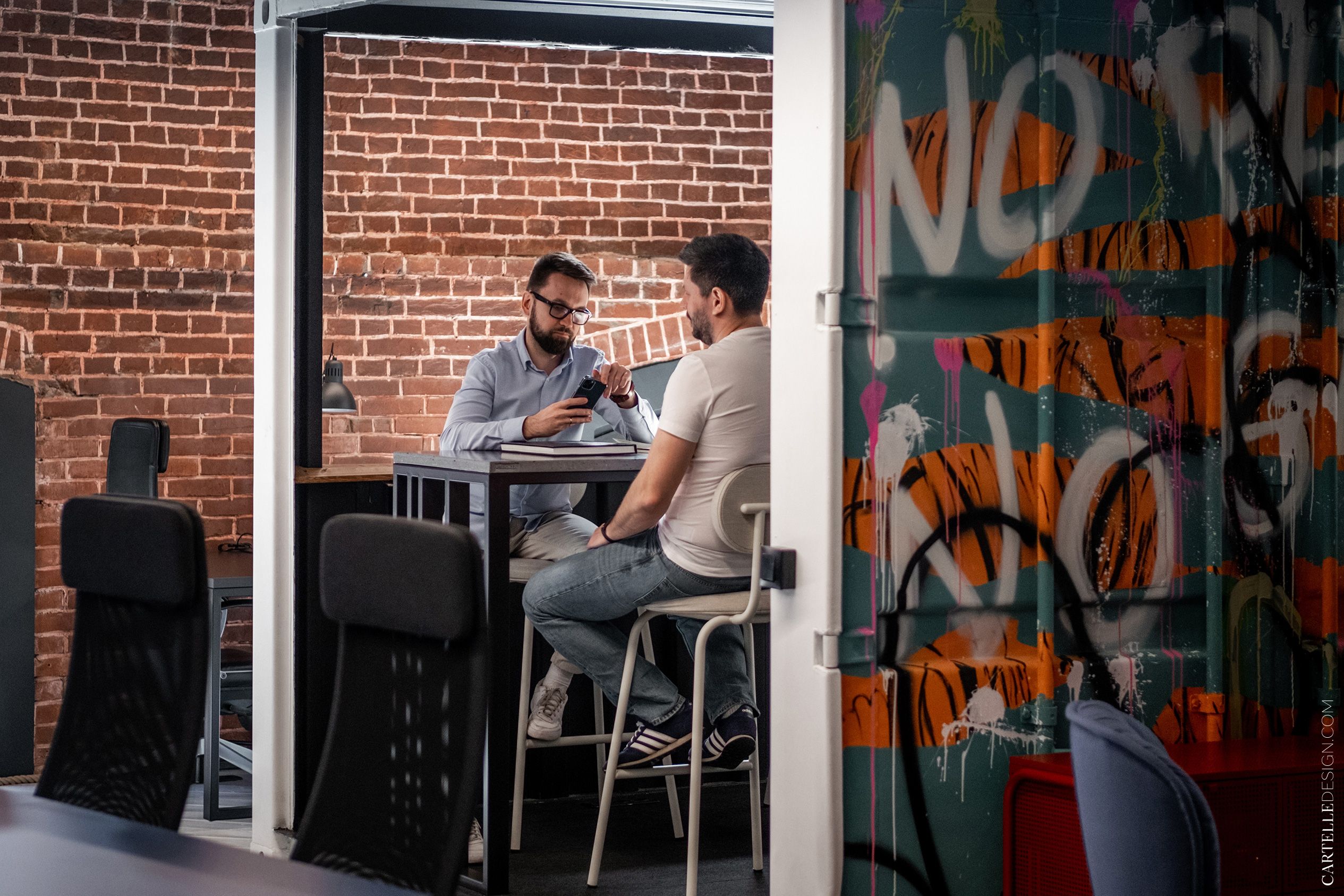
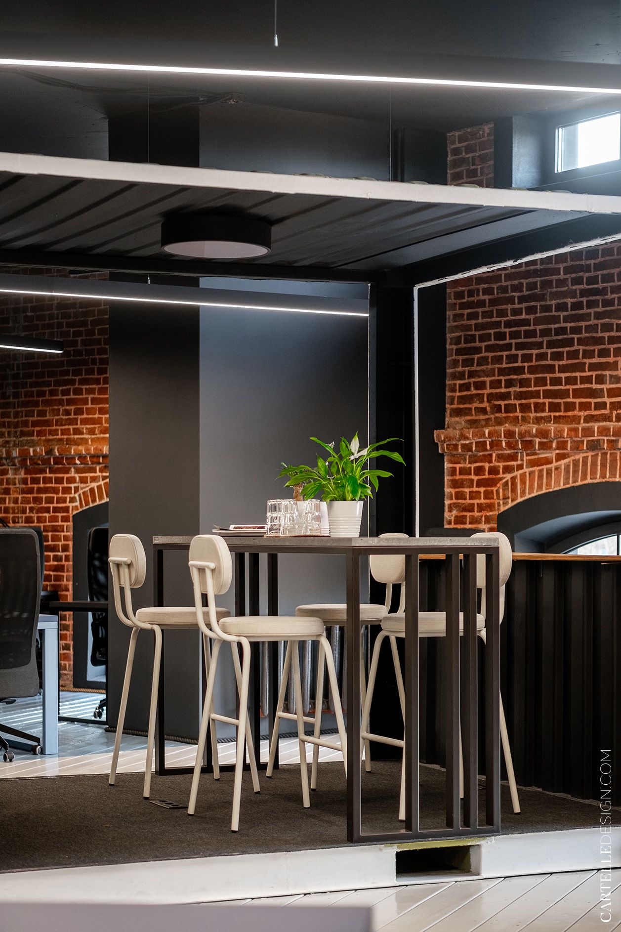
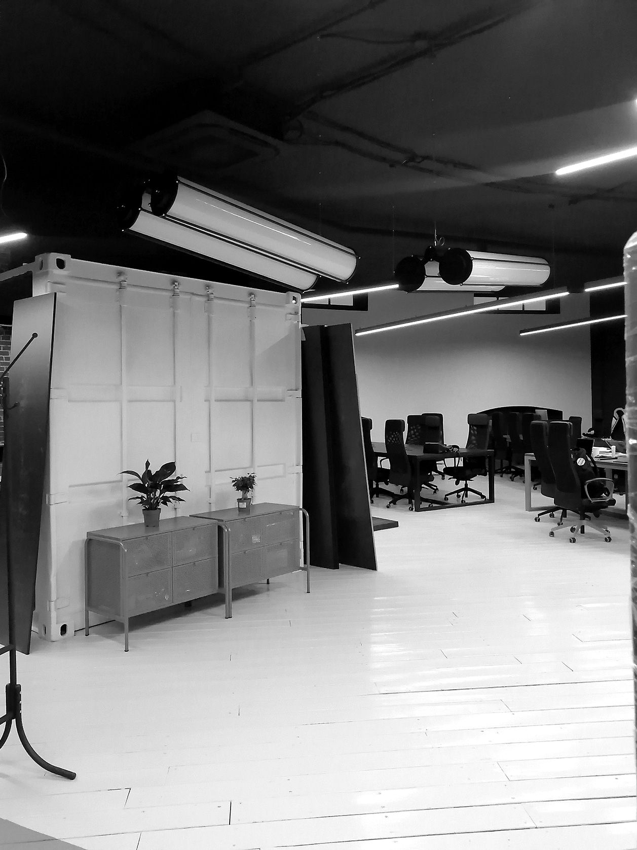
There is a container that came from previous tenants, in the center of the second half of the open space. A high table and bar stools from Delo design were placed inside. The container can be used as a meeting room or workplace.
Blue is the main accent color in this half of the office. The meeting room area and half of the tables are highlighted in this color. Some of the walls are painted, some are brick, the floor is light.
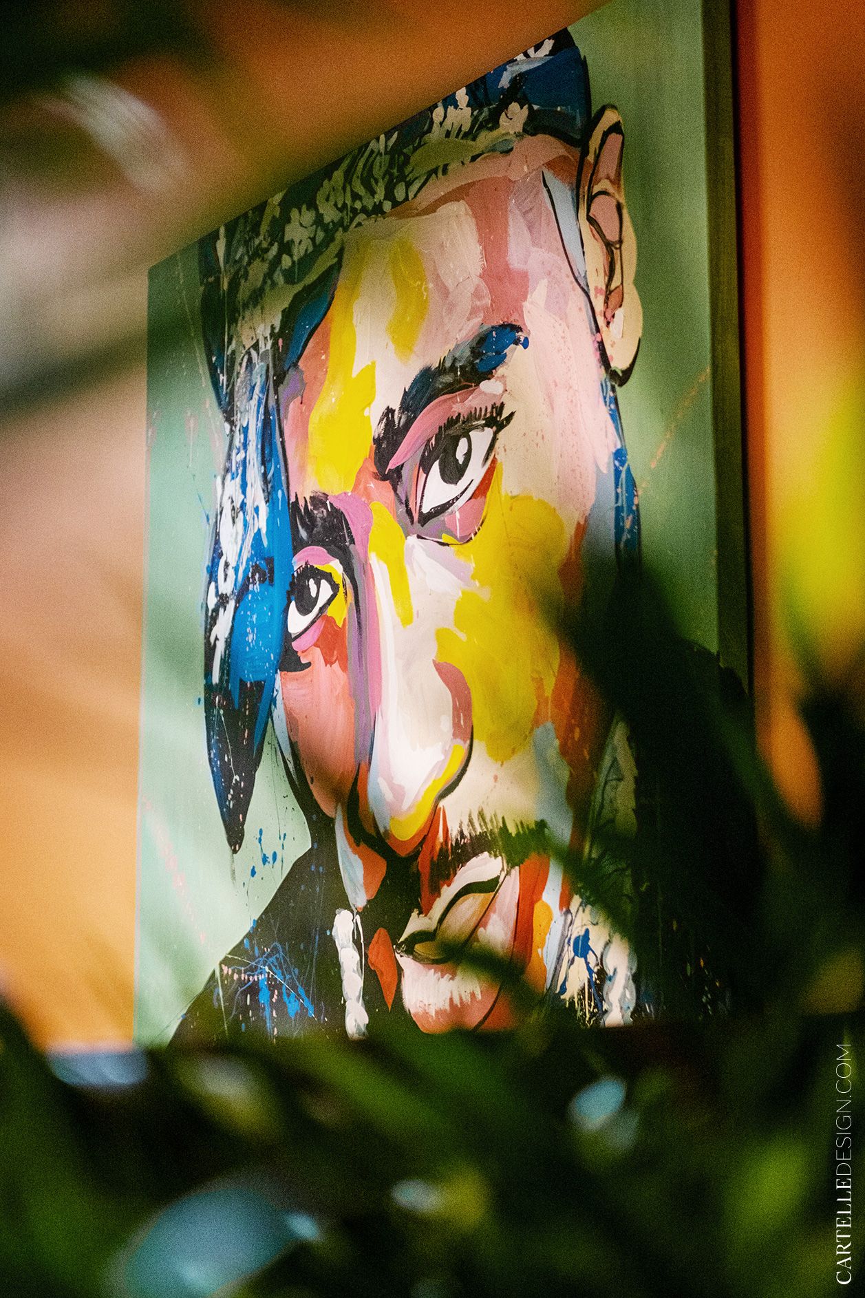
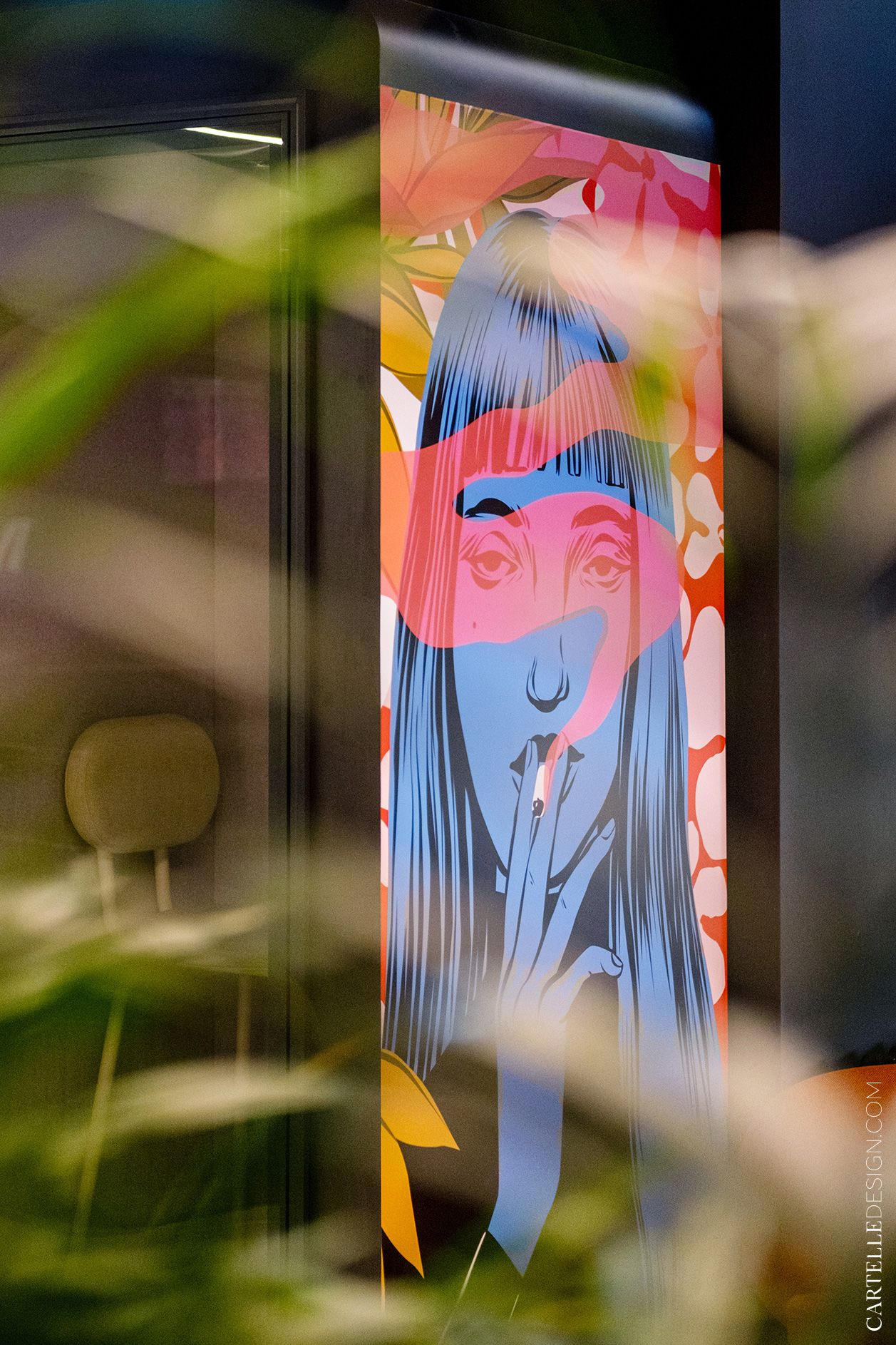
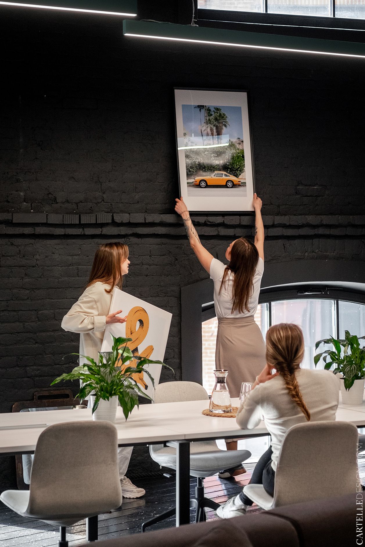
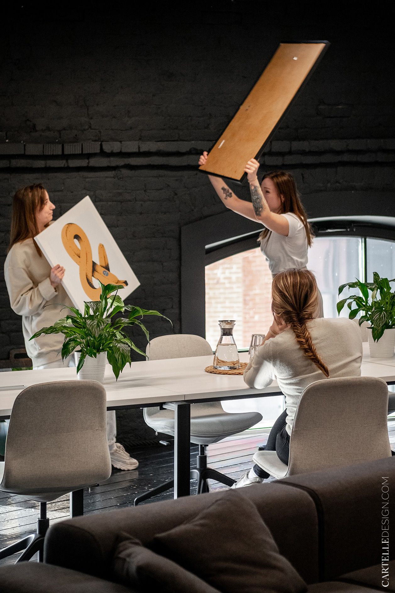
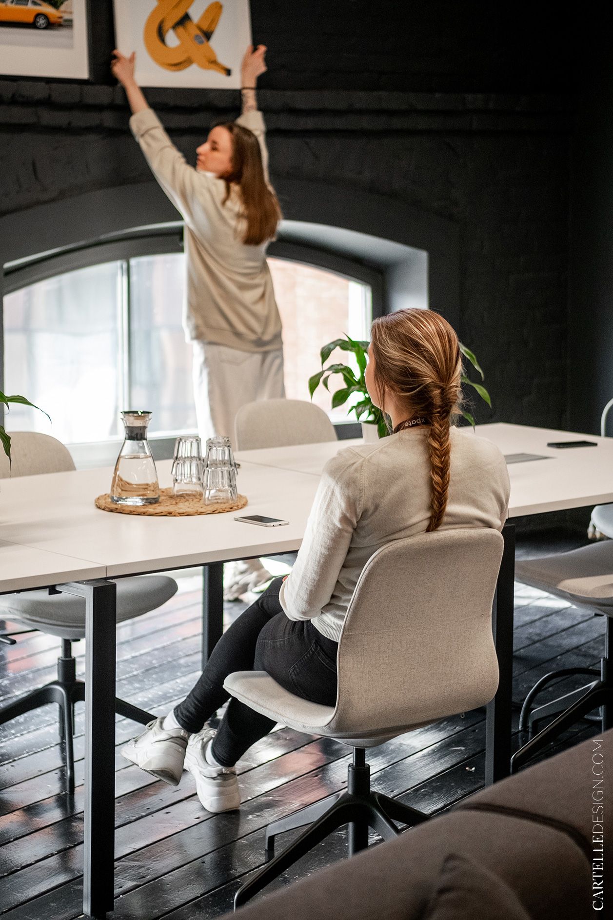
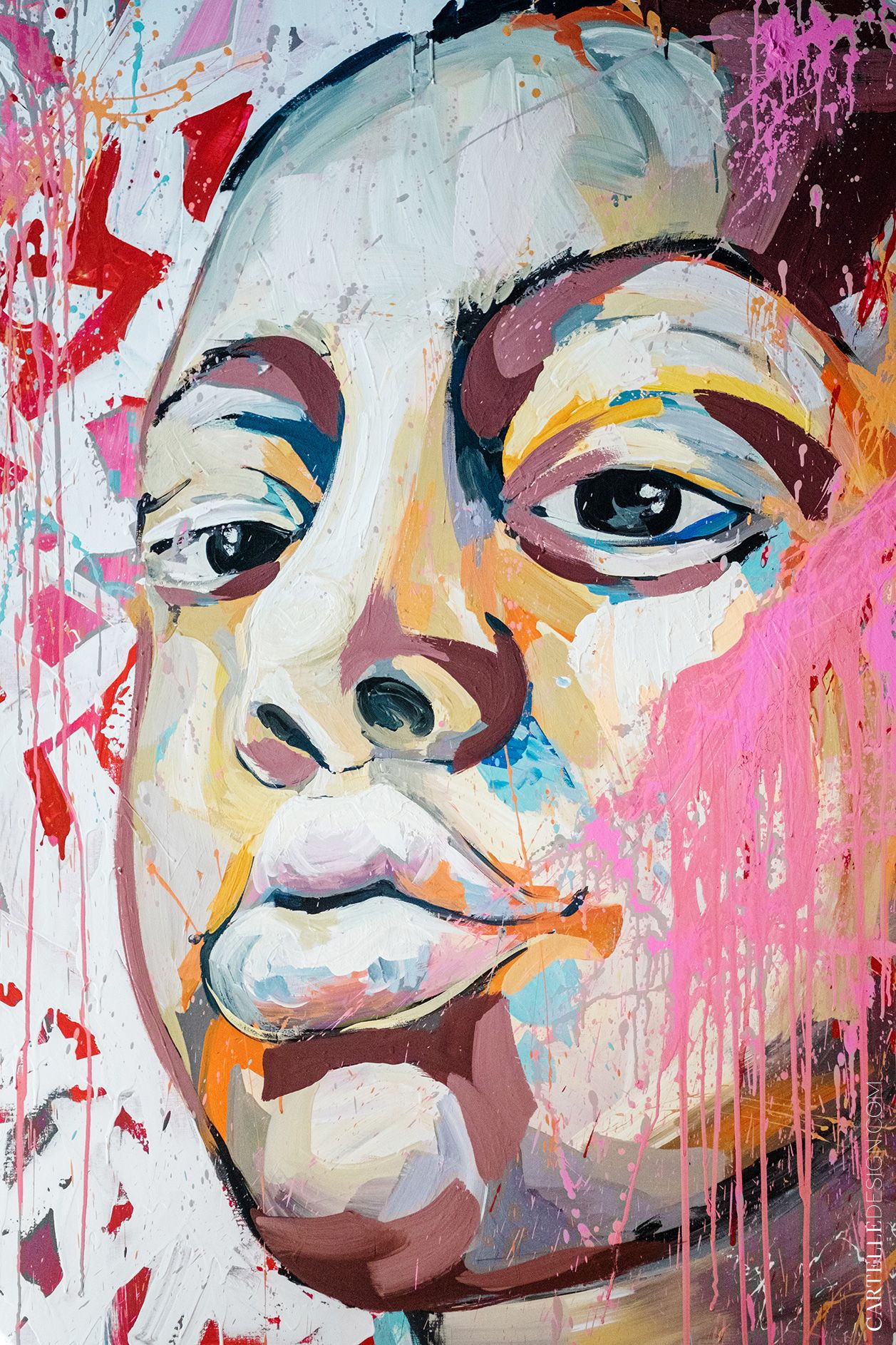
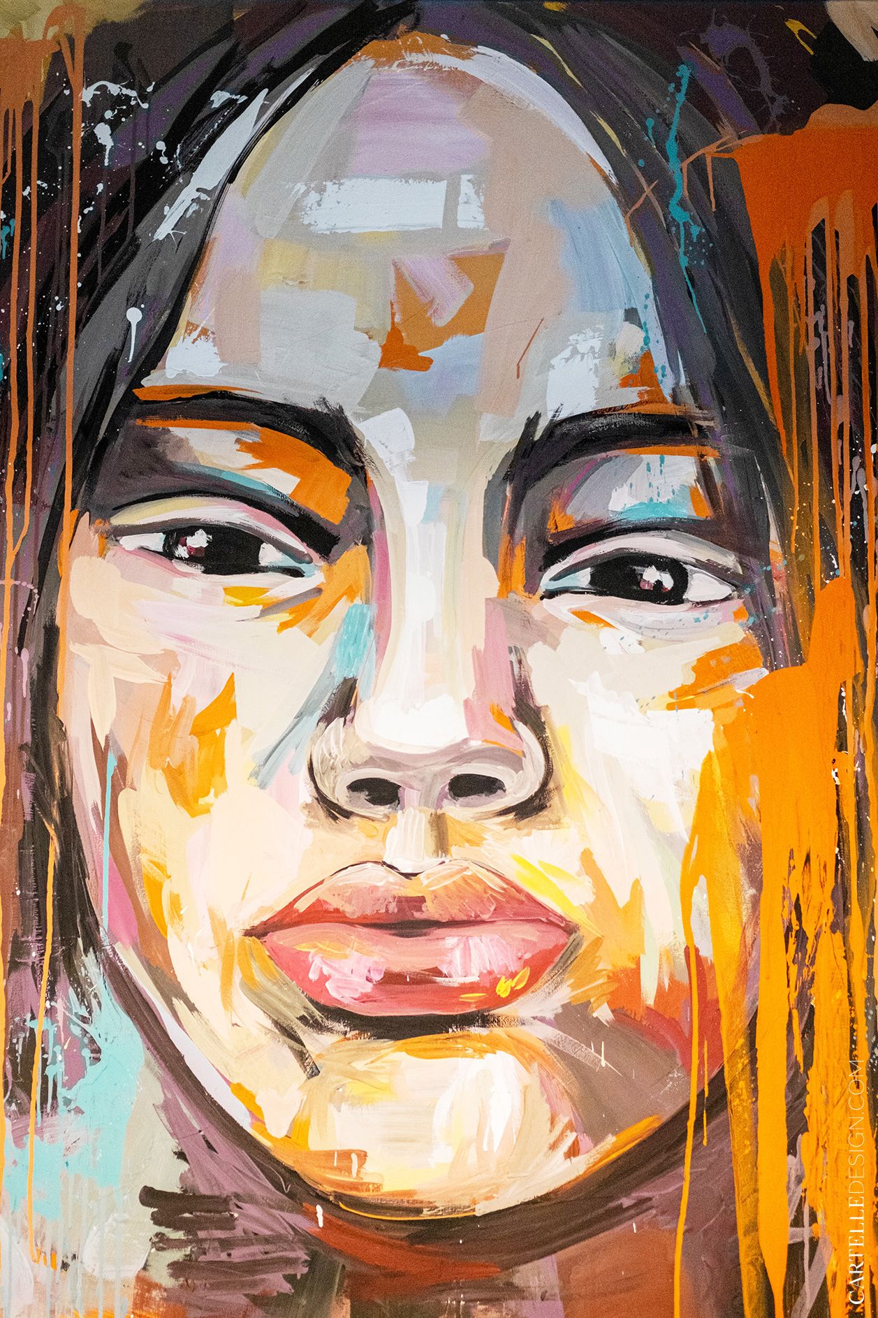
The interior is full of bright paintings, graffiti, posters and navigation. Anastasia Malinovskaya painted pictures and graffiti to order. We discussed the theme and colors of the images in advance.
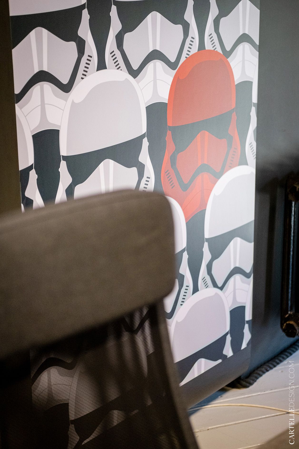
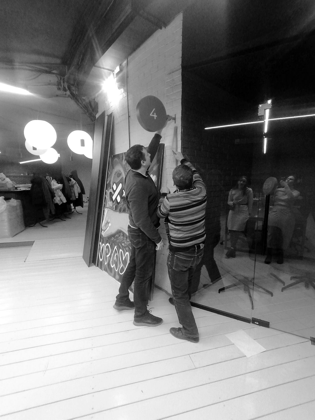
The design of navigation plates was developed by our studio. Each meeting room has its own name on a round index. Themed stickers on the side walls have been developed for meeting booths. Some of the posters were chosen by us, some - by the customers. Common colors and combinations allowed us to combine all ideas into a common graphic code.
The project had a very tight deadline. Construction work began immediately after the general concept was approved. We were afraid that the complex configuration of the premises, limited budget and a huge number of completely different ideas and wishes of customers would turn the project into chaos. But the circular layout, on the contrary, turned out to be ideal for a project with such tasks. And we managed to create a bright and interesting space, which has everything necessary for the productive work of a young company.


