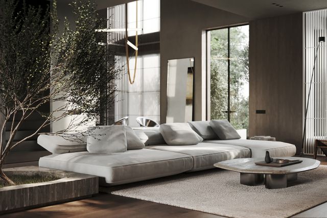
The customer’s lifestyle often determines not only the main traffic scenarios, but also the nature of the future interior. We were approached by a young man who had recently bought an apartment in a club house near Mosfilmovsky Pond overlooking Moscow City. And he asked me to develop a functional interior for him, his girlfriend and cat. The main goal was to maintain a feeling of spaciousness, create an interior with cool details and a large number of lighting scenarios to suit any mood. Among the wishes were also a functional kitchen, division of the apartment into a private zone and a space in which to gather friends.
When we visited the property for the first time, we immediately noted the advantages of the apartment: open plan, high ceilings, a large number of panoramic windows, a terrace and a balcony. The downsides are that ventilation from other apartments takes place in the hallway (we had to lower the ceiling significantly), a very narrow “wet zone” in one of the bedrooms and rather low beams near the bay windows.
When developing the layout, we divided the apartment into two large zones. To the right of the hall there is a kitchen-living room with a bay window and a terrace. The living room has many places where you can spend time with friends - a soft area, a dining area and a kitchen with a large island. Also in this part of the apartment there is a dressing room at the entrance, a guest bathroom and a utility unit. On the left side of the apartment there is a single space of the master bedroom, dressing room and bathroom; a guest bedroom with its own bathroom and a storage room.
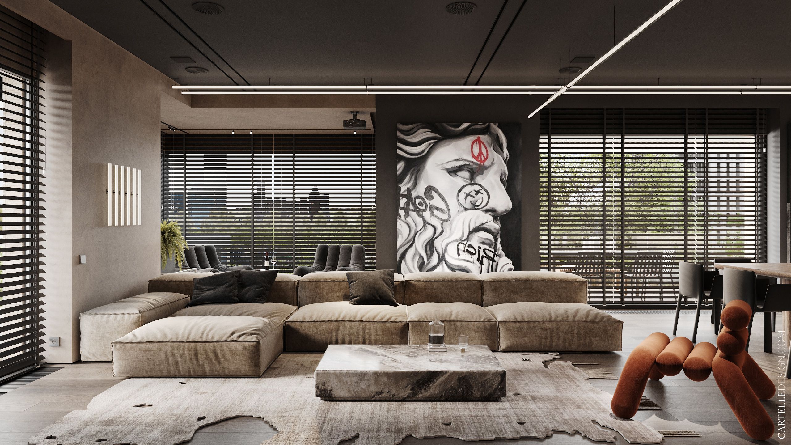
The interior is based on the contrast of dark graphite and beige. Accents are placed throughout the apartment with large strokes, creating the dynamics of the space. A large amount of wood and bright details that catch the eye add coziness. Today, natural finishing materials are the most relevant. They are the ones used in the project: wood, plaster, stone-look tiles. A tinted mirror and metal make the finish more interesting. A tinted mirror in the bedrooms gives additional depth and dynamics, reflecting city views in panoramic windows. Metal-look tiles are used in the bathrooms, on which colored lighting looks impressive. A non-standard technique that gives a wow effect.
Most of the furniture in the project is individually made. The apartment has many different storage systems, which we carefully designed based on the lifestyle and wishes of the customer. When choosing ready-made interior items, we focused on comfort, streamlined shapes, and were looking for something on the verge of art and functionality. In the living room kitchen: Living Divani Extra Soft sofa, Slice Round coffee table by MOVIMENTO, Henzel Studio Hoganas carpet (Taupe Edit), Kristalia Joko dining chairs, Lamina Too Stool Bonaldo half-bar stools, Wadi Nobonobo bay window chairs. In the master block: Lum Age chair, Mantra Take 5785 floor lamp, Archipelago 38°-175° Taupo armchair. In the guest bedroom: Lazybones Lounge by Baxter chair, CC-tapis Car Park 1 carpet, Davide Groppi Origine floor lamp. In the guest bathroom: overhead shower - Antonio Lupi Apollo 1, shower set - Antonio Lupi Filo + Molla.
Among the interesting technological solutions: we integrated an acoustic system into the space - we hid it in furniture, walls, and ceiling; hid the large projects and placed the ventilation system so that the projector screen did not inflate like a sail. All lights, curtains and blinds are controlled via the app, allowing you to quickly change the scene.


